Time Slider
The Time Slider (TS) allows users to filter data based on time windows. It also allows to play data by fixed time frames providing a better vision on how the data changed over time.
We can create this component by using a time field:
1 2 3 4 5 6 7 8 9 | |
It is important to mention that the Time Slider will only trigger a min() and max() query for the given field. That's why for this specific visual, the limit() and the sort() function are not needed.
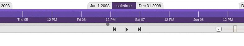
Then, we'll see the visualization as follows:

TS Components
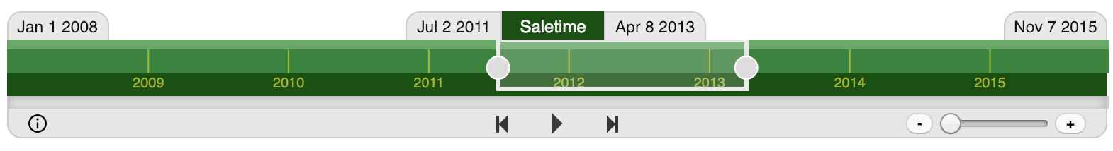
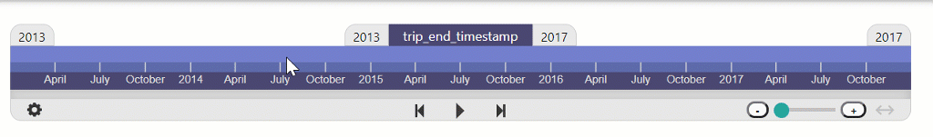
Header
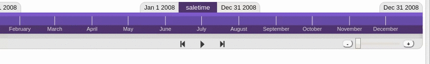
The header area which displays the min and max dates for a given fields in the data provider. These are displayed at the top right and top left of the visualization. At the center, the selected range is displayed along with the name of the field used to display the visualization. The selected range initially is the same as the full range if no initial filter or preset was defined.
Slider
The slider area contains the date ticks (divisions) which are automatically generated depending on the range. In this area we can zoom-in or zoom-out by using the mousewheel or the zoom control. The ticks will be re-calculated to display the range in a higher granularity for a better precision.
Controls
The bottom bar is the control area. Here 3 controls will be displayed: The player info control, the player and the zoom.
The first one is the small gear icon at the bottom left that will show the current player configuration (if any) when clicked. It also allows the user to change them from there without having to modify the AQL.
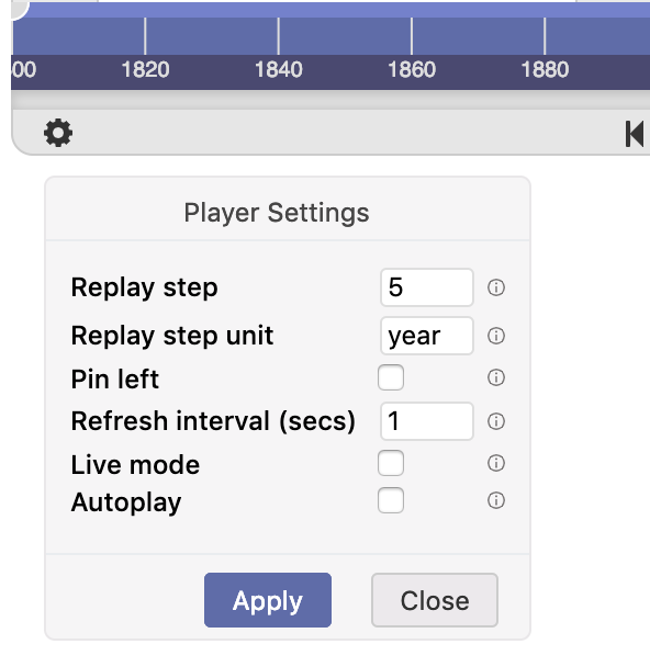
Any modification done from this window WILL NOT modify the AQL.
If no player configuration is provided, the gear icon will not be shown.
In the middle of the controls we'll find the player.
If no player configuration is provided, the player controls won't be displayed.
And in the bottom right, we can see the zoom control, that as explained before, allows the user to zoom-in or out the time slider.
Selection
In the TS we can manually select a range of dates in several ways, the first one and the most common is by dragging the cursor when positioned over the top bar in the slider area. The other one is by clicking on the middle labels (those at each side of the field name) in the header area and using the date pickers.
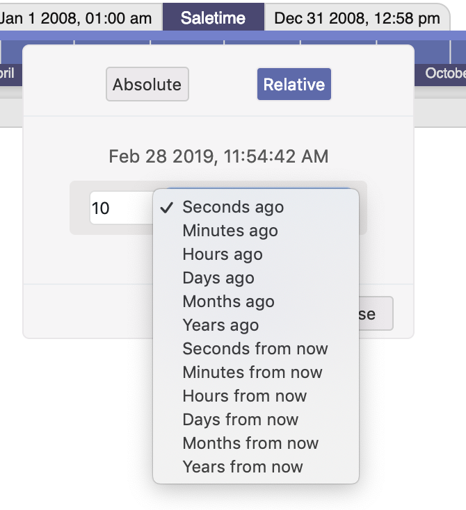
There are two types of date pickers: absolute and relative.
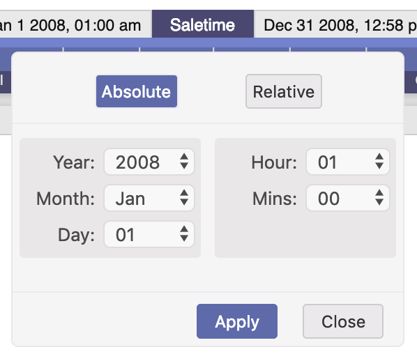
For the absolute picker, the highest time granularity (YEAR, MONTH ...) shown in the picker will depend in the granularity used in the aql used for the definition. In the picture above we can see that the highest is DAY.
And the relative picker:
The pickers allow a higher level of accuracy when selecting a range. Once the selection is done, we'll se the range as the image below:
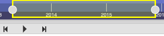
The range can be moved by dragging it or resized by using the handles.
The other way to select accurate dates is by using the presets as explained below.
single-period
The single-period option allows selecting, as the name states, one single period or unit depending on the granularity used.
1 | |
This means that if the selected granularity is DAY, the selection will be automatically accommodated to one single day counting from where the selection started:
In the example below, selecting several months will be resized to match the day Jun 13.
Or if we select a range less than a day it will expand to match the full day:
Notice that when single-period is set, the selection won't display handlers, meaning that it cannot be resized.
Fit selection
The fit selection control allows to fit the current selection to the full size of the time slider. This is useful when you are very zoomed-in and the time window selection expands beyond the limits of the time slider and consequently the initial and final ranges are lost from sight. This control is enabled when a time window selection exists and the time slider is not currently playing data.
Here is a demonstration of how it works:
The Player
The player as mentioned before allows to play data by moving a previous selection frame by frame depending on the desired mode. This means that for the player to work there must be a range already selected.
It has several options that will define its behaviour. Let's see an example:
1 2 3 4 5 6 7 8 9 10 11 12 13 | |
enable
Allows to enable or disable the player. True by default. If false, has the same effect than not setting the player property to the aktive instance.
pin-left
If true, this option will pin the left handle of the selection ('from' date) and it will be colored darker. The data queried will be accumulative creating an incremental time window. If false, then 'from' and 'to' date will equaly advance keeping the same amount of time between the two dates, creating a rolling time window. By default is false.
step
The frame or step size. It could be any number equals or bigger than 1. It works along with the step-unit, so it can be translated as 1 day, 3 years, 30 minutes, etc. By default is 1. This setting applies to historical playing only.
step-unit
Required. The unit or granularity of the frame used to move the selection. It could be any of the commonly used: YEAR, MONTH, DAY, HOUR, MINUTE, SECOND. This setting applies to historical playing only. IMPORTANT: This the only parameter without a default value, which means that is required for the player to work. If this configuration is not set, the player will be shown as disabled.
refresh
The refresh time in seconds. It represents how frequently the server will be queried. Values can be any positive number, which means that the query should be triggered as soon as all previous queries are resolved. Default value is 1.
animation-delay
The animation delay is the time that the selection window will take to move from one position to another when playing. The higher the value, the slower it will transition. We can increase or decrease this delay to make the selection window move more in sync with the visualizations as they update. Default value is 0.3 seconds.
live
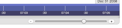
True or false. If true, this option will keep playing until the current date and time and the player won't stop playing. Once the right handle reaches the current date it will keep playing according to the refresh time. No matter what granularity is used for the time field in the aql, it will automatically switch to SECONDS. False by default.
This option should be used only for near real time sources, otherwise it will create unnecesary queries. If the option is false then as soon as the right handle reaches the end of data, the player will stop playing. False by default.
autoplay
If true, as soon as the application is ready it will start playing. The user won't have to manually click on the play button. False by default.
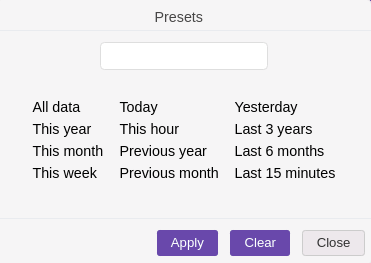
preset
A preset represents a predefined time window that will be applied as a filter. It can be applied programatically when the application loads through aql. Users can also use the preset user interface (shown below) to set specific time windows:
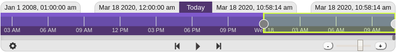
When a preset is selected, it is displayed in the header indicator of the time slider. The following image shows "Today" as the active preset:
Users may modify the selected time window after selecting a preset by using the date/time pickers or by dragging the sliders. When playing the data in these situations, users are presented with the options below:
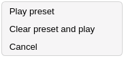
- Play preset: it drops the modification and plays the preset
- Clear preset and play: it drops the preset and plays the modified time window selection. The preset indicator is removed. A new preset can be applied if needed.
- Cancel: it closes the window
Dynamic presets
There are many more presets available than the ones listed in its user interface. They are selected through the use of 4 terms (This, Prev or Previous, Last) and the name of the unit. Examples:
1 2 3 4 5 6 7 8 9 10 11 | |
There are 2 additional presets that don't follow the rule above: yesterday and today. They are shortcuts and equivalent to Prev Day and This Day respectively.
Presets and time windows
Incremental time windows, as opposed to rolling time windows, are achived by using the time slider's pin-left option. In these situations, presets provide automatic time window switching when playing "today" or "this" type presets. In other cases, presets represent the starting point of the playing session. These cases are described in detail below.
this unit / today
- Pinned: As soon as the next unit (year, month....) is reached, the left handle automatically jumps to it and keeps playing the current unit.
- Not pinned: As soon as the rolling time window starts advancing, it does not represent the selected preset anymore.
prev unit / last-unit / yesterday
- Pinned: The left handle stays and the right handle advances according to the current configuration. As the time window starts advancing, it does not represent the selected preset anymore.
- Not pinned: It plays both handles normally according to the player configuration. As the rolling time window starts advancing, it does not represent the selected preset anymore.
last-x-units
- Pinned: The left handle stays and the right handle advances according to the current configuration. As the time window starts advancing, it does not represent the selected preset anymore.
- Not pinned: It will always play the last time unit(s) because both handles advance according to the player configuration
Custom colors
We can use custom colors to change the look of the slider area:
1 2 3 4 5 6 7 8 9 10 11 | |
The result will be as shown below: