Scatter Plot
A scatter plot (also called a scatterplot, scatter graph, and scatter diagram) is a type of plot or mathematical diagram using cartesian coordinates to display values for typically two variables for a set of data. The data is displayed as a collection of points, each having the value of one variable determining the position on the horizontal axis and the value of the other variable determining the position on the vertical axis.
ChartFactor supports rendering Scatter Plots with raw data and also aggregated with one and two groups.
Using raw data
The code below renders a Scatter Plot with raw data.
1 2 3 4 5 6 7 8 9 10 11 12 13 14 15 16 17 18 | |
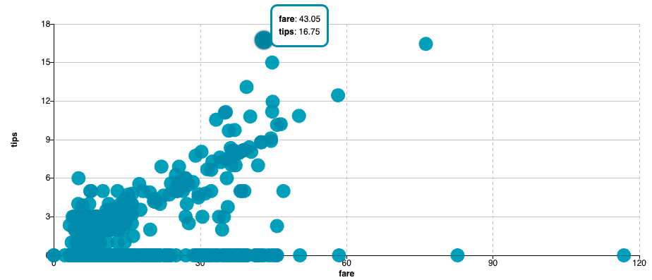
The previous code renders the Scatter Plot below. The first metric in the fields array fare is the x-axis metric. The second metric in the fields array tips is the y-axis metric. Also, notice how we limit the number of points to 1000 using the .limit() function.
Aggregating by one group
The following code shows how to create a Scatter Plot for the top 10 event names with the sum of pricepaid on the x-axis, the sum of qtysold on the y-axis and the sum of commission for the size of the symbols.
1 2 3 4 5 6 7 8 9 10 11 12 13 14 15 16 17 18 19 20 | |
Previous code renders the Scatter Plot shown below.
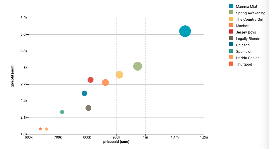
The three metrics in the code definition represent in order: pricepaid the x-Axis, qtysold the y-Axis and commission the size of the synbols.
Aggregating by two groups
The following code shows how to create a Scatter Plot where each symbol is the combination of the top 100 event names and the top 4 category names, with the sum of pricepaid on the x-axis, the sum of qtysold on the y-axis and the sum of commission driving the symbol size.
1 2 3 4 5 6 7 8 9 10 11 12 13 14 15 16 17 18 19 20 21 22 23 | |
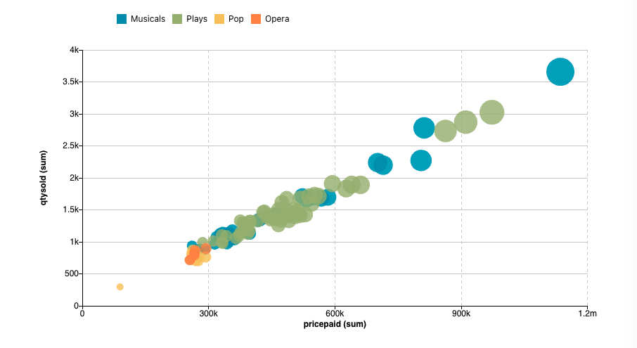
The previous code renders the Scatter Plot below. Note that color is driven by the second group catname.keyword. The legend at the top of the chart shows each category with its assigned color. For example, the symbols for the Plays category are filled with the color green.
Configuring symbols
ChartFactor supports defining different symbols for your Scatter Plot. The symbol object supports the settings below.
- color: text Color
- borderColor: text Color
- borderWidth:
Number - opacity:
Number - form:
circle|rect|roundRect|triangle|diamond|pin|arrow - size:
Number
Example:
1 2 3 4 5 6 7 8 | |
Symbols for raw data
When rendering a Scatter Plot with unaggregated data, you can plot several metrics on the y-axis and assign different symbols to each of them to differentiate them. To do this, first define individual symbol objects.
1 2 3 4 5 6 7 8 9 10 11 12 13 14 15 | |
Second, define a symbolFieldMatch object where the keys are the field names of the y-axis metrics and the values are the symbol objects. Example below.
1 2 3 4 | |
Finally, use the symbolFieldMatch setting to set your symbolFieldMatch object to your visualization.
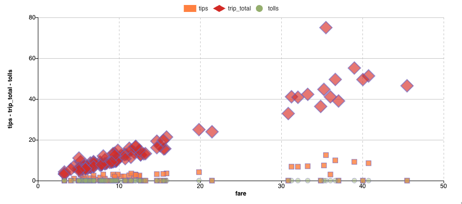
The following is a full example of a Scatter Plot rendering unaggregated data. On the x-axis, it renders fare which is the first field in the fields array. On the y-axis, it renders tips, trip_total, and tolls which are the next fields in the fields array. It then uses the symbolFieldMatch setting to enable the symbol match functionality for tips, trip_total, and tolls. Additionally, it defines a default symbol using the symbol setting.
1 2 3 4 5 6 7 8 9 10 11 12 13 14 15 16 17 18 19 20 21 22 23 24 25 26 27 28 29 30 31 32 33 34 35 36 37 38 39 40 41 42 43 44 45 46 47 48 49 | |
The previous code renders the Scatter Plot below.
Symbol size
For Scatter Plots with raw data, the size of symbols can be driven by one of the metric fields in your fields array. To do that, use the symbolFieldSize setting to specify the metric field that drives the size of the symbols. Example:
1 | |
Additionally, you can use the size property of each symbol object to control the size of a specific symbol type. Because this property is more specific, it has higher prescedence and overrides the symbolFieldSize setting.
Symbols for aggregate data
You can configure different symbols for different aggregate values using the Symbol Match functionality. To do this, first define individual symbol objects.
1 2 3 4 5 6 7 8 9 10 11 12 13 14 15 16 | |
Second, define a symbolMatch object where the keys are the group values and the values are the symbol objects. Example below.
1 2 3 4 | |
symbolMatch setting to set your symbolMatch object to your visualization.
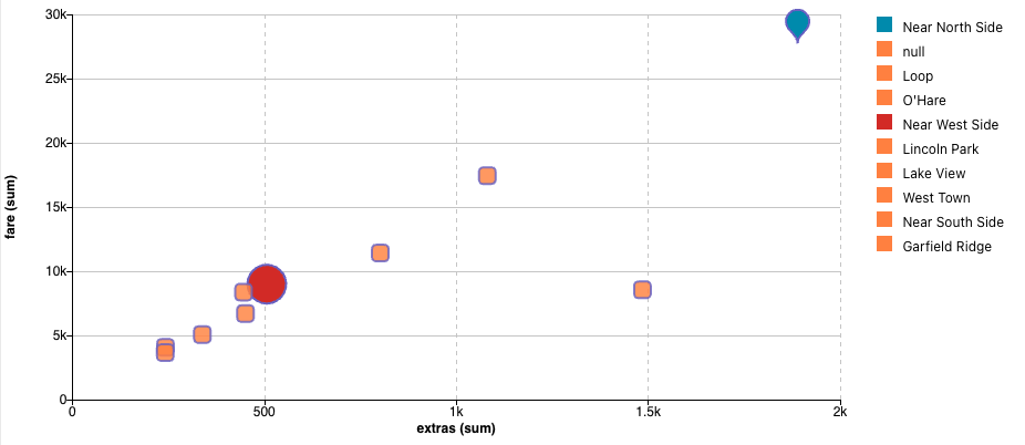
The following is a full example of a Scatter Plot aggregating data by dropoff_community_area_desc and using the symbolMatch setting to enable the symbol match functionality for the "Near North Side" and for the "Near West Side" dropoff community areas. Additionally, it defines the default symbol using the symbol setting.
1 2 3 4 5 6 7 8 9 10 11 12 13 14 15 16 17 18 19 20 21 22 23 24 25 26 27 28 29 30 31 32 33 34 35 36 37 38 39 40 41 42 43 44 45 46 47 48 49 50 51 | |
The previous code will render the following Scatter Plot with groups:
Symbol size
For Scatter Plots with aggregate data, the size of symbols is driven by the third metric in the metrics array. Additionally, you can use the size property of the symbol object to control the size of a specific symbol type. Because this property is more specific, it has higher prescedence and overrides the size behavior driven by the third metric.