Slicer
The Slicer visualization is a special table that allows the user to have a visual indicator of all the data available for a given attribute (depending on the specified limit). This data can be displayed even if the slicer is filtered. The main utility of the slicer is to add or remove multiple values for a filter based on the attribute used. The slicer is similar to most of the visualization when we need to define it:
1 2 3 4 5 6 7 8 9 10 11 12 13 14 15 16 17 18 | |
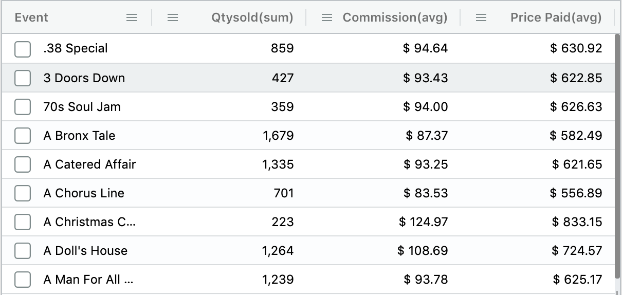
The slicer supports only one group by and multiple metrics. This visualization shine when we start using it as a filter utility. We have different modes to apply filters from the slicer:
- Clicking one value will immediately trigger one filter for that value
- Pressing Cmd/Ctrl keys and selecting several values at the time, and then releasing the key. This will trigger a new filter with all values selected
- Pressing shift and selecting an initial and a final value. This action will select all values in between the selected "start" and "end", and after releasing the shift key, it will trigger the filter with the selected range of values.
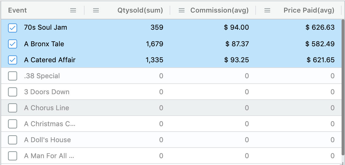
After applying a filter from the Slicer, we'll notice a set of grayed out values with a 0 (zero) for each one of the metrics. These are values that don't belong to the filtered data, but to the original. This feature is called "Merging" since it compares and merges incoming data with the one queried the first time.
We can modify the existing filter by selecting grayed out values using any of the three mentioned methods. Or we can also unselect selected values to remove them from the filter.
Unselecting values programatically
If we select a lot of values it could be tedious then to manually unselect them all. We can use the following method exposed by the slicer:
1 | |
Avoiding merging items
The Slicer merging is possible because, as explained before, it compares original queried data with new incoming data every time a filter is applied. The original data is obtained with an initial query which we call "first load".
In some cases, you may not want your slicer to show the grayed out elements, that is, you only want to see the filtered data. In this case we can use the noMerge option:
1 | |
Resetting the slicer values
In some situations you may want to reset your slicer values. For example, you may have a Zip Code slicer that needs to show only zip codes for a selected state. In this case you need to check first if the filter to be applied matches your criteria (e.g. a State was selected). If that's the case you can reset the first loading flag for the slicer like this:
1 | |
By setting the first time load to true, the Slicer knows that the filtered data for that specific filter is to be considered the 'original' data. Remember that the "first load" of the slicer provides the selectable values.
Sorting
The Slicer data can be sorted in two ways: By clicking the column header after is rendered, and/or by specifiying the sort criteria in the aql definition.
A difference with most of the visuals is that for the slicer the .sort() method is not required in the aql. By default it will sort by group ascending. So we can declare the attribute without the sort like:
1 | |
Integrated search
By default the Slicer will have a filter icon in the header of each column to allow users to filter that column:
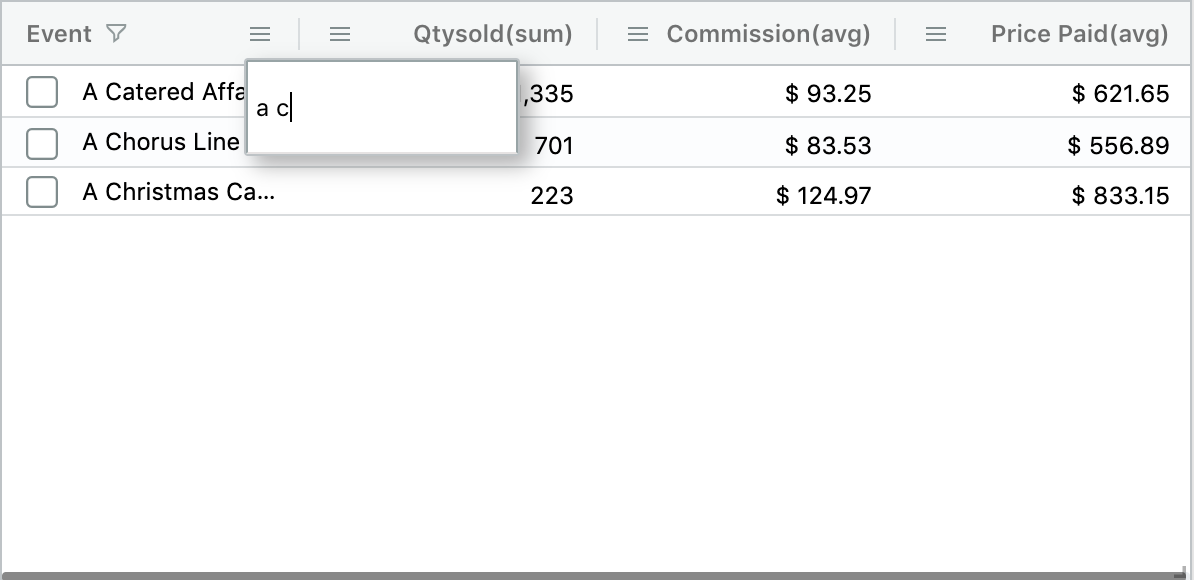
This search icon shows when users hover on the column header. To display it all the time we can use:
1 2 3 4 5 | |
showSearch option to false.
Case insensitive searches
Slicer searches are case-insensitive. This behaviour works automatically on SQL data engines.
For Elasticsearch, case insensitiveness is supported for fields mapped both as text and keyword. This is also the default string mapping in Elasticsearch. Example string mapping for the field venuename that supports case insensitiveness:
1 2 3 4 5 6 7 8 9 10 | |
Hide the Slicer header
If we want to hide the columns headers for the slicer we can use the following:
1 | |
Move selected items to the top
The default Slicer behavior for selected items is to move them to the top of the table. For example, if you select the last item in a Slicer, it immediately moves to the top. If you don't desire this behavior you can use the following setting:
1 | |
Selection mode
If you want to change how the Slicer selects items you can use the selectModeoption. Available values are: single and multiple. The single option allows to select only one item at the time while the multiple option allows to select one or more items. The dafault value is multiple.
Single mode code:
1 | |
Multiple mode code:
1 | |
Custom theme
To change the theme and styles of the Slicer you can refer to Table theme configuration
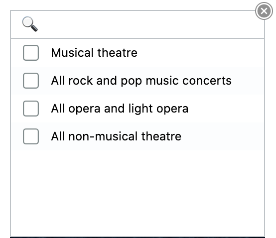
Dropdown
The dropdown setting allows you to save space in your dashboard by transforming your slicer into a dropdown. To do that, add the dropdown setting as shown below:
1 | |
With this setting, the Slicer renders as below:
Dropdowns behave in the same way as slicers and they support the same configurations. For example, you can configure them to allow single or multiple choices as described in the Selection mode section.
The dropdown setting can be a boolean value or an object with two keys: showSearch and showAttribute:
1 2 3 4 | |
showSearch
Enables or disables the search input field at the top of the dropdown component. If not specified, its default behavior is as follows:
- When the Slicer has no metrics, then the dropdown renders with the search input field and with no header
- When the Slicer has one or more metrics, then the dropdown renders with column headers and no search input field since column headers include a search function
showAttribute
Enables or disables rendering the attribute name in the select component when the dropdown is close. Its default value is false.
Example when is enable: 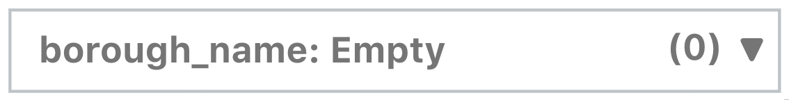
Example when is disable: 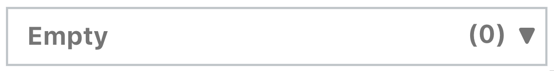
Events
sort-changed
This event fires when the header of the columns are clicked to change the sort. The event received provides information about the sort model used:
1 2 3 4 5 6 7 8 9 | |
slicerfilter
This event is triggered when items are selected in the Slicer. The event contains the filter built out of the selected items
1 2 3 4 5 6 7 8 9 10 11 12 | |