Color
The color of a visualization can be modified by using the Color object available in ChartFactor
1 2 | |
Palettes
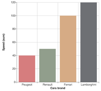
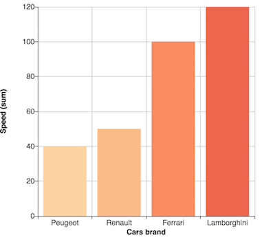
Palettes are the set of colors used to display data in a visual. ChartFactor includes a set of predefined palettes for the color object. These are: intense (default), green, macarons, purple, roma, and vintage. Palettes and themes can be combined.
1 2 | |
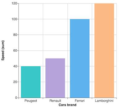
Macarons palette
Vintage palette
Palettes are nothing more than predefined sets of colors. If we want to create our own palette, we must define our own array of colors and then pass it to the palette method of the Color object. The palette method accepts a palette definition or an out-of-the-box predefined palette name.
1 2 3 4 5 6 7 8 9 10 11 | |
Custom color palette
Color by Attribute Values
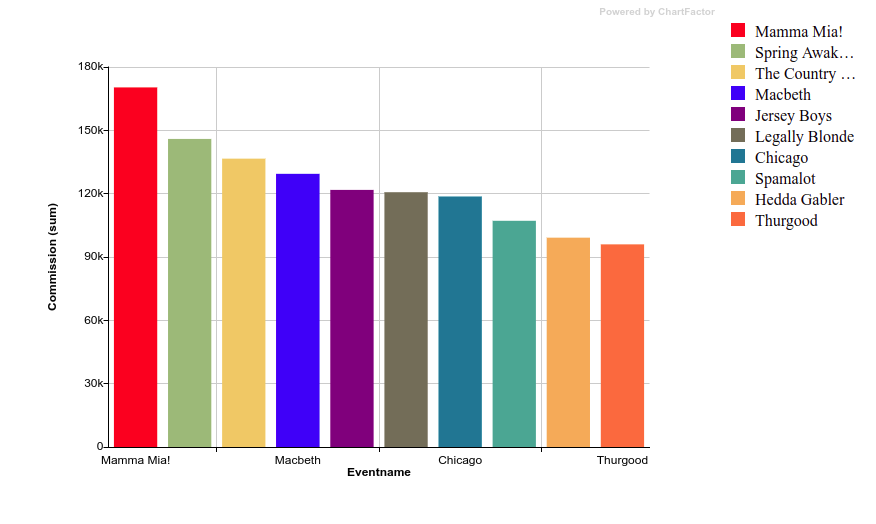
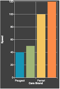
The color by attribute value feature is useful when you want to assign specific colors to attribute values in your chart. It is specially helpful when you have a system of charts and you want to establish consistent colors for those attribute values (e.g. Ford always in blue, Toyota always in red).
The example below shows how to define colors for attribute values:
1 2 3 4 5 | |
This is a full example using the definition above to render bars.
1 2 3 4 5 6 7 8 9 10 11 12 13 14 15 16 17 18 19 20 21 22 23 24 25 26 27 28 29 30 31 32 33 | |
The previous code will render a Bars Chart like the one shown below:
Multimetric charts
For Multimetric charts, to color each metric with a different color, you need to match the labels of the metrics you are using in your chart. If you are using the count metric (e.g. cf.Metric('count')), use its default label Transactions unless you provided a different label using the Custom Metadata feature.
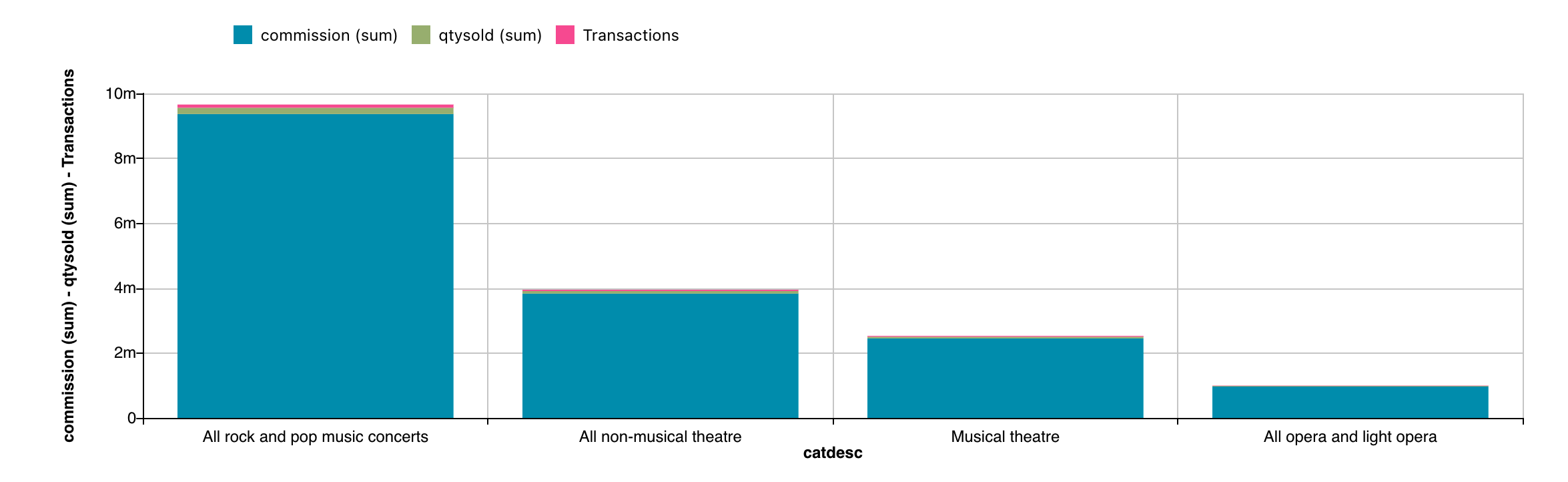
The full example below renders a Multimetric Bars assigning specific colors to the commision, qtysold, and count metrics.
1 2 3 4 5 6 7 8 9 10 11 12 13 14 15 16 17 18 19 20 21 22 23 24 25 26 27 28 29 30 | |
The previous code will render a multimetric bar chart like the one shown below:
Color by Metric
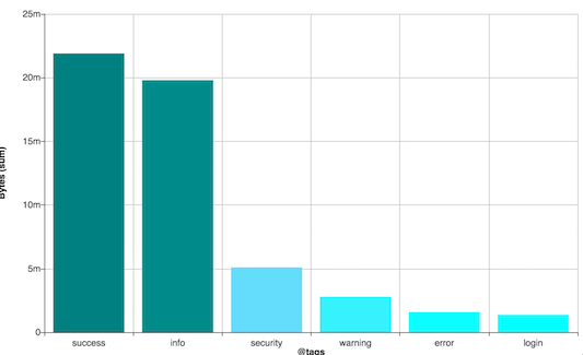
The color object accepts a metric object. Use this feature when you have ordered data. Lightness steps dominate the look of these schemes, with light colors for low data values to dark colors for high data values. Example:
1 2 3 4 5 | |
Color ranges
The range method of the Color object allows you to specify a range in the form of a list of objects that contain the minimum (min), maximum (max) and color (color) of each range.
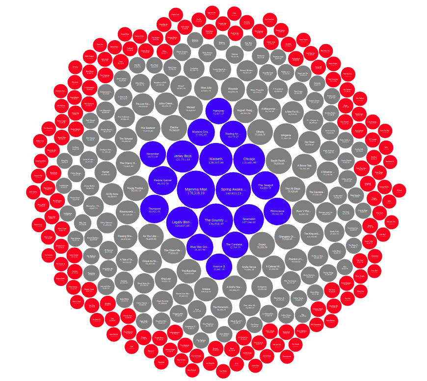
The example below shows how to define color ranges:
1 2 3 4 5 | |
This is a full example using the definition above on packed bubbles.
1 2 3 4 5 6 7 8 9 10 11 12 13 14 15 16 17 18 19 20 21 22 23 24 25 26 27 28 29 30 31 32 33 34 | |
The previous code will render a Packed Bubbles Chart like the shown below:
Automatic color ranges
Sometimes, it is better to enable automatic color range calculation rather than specifying color ranges manually. To do so, you can call the autoRange function of cf.Color as shown below:
1 | |
The autoRange function has the following features:
- It leverages the Jenks Fisher's Natural Breaks Classification algorithm to automatically obtain color range breaks
- The number of colors in the color palette defines the number of ranges
- It supports dynamic recalculation of ranges while adding and removing filters to the visualization. To enable automatic recalculation, pass the object
{ dynamic: true }as parameter. The default value fordynamicisfalsewhich is useful when you would like to visualize metric changes under constant color ranges through different time windows for example.
Pivot Table V2
Pivot Table V2 supports coloring by metric for all metrics that exist in your pivot table. Follow the steps below:
- Use the
ColorScaleobject to specify themetric,palette, and the optionalminandmaxproperties for the range of values of the color scale. - Use the
colorScale()method of theColorobject to pass one or moreColorScaleobjects for each metric of your pivot table. You can also pass an array ofColorScaleobjects instead of individual parameters.
Example:
1 2 3 4 5 6 7 8 9 10 11 12 13 14 15 16 17 18 19 20 21 22 23 24 25 26 | |
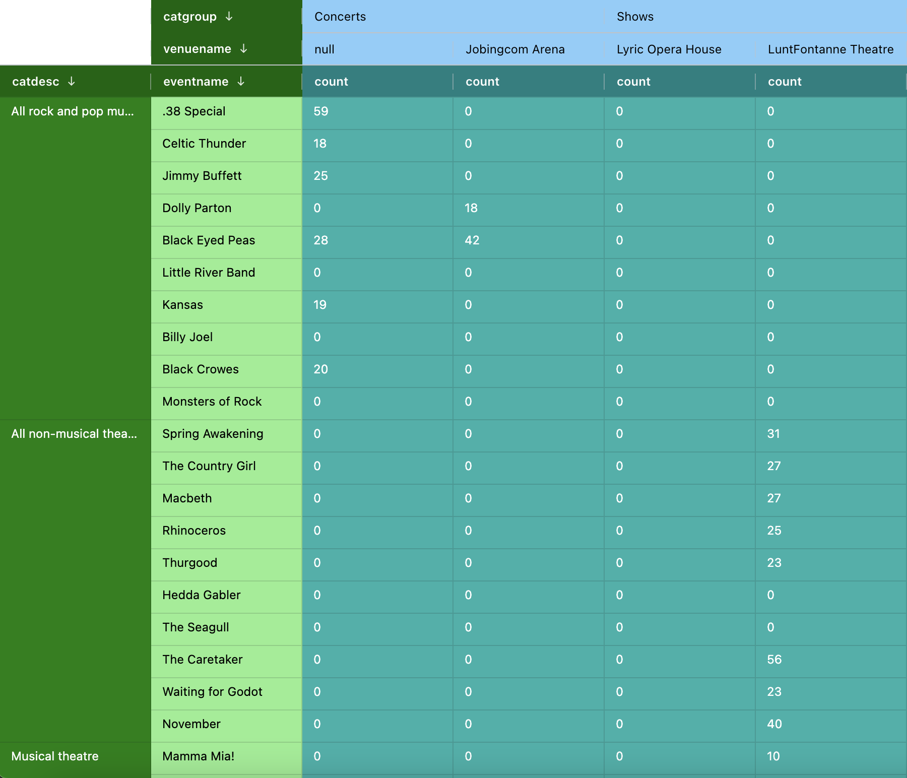
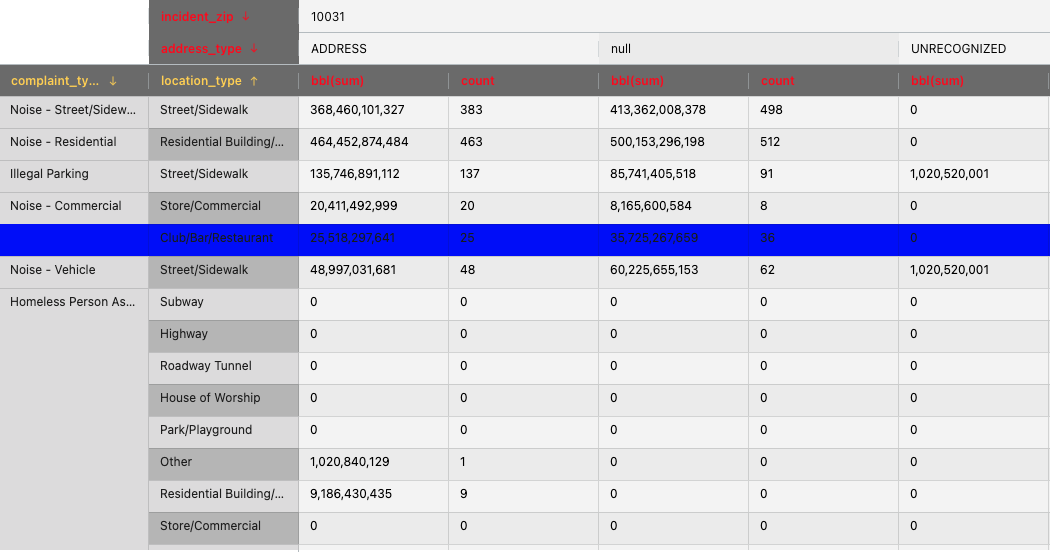
The previous code renders the following table:
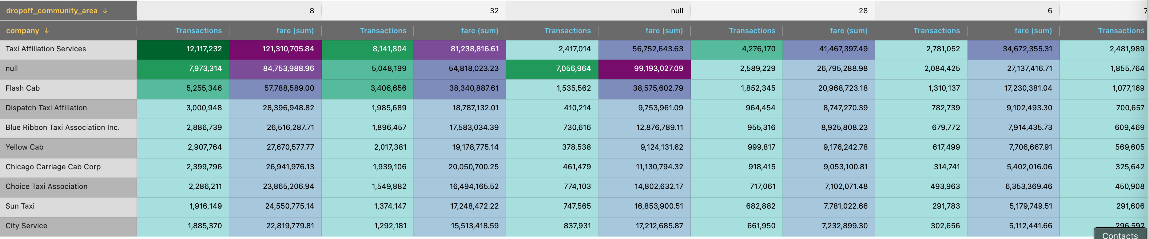
The example above applies color scales to the count and fare metrics. The background color of each cell is set based on the values of the metrics, with the specified palette defining the color gradient. The darkest color in the palette corresponds to the highest value, while the lightest color corresponds to the lowest value in the range. The text color of each value is automatically adjusted to ensure readability against the background color.
The color functionality automatically obtains the minimum and maximum values of the metrics. This is useful when you want to apply color scales dynamically based on the data in the pivot table. If you want to apply your own min and max values, you can specify them using the min and max properties of ColorScale as shown below:
1 2 3 4 5 6 7 8 9 10 | |
Color Themes
Color themes are the styles or 'skins' used on a visualization.
Standard visualizations
ChartFactor includes two out-of-the-box color themes for its standard visualizations: light which is the default theme and dark.
1 2 | |
This will modify the visual as follow:
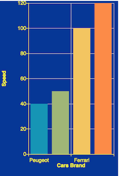
 Dark theme
The color object also allows custom themes, that can be specified as JSON objects:
1 2 | |
This configuration will display the visual like this:
Custom "blue" theme
Table visualizations
Table visualizations such as the Raw Data Table, Pivot, Pivot V2, and Slicer, support the standard theme, in addition to the light and dark themes. If not specified, the default theme is the light theme. Setting a different theme for a table visualization is done in the same way as other visualizations. For example:
1 2 3 | |
Custom settings
You can customize the theme of your table visualization by supplying a JSON object with CSS-like properties that target specific elements. Just invoke the theme method on the Color object and pass your JSON configuration as shown below.
1 2 3 4 5 6 7 8 9 10 11 12 13 14 15 16 17 18 19 20 21 | |
This color configuration renders a table like this:
The following are the supported settings:
-
cellMoving: inside this option, you can define all the necessary CSS style to modify the container and the text of the cell that is moving. You can define a string with all the properties you need like you normally do when setting the attribute
stylein some HTML tag. -
gridPanelStyle: inside this option, you can define all the necessary CSS style to modify the container of the chart or the general grid panel of the chart instance. It is useful for removing the border of the grid container. You can define a string with all the properties you need like you normally do when setting the attribute
stylein some HTML tag. -
headerStyle: inside this option, you can define all the necessary CSS style to modify the header of the chart. It is useful for changing the background and color of the labels. You can define a string with all the properties you need like you normally do when setting the attribute
stylein some HTML tag. -
numericHeaderStyle: inside this option, you can define all the necessary CSS style to modify the numeric headers of the chart. It is useful for changing the background and color of the labels. You can define a string with all the properties you need like you normally do when setting the attribute
stylein some HTML tag. -
headerIconStyle: inside this option, you can define all the necessary CSS style to modify the icons inside the headers. It is useful for changing the color of the icons. You can define a string with all the properties you need like you normally do when setting the attribute
stylein some HTML tag. -
headerLabelStyle: inside this option, you can define all the necessary CSS style to modify the specific container of labels inside header columns. It is useful for changing the font-size, font-family, etc. You can define a string with all the properties you need like you normally do when setting the attribute
stylein some HTML tag. -
headerNumericStyle: inside this option, you can define all the necessary CSS style to modify the header of the chart when a field is a numeric type
INTEGER, DOUBLE, PERCENT, MONEY. It is useful for changing the color or background when a field type is numeric. You can define a string with all the properties you need like you normally do when setting the attributestylein some HTML tag. -
headerResizeLineStyle: inside this option, you can define all the necessary CSS style to modify the separator line between columns inside the header definition. It is useful for changing the color of the separator line. You can define a string with all the properties you need like you normally do when setting the attribute
stylein some HTML tag. -
headerHorizontalLineStyle: inside this option, you can define all the necessary CSS style to modify the bottom line between horizontal columns inside a group header definition. It is useful for changing the color of the bottom line. You can define a string with all the properties you need like you normally do when setting the attribute
stylein some HTML tag. -
icons: inside this option, you can provide your own icons. If you have doubt, please refer to: agGrid Icons
-
bodyStyle: inside this option, you can define all the necessary CSS style to modify the body of the chart. You can define a string with all the properties you need like you normally do when setting the attribute
stylein some HTML tag. -
unselectedCheckboxStyle: inside this option, you can define all the necessary CSS style to modify the checkbox inside the Slicer chart when is unselected. It is useful for changing the color or background of the checkbox. You can define a string with all the properties you need like you normally do when setting the attribute
stylein some HTML tag. -
selectedCheckboxStyle: inside this option, you can define all the necessary CSS style to modify the checkbox inside the Slicer chart when the component is selected. It is useful for changing the color or background of the checkbox. You can define a string with all the properties you need like you normally do when setting the attribute
stylein some HTML tag. -
filterStyle: inside this option, you can define all the necessary CSS style to modify the search input field. You can define a string with all the properties you need like you normally do when setting the attribute
stylein some HTML tag. -
rowEvenStyle: inside this option, you can define all the necessary CSS style to modify the even rows inside the grid panel. It is useful for changing the color or background of the row. You can define a string with all the properties you need like you normally do when setting the attribute
stylein some HTML tag. -
rowOddStyle: inside this option, you can define all the necessary CSS style to modify the odd rows inside the grid panel. It is useful for changing the color or background of the row. You can define a string with all the properties you need like you normally do when setting the attribute
stylein some HTML tag. -
rowNumericEvenStyle: inside this option, you can define all the necessary CSS style to modify the even rows inside the grid panel when the field is a numeric type
INTEGER, DOUBLE, PERCENT, MONEY. It is useful for changing the color or background of the row. You can define a string with all the properties you need like you normally do when setting the attributestylein some HTML tag. -
rowNumericOddStyle: inside this option, you can define all the necessary CSS style to modify the odd rows inside the grid panel when the field is a numeric type
INTEGER, DOUBLE, PERCENT, MONEY. It is useful for changing the color or background of the row. You can define a string with all the properties you need like you normally do when setting the attributestylein some HTML tag. -
rowSelectedStyle: inside this option, you can define all the necessary CSS style to modify the selected rows. It is useful for changing the color or background of the selected row, for example in Slicer you can change the background color of the selected items. You can define a string with all the properties you need like you normally do when setting the attribute
stylein some HTML tag. -
loadingTemplate: inside this option, you can define a custom HTML template for the loading message showing when visualization is busy. This is the default template:
<span class="ag-overlay-loading-center">Loading...</span>. You are free to modify it or create a new template from scratch. -
rowHighlight: inside this option, you can define all the necessary CSS style to modify the styles of a highlighted row. It is useful for changing the color or background of the row. You can define a string with all the properties you need like you normally do when setting the attribute
stylein some HTML tag. -
dimensionHeaders (only for Pivot Table V2): inside this option, you can define all the necessary CSS style to modify the group dimension headers of the Pivot Table. It is useful for changing the background and color of the labels. You can define a string with all the properties you need like you normally do when setting the attribute
stylein some HTML tag. -
dimensionParentCell (only for Pivot Table V2): inside this option, you can define all the necessary CSS style to modify the grouped cells in the group dimension section of the Pivot Table. It is useful for changing the background and color cells. You can define a string with all the properties you need like you normally do when setting the attribute
stylein some HTML tag. -
dimensionStickyCell (only for Pivot Table V2): inside this option, you can define all the necessary CSS style to modify the sticky cells visible in the group dimension section when you scroll vertically. It is useful for changing the background and color of this cell. You can define a string with all the properties you need like you normally do when setting the attribute
stylein some HTML tag. -
dimensionCellsEven (only for Pivot Table V2): inside this option, you can define all the necessary CSS style to modify the non-grouped even cells in the group dimension section of the Pivot Table. It is useful for changing the background and color cells. You can define a string with all the properties you need like you normally do when setting the attribute
stylein some HTML tag. -
dimensionCellsOdd (only for Pivot Table V2): inside this option, you can define all the necessary CSS style to modify the non-grouped odd cells in the group dimension section of the Pivot Table. It is useful for changing the background and color cells. You can define a string with all the properties you need like you normally do when setting the attribute
stylein some HTML tag. -
dimensionColumnCells (only for Pivot Table V2): inside this option, you can define all the necessary CSS style to modify the rows before the column dimension headers that contain the column dimension values. It is useful for changing the background and color of the labels. You can define a string with all the properties you need like you normally do when setting the attribute
stylein some HTML tag. -
dimensionColumnStickyCell (only for Pivot Table V2): inside this option, you can define all the necessary CSS style to modify the sticky cells visible in the column dimension section when you scroll horizontally. It is useful for changing the background and color of this cell. You can define a string with all the properties you need like you normally do when setting the attribute
stylein some HTML tag. -
metricHeaders (only for Pivot Table V2): inside this option, you can define all the necessary CSS style to modify the metrics headers of the Pivot Table. It is useful for changing the background and color of the labels. You can define a string with all the properties you need like you normally do when setting the attribute
stylein some HTML tag. -
metricCellsEven (only for Pivot Table V2): inside this option, you can define all the necessary CSS style to modify the metric even cells that contain the metrics values of the Pivot Table. It is useful for changing the background and color of the labels. You can define a string with all the properties you need like you normally do when setting the attribute
stylein some HTML tag. -
metricCellsOdd (only for Pivot Table V2): inside this option, you can define all the necessary CSS style to modify the metric odd cells that contain the metrics values of the Pivot Table. It is useful for changing the background and color of the labels. You can define a string with all the properties you need like you normally do when setting the attribute
stylein some HTML tag. -
metricsTotals (only for Pivot Table V2): inside this option, you can define all the necessary CSS style to modify the metrics totals cells that contain the totals of the metrics values of the Pivot Table. It is useful for changing the background and color of the labels. You can define a string with all the properties you need like you normally do when setting the attribute
stylein some HTML tag.
Pivot Table V2 theming example
1 2 3 4 5 6 7 8 9 10 11 12 13 14 15 | |
In this example we are setting the styles in this way:
-
dimensionHeaders: the group dimension headers section has a dark green background and white text. -
dimensionParentCell: the parent cell of the group dimension has a green background and white text. -
dimensionStickyCell: the sticky cell visible when scrolling vertically has a light green background and black text. -
dimensionCellsEven: the non-grouped even cells in the groups section have a light green background and black text. -
dimensionCellsOdd: the non-grouped odd cells in the groups section have a light green background and black text. -
metricHeaders: the metrics headers have a teal background and white text. -
dimensionColumnCells: the rows above the column dimension headers that contains the column dimension values have a lightseagreen background and white text. -
dimensionColumnStickyCell: the columns sticky cell visible when scrolling horizontally has a light-sea-green background and black text. -
metricCellsEven: the column dimension even cells that contains the metrics values has a lightskyblue background and black text. -
metricCellsOdd: the column dimension ood cells that contains the metrics values has a lightskyblue background and black text. -
metricsTotals: the metrics totals cells that contains the totals of the metrics values has a red background and white text. -
rowHighlight: the highlighted rows have a yellow background and black text.
Here is a preview of the result:
Overriding themes
To customize out-of-the-box themes, specify the name of the theme using the name property plus any additional custom settings as shown below.
1 2 3 4 5 6 | |
This will have all the standard theme styles, but the header text will be red and highlighted rows will be blue as shown below,
Compare with the out-of-the-box standard theme:
Time Range Picker theme configuration
The following are the supported color theme settings for the Time Range Picker:
-
tpButton: inside this option, you can define all the necessary CSS to modify the button box styles of all Time Range Picker buttons.
-
tpButtonActive: inside this option, you can define all the necessary CSS to modify the active button box styles of all Time Range Picker active buttons.
-
tpLabel: inside this option, you can define all the necessary CSS to modify the labels and anchors of the Time Range Picker body.
-
tpInput: inside this option, you can define all the necessary CSS to modify the inputs and selects in the Time Range Picker body.
-
tpHeader: inside this option, you can define all the necessary CSS to modify the header container of the Time Range Picker.
-
tpBody: inside this option, you can define all the necessary CSS to modify the body container of the Time Range Picker.
-
tpFooter: inside this option, you can define all the necessary CSS to modify the footer container of the Time Range Picker.
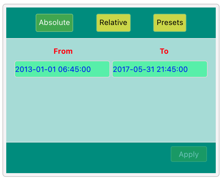
For example, see the Time Range Picker theme configuration below:
1 2 3 4 5 6 7 8 9 10 11 | |
The color theme configuration above will render a Time Range Picker like this:
Time Slider theme configuration
The Time Slider visualization has its own color configuration as shown here.
Color Support
The following table shows the current support for different color options across widgets.
| Widget Name | Color by Category | Color by Metric | Color by Range | Assigned colors to attribute values |
|---|---|---|---|---|
| Area Line | Yes | No | No | Yes |
| Group Legend | Yes | No | No | Yes |
| Bars | Yes | Yes | Yes | Yes |
| Bars and Line | Yes - each metric is a category | No | No | Yes |
| Box Plot | Yes | No | No | No |
| Multimetric Area Line | Yes - each metric is a category | No | No | Yes |
| Stacked Bars | Yes - for the subgroup | No | No | Yes |
| Clustered Bars | Yes - for the subgroup | No | No | Yes |
| Multimetric Stacked Bars | Yes - each metric is a category | No | No | Yes |
| Multimetric Cluster Bars | Yes - each metric is a category | No | No | Yes |
| Disk | Yes | Yes | Yes | No |
| Donut | Yes | Yes | Yes | Yes |
| Pie | Yes | Yes | Yes | Yes |
| Trend: Attribute Values | Yes | No | No | Yes |
| Trend: Multimetric | Yes | No | No | Yes |
| Floating Bubble | Yes | No | No | Yes |
| Nested Pie | Yes | No | No | No |
| Radar | Yes | No | No | Yes |
| Scatter Plot (no group) | Yes | Yes | No | N/A |
| Scatter Plot (single group) | Yes | Yes | Yes | Yes |
| Scatter Plot (two groups) | Yes | No | No | Yes |
| Tree | Yes | No | No | No |
| Tree Map | Yes | Yes | Yes | Yes |
| Tree Map 2D | Yes - for the first group | No | No | Yes - for the first group |
| Gauge | Yes | Yes | No | No |
| Histogram | Yes | No | No | No |
| KPI | No | No | Yes | No |
| Network | Yes | Yes | No | Yes |
| Packed Bubbles | Yes | Yes | Yes | Yes |
| Pivot Table V2 | NA | Yes | No | NA |
| Sunburst | Yes | No | No | No |
| Heat Map | No | Yes | Yes | No |
| Vector Map | No | Yes | Yes | No |
| Geo Map (shapes) | No | Yes | Yes | No |
| Geo Map (markers) | No | Yes | Yes | No |
| Word Cloud | Yes | Yes | Yes | No |