Exploring your first dataset
Let's explore the titanic.csv dataset which can be easily downloaded from the chartfactor.com server.
Start your Jupyter Notebook or JupyterLab and create a new .ipynb file. Then, enter the following code in the first cell and run it.
1 2 3 4 | |
You sould see the following:
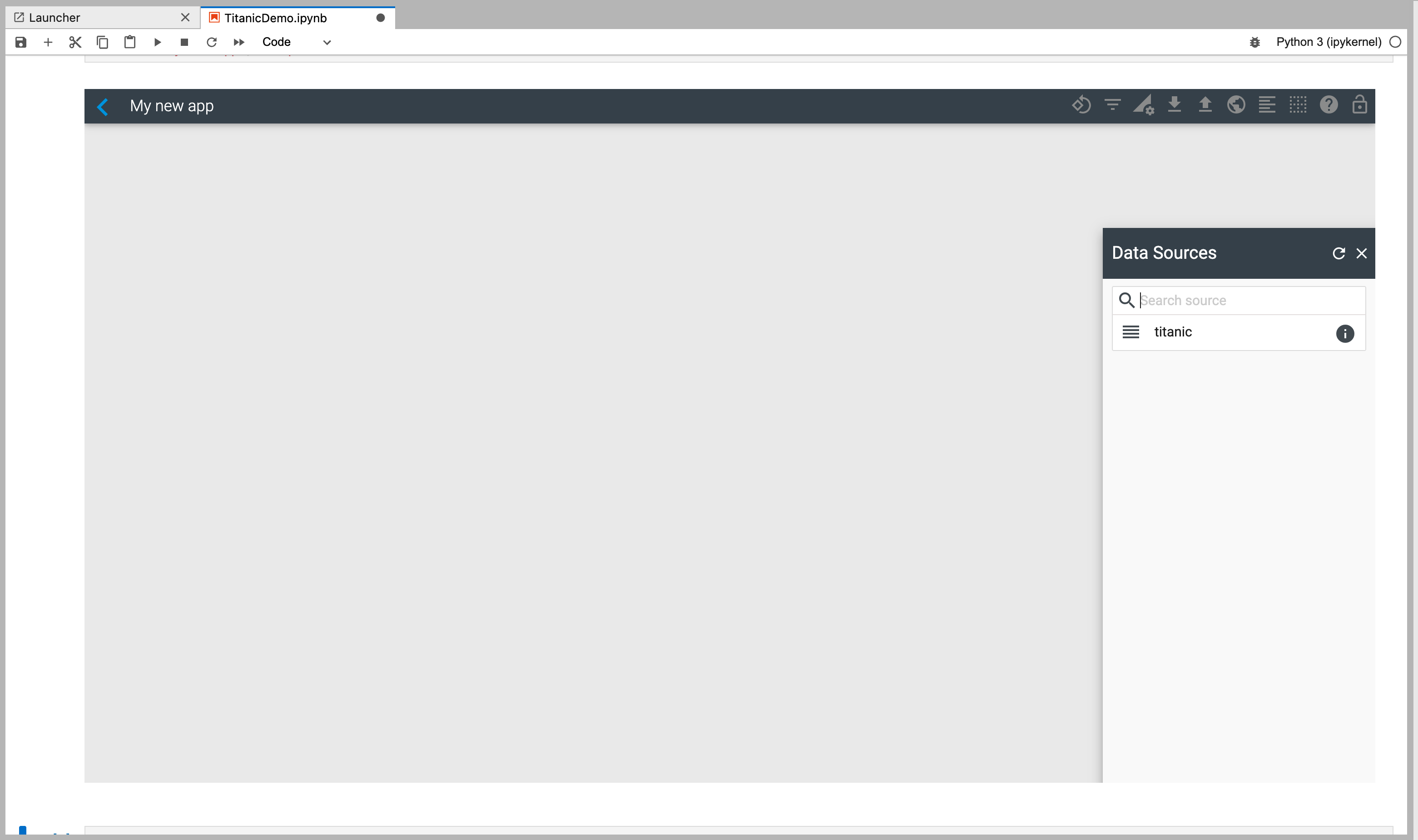
The name of the app on the top right is "My new app" which is the name you passed as a parameter to the cf.studio() function. cf.studio() opens the app with that name if it exists or creates a new one if it doesn't exist.
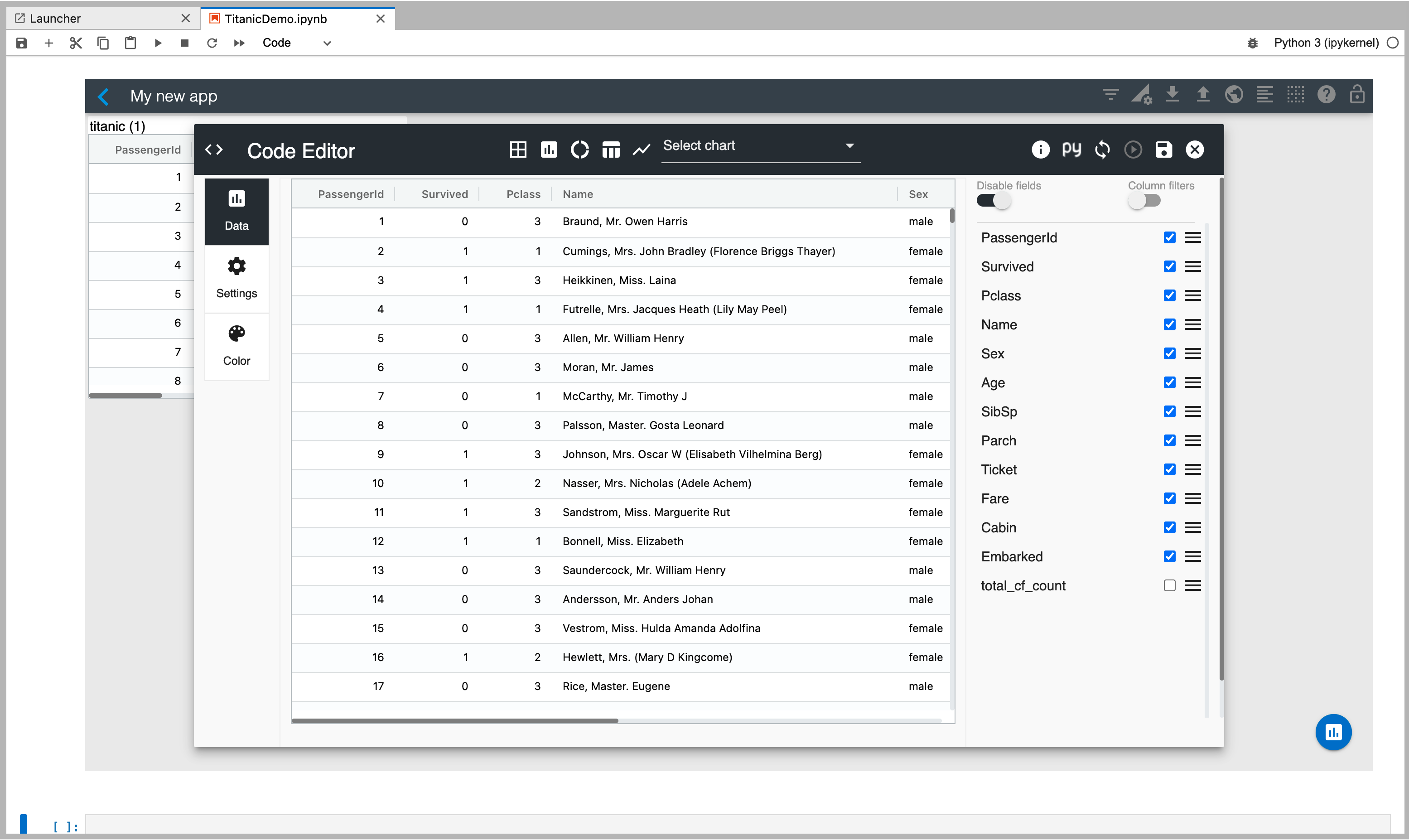
Now, select your titanic dataframe to visualize its data as shown below.
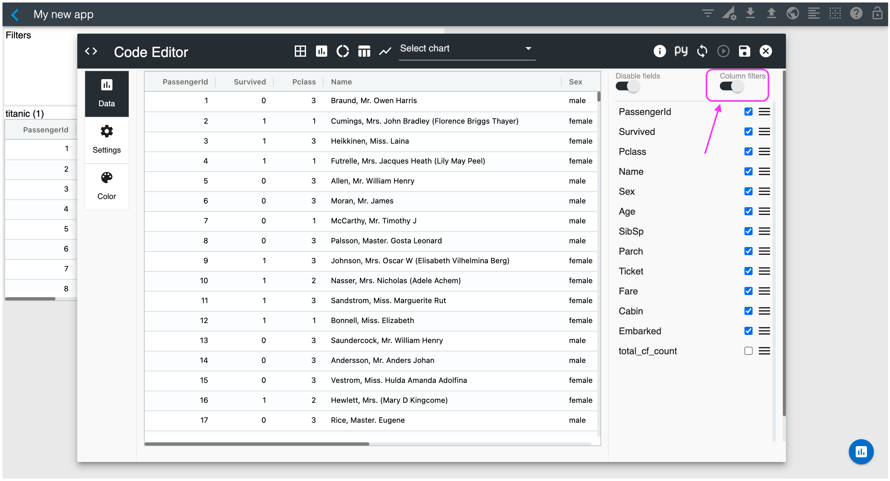
Enable "Column filters" so that you can filter data using the built-in column slicers.
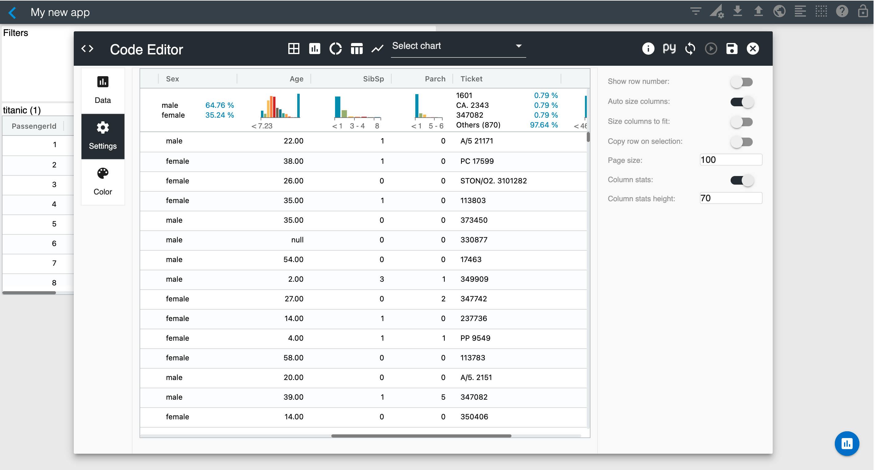
Go to the Settings section and enable "Column stats". This will render column statistics for all columns of your dataframe.
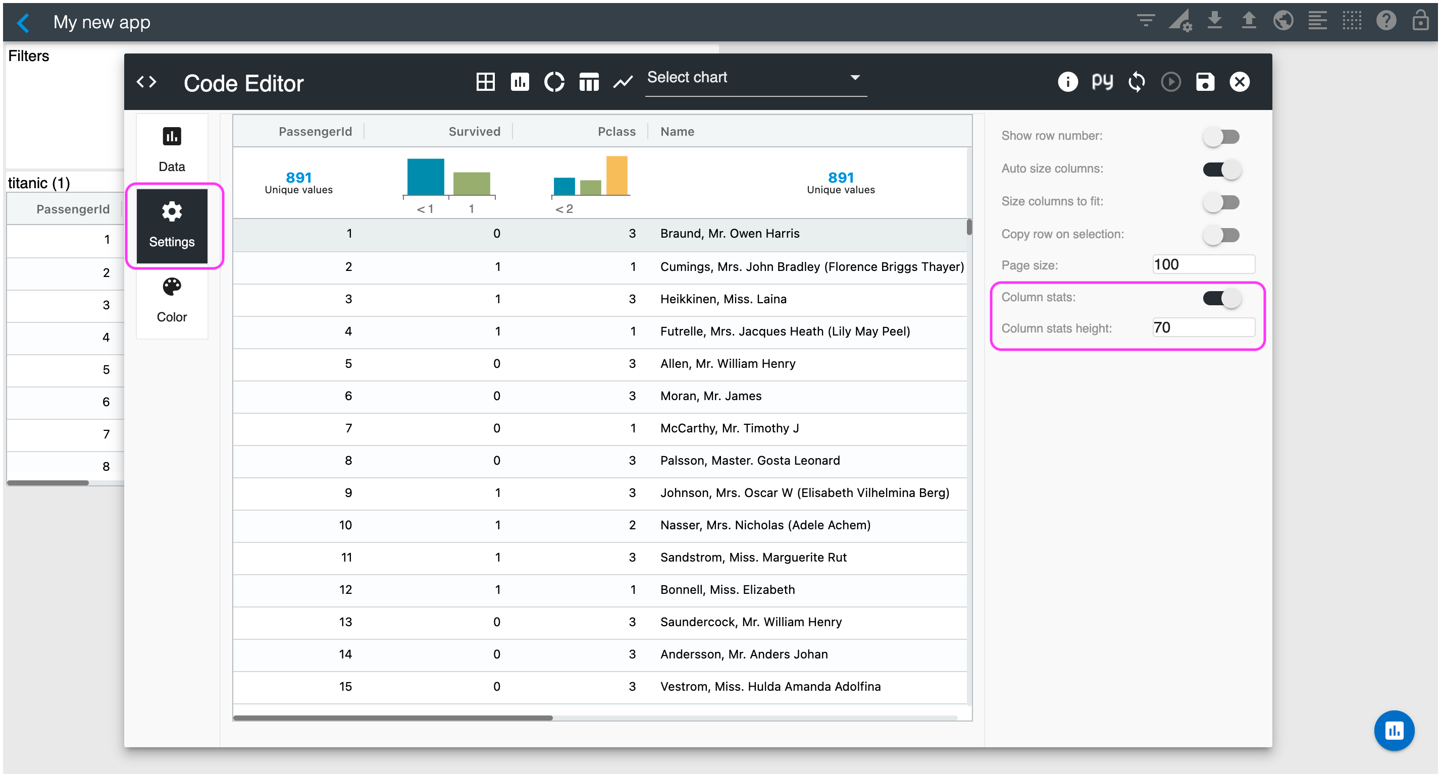
Looking at the column statistics, you have 891 distinct passenger IDs and if you hover on the Survived histogram you will see that 549 passengers did not survive. You can scroll horizontally to see additional column statistics such as sex and age as shown below.
You can save this visualization by selecting the "Save" button on the top right corner of the Editor. Then, you can resize your table in the Studio canvas as needed.
The next section will cover how to add and configure additional visualizations in your Studio canvas.