Group Legend
The Group Legend is suitable to render a common legend for several visualizations that share a common group. ChartFactor allows to define a Group Legend in the following way:
1 2 3 4 5 6 7 8 9 10 11 12 | |
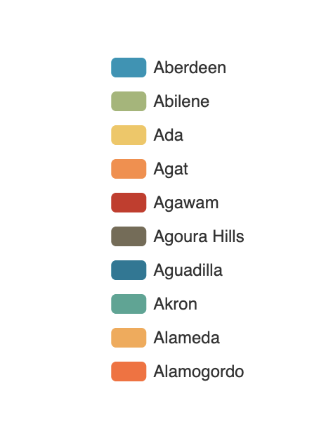
The previous code will render the Group Legend below:
Group Legend configuration
The Group Legend supports multiple settings to change its rendering behavior. The following are the supported settings:
orientation
Defines the legend orientation in the same way you can change a Bars chart orientation. The supported values are horizontal and vertical. The default value is vertical.
charts
Defines a list with the charts that share this legend. When users hover on legend items, the charts in this list highlight that specific item. Remember that this only works if the legend group matches the group of each chart listed. The default is an empty array. Code example: .set("charts", [getId("Bars'), getId("Pie'), ...]). In this example the getId() function simply returns the element of the chart. This function is automatically available in ChartFactor Studio.
options
Here you can define an object to customize the Group Legend chart.
show
Defines if the Group Legend chart is shown or not. It only accepts boolean values. Its default value is true.
verticalPosition
Defines the vertical position. Available values are top, center and bottom. Also, you can set an integer that represents the distance between the top border of the container and the first legend item, or you can set a percentage string value as follow "10%".
horizontalPosition
Defines the horizontal position. Available values are left, center and right. Also, you can set an integer that represents the distance between the left border of the container and the first legend item, or you can set a percentage string value as follow "10%".
icon
Defines the legend icon, availables values are: circle, rect, roundRect, triangle, diamond, pin, arrow. Also you can set an external icon image image://http://www.myhost.com/b.png, or set a Base64 format image image://data:image/gif;base64,R0lGODlhEAAQAM or set a vector path SVG path://M30.9,53.2C16.8,53.2,5.3,41.7,5.3,27.6S16.8,2,30.9. The default value is roundRect.
pageMargin
Defines the distance between page buttons and legend items. It useful when a container is small and the items don't fit, automatically a paging component appears. With this option, you can change the distance from the legend items. Is an integer number.
pageItemMargin
Defines the distance between page buttons and the page info text. It is useful when you have 1000 pages and the info shows 500/1000, this is probably a big text that could overlap with the paging icons. It is an integer number.
pageIcons
Defines the [previous page button, next page button] icons. You can use an external source ["image://http://www.myhost.com/previous.png", "image://http://www.myhost.com/next.png"], or use a Base64 format image [image://data:image/gif;base64,R0lGODl, image://data:image/gif;base64,R0lGODl] or set a vector path SVG ["path://M30.9,53.2C16.8,53.2,5.3,41.7,5.3,27.6S16.8,2,30.9", "path://M30.9,53.2C16.8,53.2,5.3,41.7,5.3,27.6S16.8,2,30.9"]. It is always an array and the default value is ['M0,0L12,-10L12,10z', 'M0,0L-12,-10L-12,10z'].
pagePosition
Defines the paging component position. Available values are start and end. The default value is end.
selectMode
Enables or disables the select action when users click over a legend item. Possible values are: single, multiple, true, and false. The default value is true which is equivalent to multiple.
inactiveColor
Defines the color to fill a inactive item ion the legend. It is useful in clientFilter to change the color of unselected items.The default value is #ccc
iconSize
Defines the width and height of the legend item icon. Is always an array [itemWidth, itemHeight]. The default value is [25, 14].
width
Defines the width of the legend component. Possible values are integers or a percentage value such as "80%". This only applies if the orientation is horizontal. The default value is to be adaptive.
height
Defines the height of the legend component. Possible values are integers or a percentage value such as "80%". This only applies if the orientation is vertical. The default value is to be adaptive.
Code example
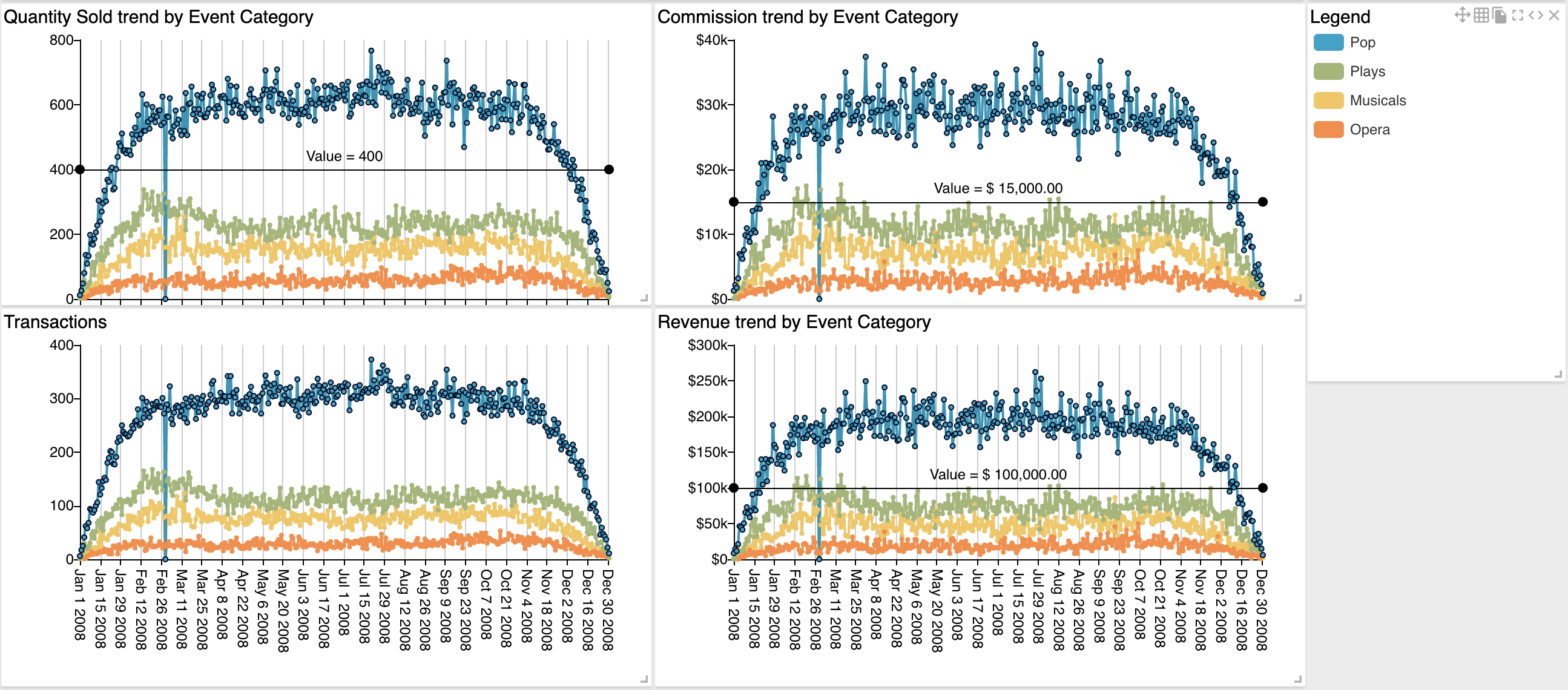
Here is a code example of how to use the Group Legend to highlight four Trend charts that share the same group. In this particular case, the four trends and the legend widget group by the catname.keyword attribute.
1 2 3 4 5 6 7 8 9 10 11 12 13 14 15 16 17 18 19 | |
Group Legend support
Group Legend supports the following visualizations:
| Visualization Name | Supported |
|---|---|
| Area Line | Yes |
| Bars (one group) | Yes |
| Donut | Yes |
| Floating Bubble | Yes |
| Pie | Yes |
| Scatter Plot | Yes |
| Tree Map | Yes |
| Trend: Attribute Values | Yes |