Interactivity
If you completed the Visualizing your data section, you should now have a dashboard with a few visualizations showing Austin 311 Calls data. My dashboard currently looks like this:
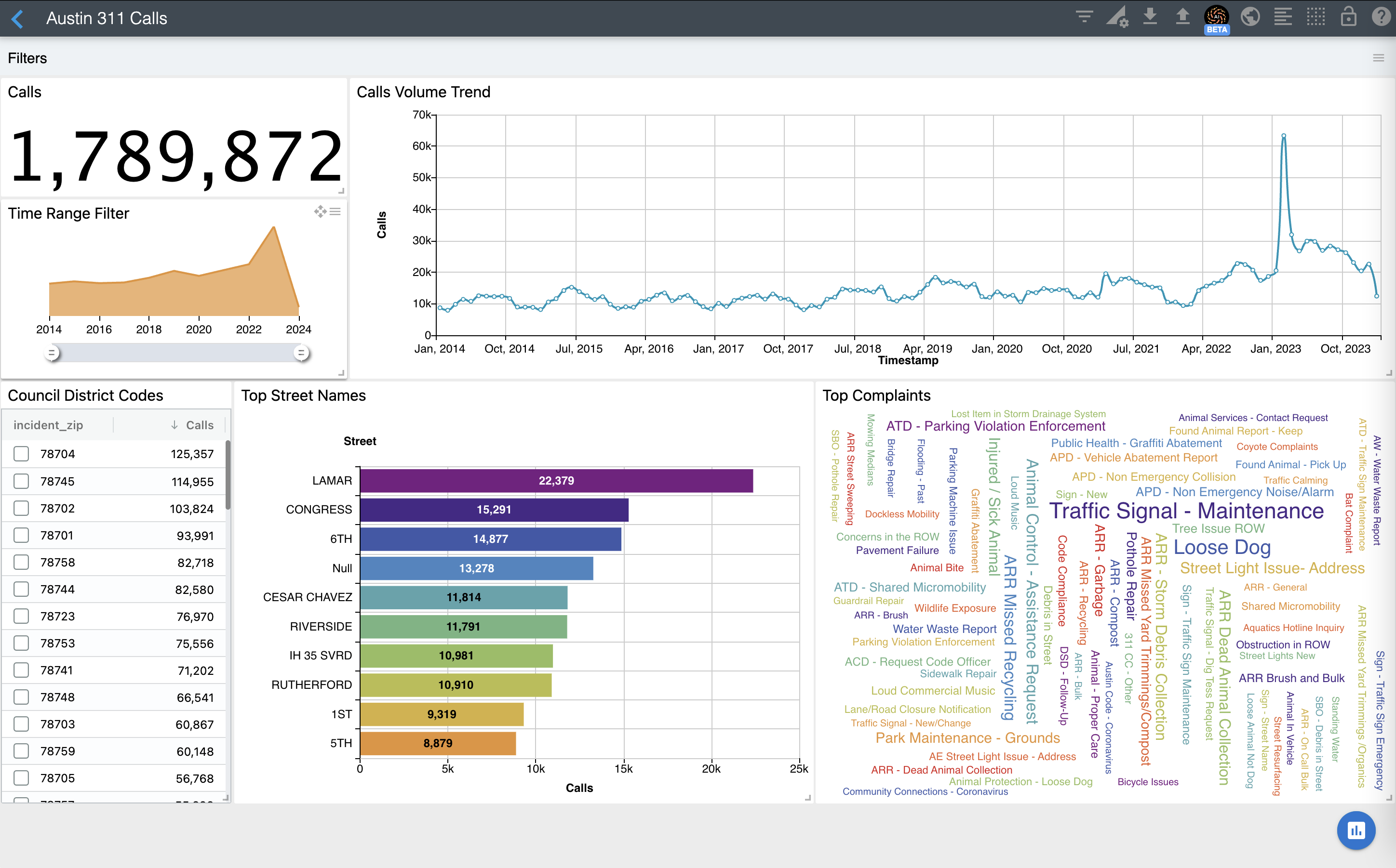
ChartFactor Studio automatically includes interactivity to your application. This is a component we call Interaction Manager and it is represented by the Filters section at the top of the dashboard. It will render the current filters that are applied to the visualizations.
To add filters, simply click on visualizations shapes. For example, let's select LAMAR street on the Top Streets bar chart. You should see your dashboard similar to this one:
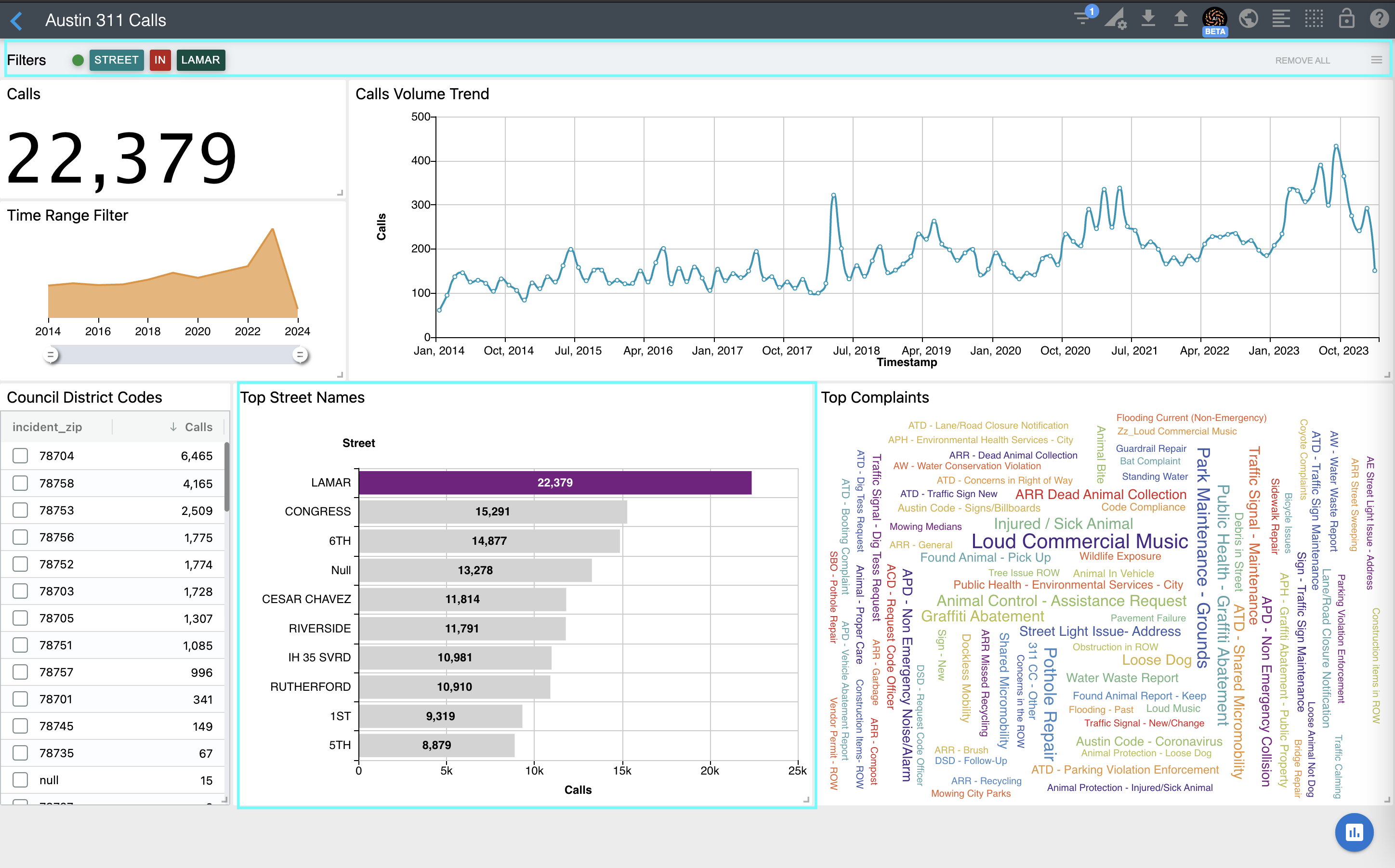
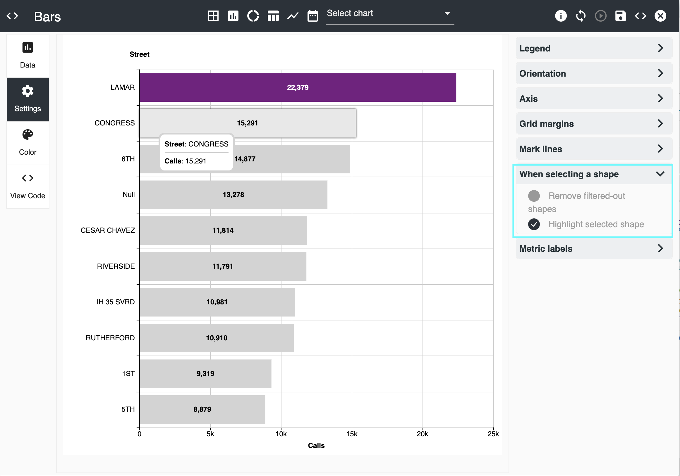
Notice that the LAMAR street bar is highlighted while the other ones remain. This is because we previously selected this behavior in the Settings section of the bar chart. Another option when selecting a shape is to simply filter-out the others:
Many charts such as Bars and Heat Maps support filtering and zooming in. The video below shows filtering and zooming in for the Heat Map.
You can also edit the Interaction Manager widget to add drill hierarchies and filter rules. When opening the editor, you will see a template with commented-out code to help you get started. Please refer to the Interaction Manager documentation for additional details, specifically the Filter Rules, Drill Hierarchy, and Skins section if you'd like to change its look and feel.
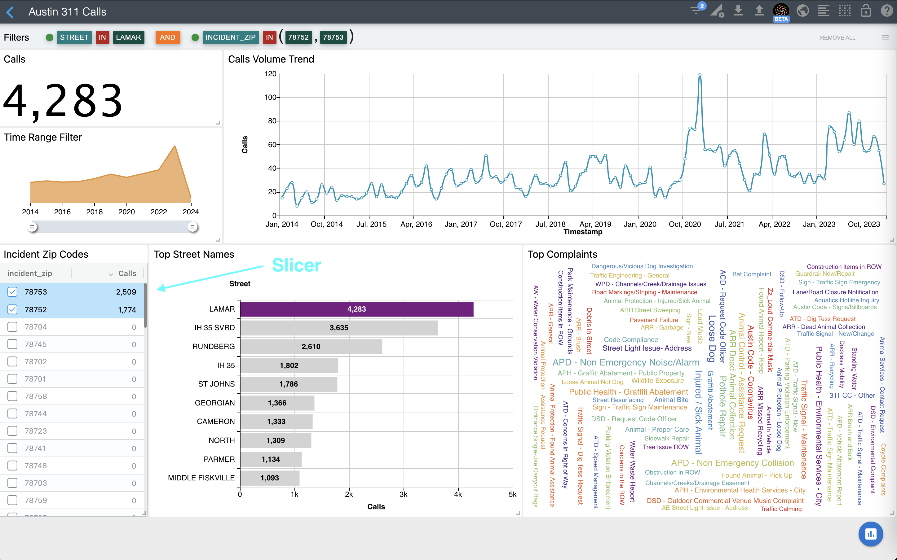
Slicing data
Now, let's slice the data by Incident Zip Codes 78752 and 78753. We will do this by using the Slicer component. Add it as any other visualization and configure its group-by attribute and metric using the chart editor. Once configured, you can select the Incident Zip Codes as shown below. You can also use the Command key (Mac) or Ctrl key (Windows) and the Shift key to select a block of rows at the same time.
Refer to the Slicer documentation for detailed information about this component.