Filtering interactively
This section assumes you already covered the Visualizing data section. In this section, we will you how to add and remove filters interactively.
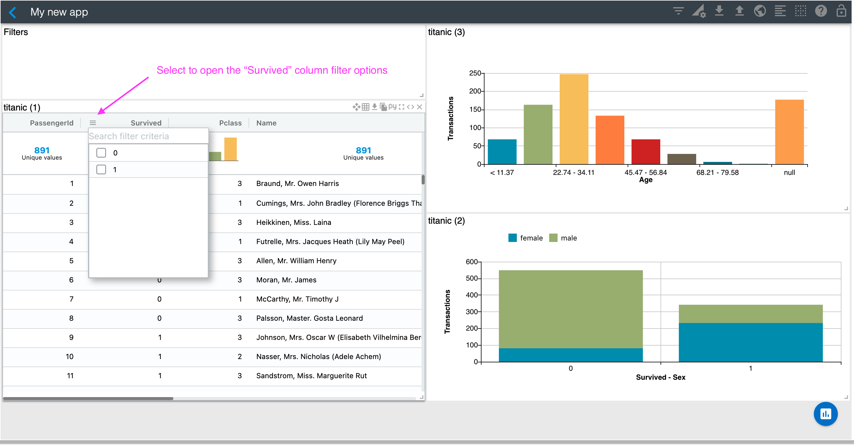
Let's assume you'd like to visualize only records of people who did not survive. There are different ways to do this. Since you enabled the table's column filters in the previous section, you could select Survived = 0 using the Survived column filter as sown below.
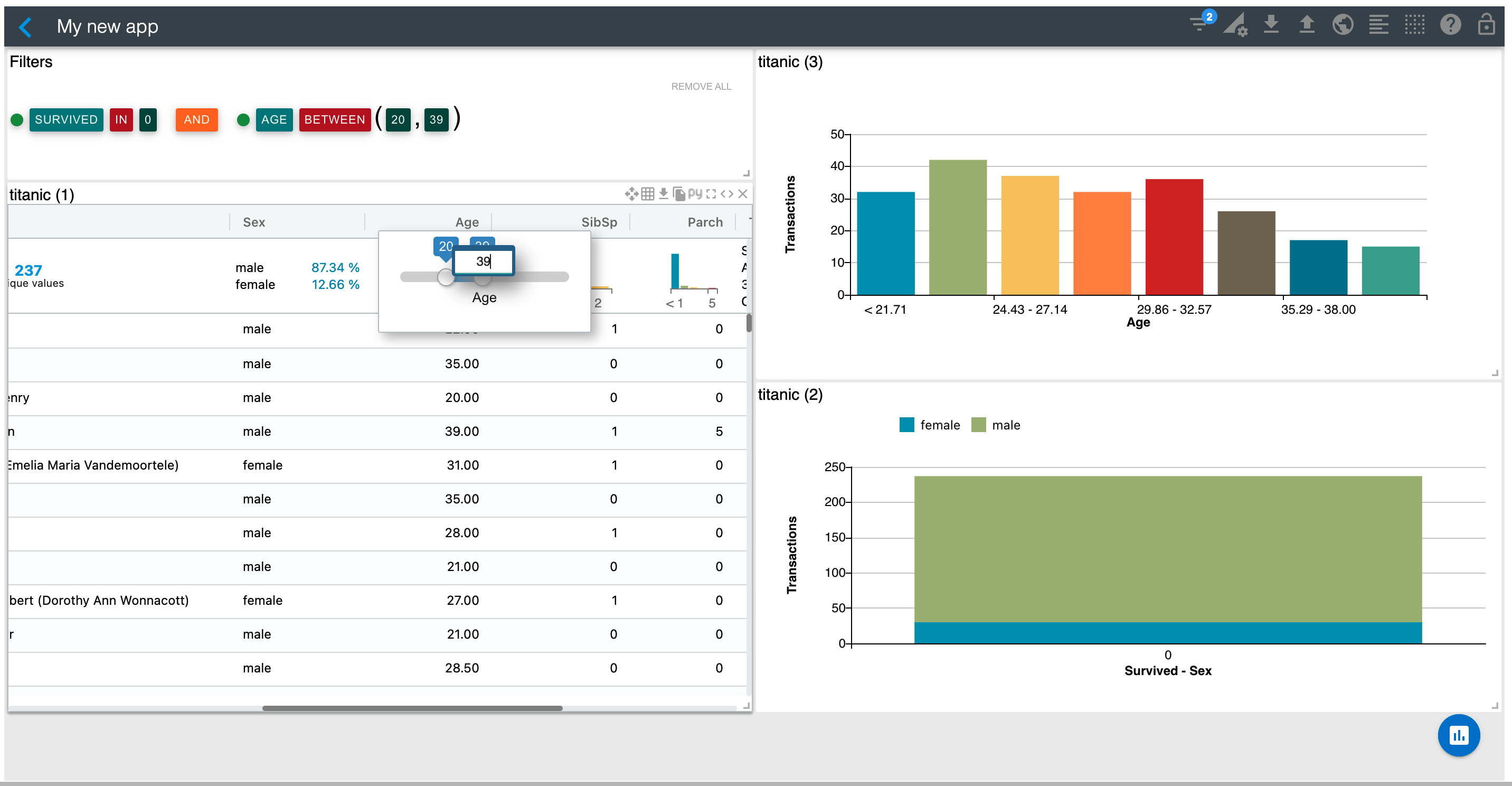
You could do the same with the Age column and use its range filter to visualize only records of passengers of age 20 to 39. You can double click on the range filter handles if you'd like to type the range numbers instead of using the slider. See below.
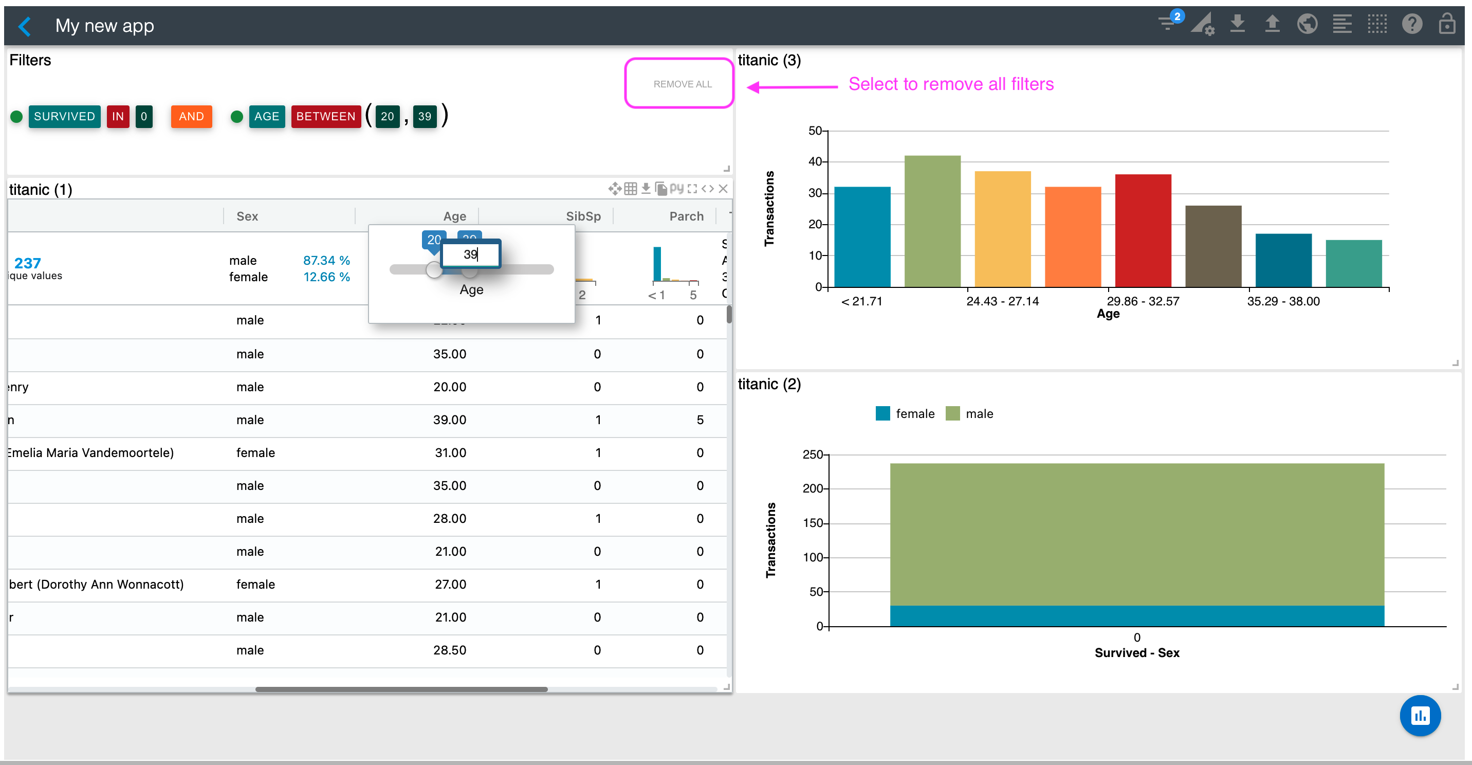
Let's now remove all filters by selecting the "Remove All" link on the Filters section.
You can also add filters by clickin on the visualizations. For example, let's assume you'd like to filter by female passengers who did not survived. To do that, click on the blue area of the bar that corresponds to Survived = 0. You should now have a filtered application as shown below.

You could also click on the histogram bars to filter by one of its age ranges. Or, you can remove specific filters or switch their operation from IN to NOT IN by simply clicking on the filter and operation respectively in the "Filters" widget.
In the next section, we'll show you how you can render any of these charts on a separate Notebook cell.