Raw Data Table
The Raw Data Table (RDT) is an ag-grid based table used to display raw, non aggregated data. Its configuration and options differ from the rest of the visuals.
Rendering the RDT
The RDT uses .field() instead of .groupby() and it doesn’t use .metrics()
1 2 3 4 5 6 7 8 9 10 11 12 | |
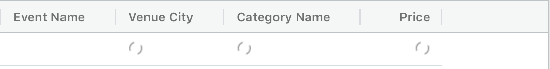
This will render an RDT like this:
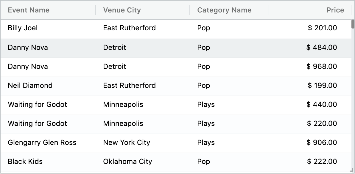
The first thing to notice here is the fields variable, which is an array of Field objects that exist specifically for the RDT. Each one of these objects has the name of the field and any label we want to display as column header for that field. That’s the main purpose of the Field object.
You can also define field labels using Custom Metadata. See the Custom Metadata section to learn how to define field labels.
If we don’t want to use the Field object, you can just pass an array of strings representing the field names into the .fields() function like this:
1 2 3 4 5 6 | |
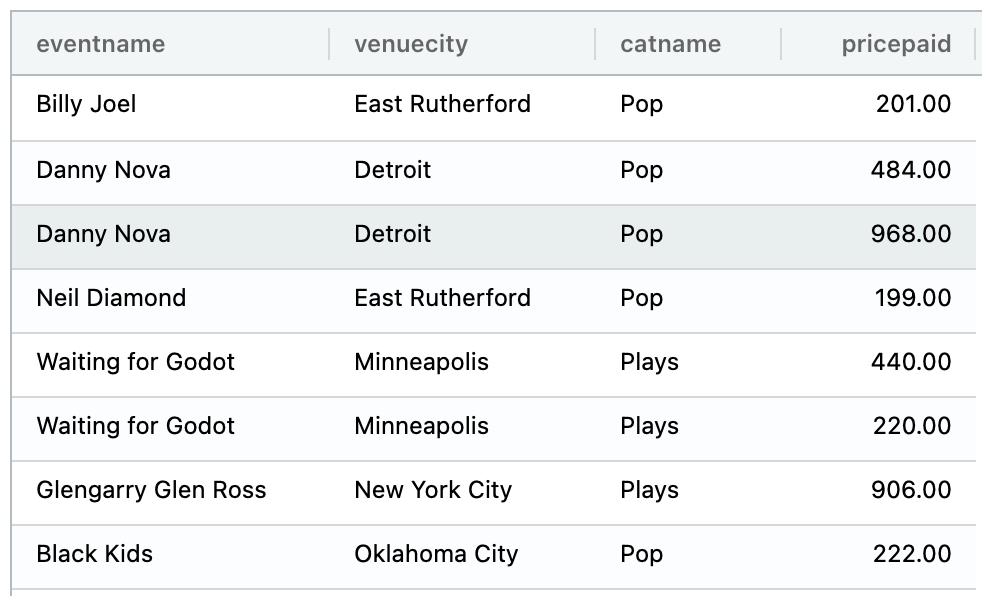
Notice how the column headers changed now to use the field names instead of the field labels.
Get all fields and exclude some
This is a very common case. Bring all fields and exclude a few. To do this we use the .fields() function without parameters, it will understand that if no fields were specified it will retrieve all of them.
The in order to exclude some of those fields, we’ll use the .exclude() function passing the fields we don’t want to query. The parameters will be the names of those fields:
1 2 3 4 5 6 7 | |
Sorting by columns
The RDT will allow to sort the data by clicking over any column header. It will loop through descending, ascending and alphabetically which is the default.
Setting the sort via AQL
Sort order can be specified via AQL in this way:
1 2 3 4 5 | |
The above will sort by catname ascending first, then eventname descending and finally pricepaid for Shows ascending:
Sorted columns will have the up arrow indicator when is ascending and the down arrow when is descending. Also the sort order in the same way that was specified in the aql.
Tip
When playing data with the Time Slider data player, sort your RDT by the time field used in the Time Slider in descending order so that you can see the new data arriving at the top.
RDT options
The options for the RDT must be specified BEFORE the visualization is rendered, meaning before invoking the .execute() method.
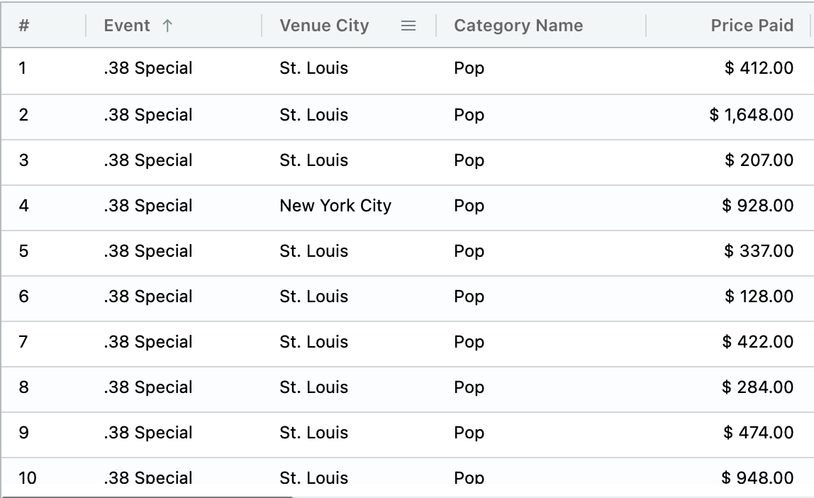
Row number
This option displays row numbers on the first column. See the example below.
1 2 3 4 5 6 7 | |
Row loading indicator
The loading indicator is displayed when the RDT is waiting for data:
This indicator is not provided within ChartFactor, instead ChartFactor tries to load it from ${app_root}/../img/loading.gif by default. If we have a different structure like ${app_root}/assests/images/loader.gif, then we need to tell ChartFactor the right path as shown below:
1 | |
Or, if we don’t have a gif and we want to pull it from an external resource, or use a font like Google fonts or Awesome fonts that provider spinners as DOM elements classes, we can specify the html element that will render the spinner instead:
1 | |
or
1 | |
Custom cell format for images and URLs
The custom cell format allows you to format URL values as links or images.
For example, if you have a field that contains a URL, you can format it as a clickable link that will open the URL in a new tab:
1 2 3 | |
If you have a field that contains a URL of an image, you can format it as an image and the RDT will render the image instead of the URL:
1 2 3 | |
Formatting cells with your own custom format
The main purpouse of the RDT is to show raw data as it is stored in the data engine. However, we can still format the values and apply styles to them for a better visualization. The formatting is applied then at render time with the option cellFormat.
1 2 3 4 5 6 | |
In the object we have two properties, the first one is fields. This property accept the following values:
1 2 3 4 5 6 7 8 | |
The property format, must be a function that takes three parameters: the field name, the value of the field for the corresponding cell and the params object. The last one is an ag-grid custom object that can be used to access custom properties like api, columnApi or the entire row node. More details about params here.
Internally the result of this function will be applied to the cellRenderer property for the definition of each cell in each column, if this one matches the fields property criteria.
The function must return an object with any (or both) of this two properties depending on what we need: value and style. The first one is the new value for the cell and the second one is an object with css properties.
For example, let's say that for a given field we want to display them in different colors depending on their values and the row data:
1 2 3 4 5 6 7 8 9 10 11 12 13 14 15 16 17 18 19 | |
The next example will transform the value depending on the field:
1 2 3 4 5 6 7 8 9 10 11 12 13 14 15 16 17 18 19 20 | |
Group columns
Columns can be grouped like this:
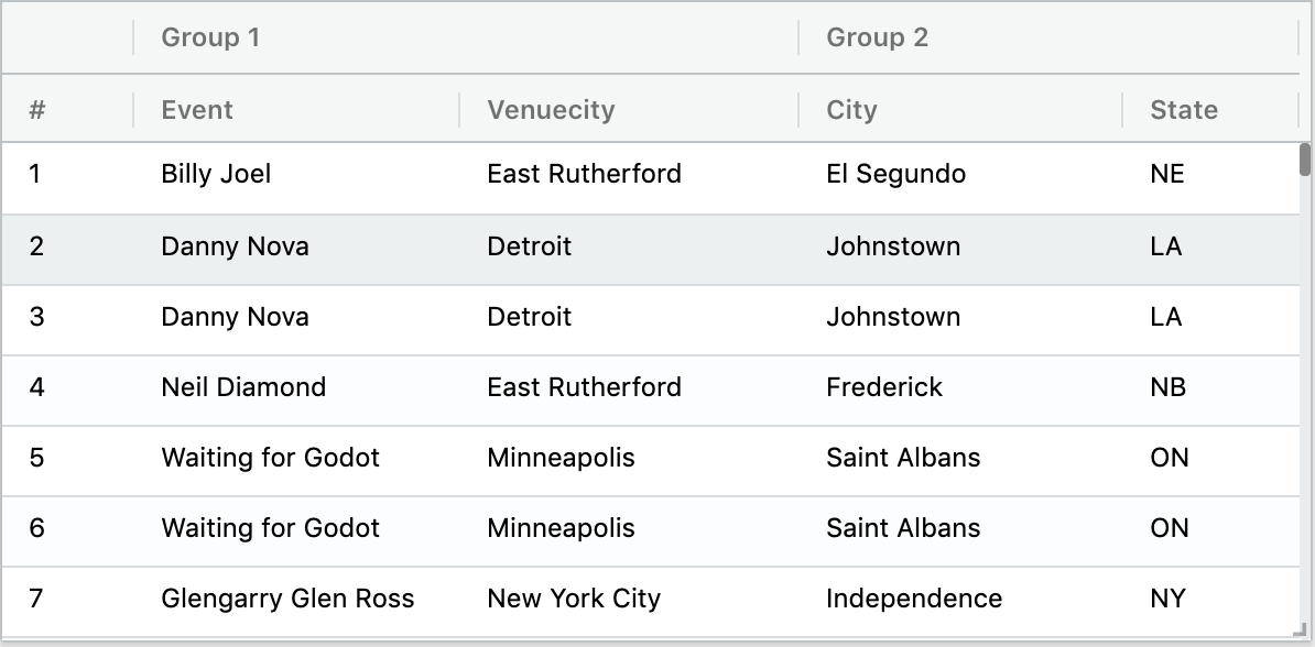
We can define groups and the fields to include under a specific group in two ways:
The first one can be used when we use .fields() without specifiying field names and we want to group some of them:
1 2 3 4 5 6 7 8 | |
The second way is by telling the Field object what group to use:
1 2 3 4 5 6 7 8 9 10 11 | |
Your group header can be an image or formatted text instead of plain text. To accomplish that, pass HTML instead of just text to the .group() function. In our previous example, grp3 consists of html that includes div and img tags. For that specific group, the table will render the group header with the specified image icon as shown below.
Size columns to fit
This option will make the columns to scale (growing or shrinking) to fit the available width. This is useful when adding more data (new fields for example) after the table has been rendered for the first time. It can be set at execution time or after the table was rendered.
1 | |
Auto size columns
This option will make all columns to adjust to the text width. It can be considered as the opposite to sizeColumsToFit, and this means that when one of them is applied will override the effect of the other one.
1 | |
Columns width
The columnWidth property allows to manually set the ideal width for every grid column. This property won't have any effect if this property sizeColumnsToFit is also set.
1 2 3 4 5 6 7 | |
Column sortable
The sortable property allows to declaratively enable or disable the sort behaviour for specific columns. The default value for all columns is true meaning that sorting is enabled for all columns unless their data type does not support it (e.g. Geopoint data type). In the example below, we specify that the "company" column should not allow sorting.
1 2 3 4 | |
Export content to CSV
The RDT allows to export its content into a csv file. We can specify what columns to use and the name of the file:
1 2 3 4 5 6 7 8 9 10 | |
The use of args, as well as any of the two parameters are optional. By default all columns will be exported, and the file name will be export.csv.
Limits and Page Size
Raw data tables use infinite scrolling to show data as naturally as possible, but behind the scenes, it uses pages of 100 rows by default. This page size can be changed with the limit function as we can see bellow:
1 | |
Limits under 100 are not allowed. This ensures a page size big enough to be displayed in the view port of the Raw Data Table.
Ag-grid custom options
Since the RDT is based on ag-grid, we can specify custom configurations directly to the grid options. For the inner working of the RDT there are a few options and events that cannot be overwritten. These are the following:
1 2 3 4 5 6 7 8 9 10 11 | |
Any other option supported by ag-grid can be specified through the customOpts property to provide more flexibility when applying custom styles for example:
1 2 3 4 5 6 7 8 9 10 11 12 13 14 15 16 17 18 19 | |
We can also extend the functionality beyond the defaults. For example, the RDT doesn't trigger filter natively since its main purpose is to show the raw data. This can be implemented by hooking to the ag-grid events directly:
1 2 3 4 5 6 7 8 9 10 11 12 13 14 15 | |
For more configurations please refer to the official ag-grid documentation.
Custom columns options
RDT columns can be configured with ag-grid level options through the fields objects. You can learn more about these options here. This adds more flexibility in cases when we need to modify behaviour for a given column that is not allowed directly through the aql.
In Chartfactor the properties for each column can be configured using the fromJSON() function like the example bellow:
1 2 3 4 5 6 7 8 9 10 11 12 13 14 15 16 17 18 19 20 21 22 23 24 25 26 27 28 29 30 31 32 33 34 35 36 37 38 | |
IMPORTANT: Note that the property cellRenderer is defined for event_name and category. If a function is defined to format the cells with the set('cellFormat', formatter) method (See formatting cells), in this case the cell rendering for the two fields will be driven by the myCellRenderer function an not by the cellFormat configuration.
Copy on selection
This feature allows users to highlight cells like in Excel and press Cmd + c (macOS) or Ctrl + c (Windows) to copy the selection. The values are then copied to the clipboard.
By default, each column uses a tab separator (\t) and each row uses a newline separator (\n), but these can be customized in the configuration.
There are two ways to use this configuration:
Simple mode - Just enable or disable the feature:
1 | |
Advanced mode - Customize the separators:
1 2 3 4 5 | |
Or use a comma separator for columns (CSV format):
1 2 3 4 5 | |
Filter on selection
This feature allows users to highlight cells, like in Excel, and press Cmd + i (macOS) or Ctrl + i (Windows) to automatically create filters from the selected values.
The feature is disabled by default. To enable it, use the following configuration:
1 | |
Supported field types
Filters can be generated only from fields of type:
- ATTRIBUTE
- INTEGER
The generated filters will use the IN operator.
Tree Data Table
Warning
Tree Data Table is an experimental feature. Its documentation and configuration properties may change within minor releases.
The ChartFactor Tree Data Table renders a tree with expandable/collapsible nodes. Example below.
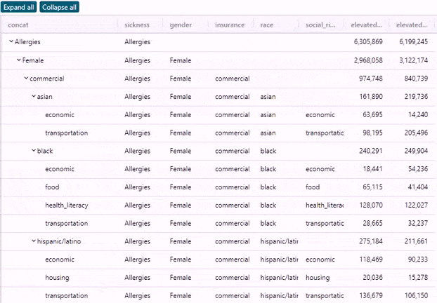
It supports infinite scrolling plus expandable and collapsible functionality while maintaining at the most two pages of data in the browser. This means that it supports theoretically infinite amounts of data. Expanding a large node (e.g. 100k rows) will not crash the browser.
Note
The Tree Data Table setting is currently supported only for the Elasticsearch data provider.
The data assumption is that the hierarchical columns are concatenated in a single column with the separator of your choice. See the next section for details.
Configuring your Tree Data Table
To configure your Tree Data Table, set the treeConfig property as follows:
1 2 3 4 5 | |
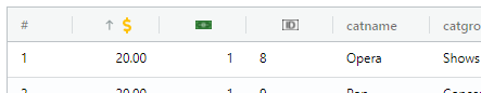
- field: The column that contains the concatenated hierarchical values. An example of concatenated hierarchical values is
Allergies__Female__commercial__asian__. Each value between the__separator is a tree node. In this example, you have 4 hierarchy levels. The last level is a leaf and it also ends with the separator__. This would render like this:
1 2 3 4 | |
- separator: One or more characters that define the separation between the tree nodes
- showHeaderControls: This property is a Boolean (
trueorfalse) and allows you to specify if you want to render the "Expand all" and "Collapse all" buttons at the top.
Note
- The Tree Data Table automatically sorts the column specified in the
fieldproperty ascending. Users can sort the remaining columns as needed. - When applying filters, you should programatically remove the
treeConfigsetting. Otherwise, filtering out parent nodes can leave the tree data table in an inconsistent state.
The Tree Raw Data Table demo provides a working code example.
Suppress movable
This setting allows you to block the movement of specific columns by sending an array of fields and their moving settings. You can also easily block the movement of all columns by setting suppressMovable to true.
1 2 3 4 5 6 7 8 9 | |
Column pinning
This setting allows you to specify what columns are pinned and their pinning position, either left or right. Example:
1 2 3 | |
Column filters
This option allows you to provide column filtering for table fields. To enable column filters, use the columnFilters setting and provide an array of objects where each object includes the field name and optionally the component name. Example:
1 2 3 4 5 6 7 8 9 10 11 12 13 | |
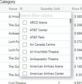
If you don't specify a component name, the Chartfactor Toolkit uses its out-of-the-box components depending on the field type:
- The
slicerfilter component renders for ATTRIBUTE and INTEGER field types. Refer to the Slicer for a full description of its capabilites and settings. - The
rangefilter component renders for NUMBER, MONEY, PERCENT field types. Refer to the Range Filter for a full description of its capabilites. - The
datePickerfilter component renders for TIME field types. Refer to the Time Range Picker for a full description of its capabilities. Note that you can change the granularity of the TIME attribute by using the props option to specify the "func" value as shown below:
1 2 3 | |
Column Filter object properties
- field: The name of the field to apply column filters
- component: The name of the filter component. Out-of-the-box, available components are:
slicerandrange - customClass: The class to use in the column filter. Useful when you provide your own custom component. See the Custom component section for more details.
- staticFilterFields: An array of strings specifying fields that should be considered as static filters when loading the column filter component
- props: With this property you can pass settings to a column filter component. For example, for the
slicercolumn filter component, you could set theselectModeassingle. In addition, theslicercolumn filter component supports thelimitsetting to limit the available values. However, it does not support thenoMergesetting as it internally uses client filters.- width: Inside the props object, you can specify the width of the column filter component. This is useful when the column filter content is too big and you want to use a bigger width to display the content. Allowed values are integers. The default value is
200which means 200px.
- width: Inside the props object, you can specify the width of the column filter component. This is useful when the column filter content is too big and you want to use a bigger width to display the content. Allowed values are integers. The default value is
Note
- You need to add the Interaction Manager component to your application to enable column filtering
- Field names in Elasticsearch may include the
.keywordsuffix. Please check the index field definition and add this suffix to your field name if needed.
Custom component
If you want to implement your own filter component you just need to provide the name of the component and the component class:
1 2 3 | |
The component you provide should follow the ag-grid filter component structure. Additionally, the ChartFactor Toolkit includes the following information in the init method params:
- The provider of the RDT:
params.colDef.filterProvider - The source of the RDT:
params.colDef.filterSource - The field to apply the filter:
params.colDef.fieldName - The props for the column filter component:
params.colDef.fcProps - The element ID for the column filter component:
params.colDef.columnFilterId. It is important to use this element ID for your column filter visualization (e.g..element(params.colDef.columnFilterId)) for the Raw Data Table'sgetColumnFilterId()function to work properly. - The static filters that are already in the RDT:
params.colDef.staticFilters. This is so that you can apply the same static filters to your column filter component. - An array of strings with the fields that should be considered as static filters:
params.colDef.staticFilterFields. You can, for example, obtain the Interaction Manager current filters and apply them to your column filter component if they are specified in this property.
You can use these additional properties to create your own HTML and visualizations to include the column filters in the Interaction Manager. Example below.
1 2 3 4 5 6 7 8 9 10 11 12 13 14 15 16 17 18 19 20 21 22 23 24 25 26 27 | |
For more information about the ag-grid filter component structure check this AG Grid Filter Components article. You can also check the Raw Data Table - Custom Column filter demo.
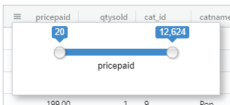
Column totals
This configuration allows you to show a row sticky to the bottom containing the aggregation of specific columns. The possible aggregation functions are the ones supported by your specific data provider (e.g. sum, avg, min, max, unique, unique_approx). Example below:
1 2 3 4 | |
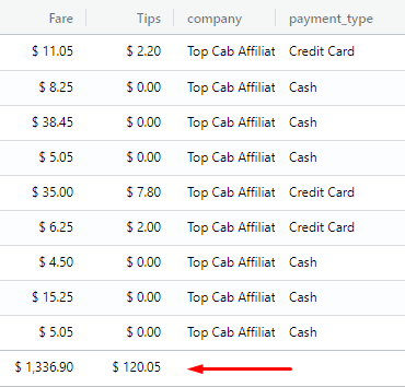
Please note the following:
* The columnTotals configuration only supports numeric field types. They are INTEGER, NUMBER, MONEY, PERCENT.
* Applying a filter to the raw data table will also recalculate its column totals
Header tooltips
This option allows you to define tooltips for specific column headers. You can provide a string with the text of the tooltip or a string with an HTML structure. Example bellow:
1 2 3 4 | |
Header tooltips delay
In order to configure the time delays to show and hide the tooltips, you can use the tooltipShowDelay and tooltipHideDelay settings assigning a numeric value in milliseconds. The default value for each of these settings is 1000 milliseconds. Example below:
1 2 | |
Header icons
This option allows you to render an icon for a column header instead of its field label. You can use Font Awesome and Google Material icons but it's also possible to use custom icons in formats like a URL, a Base64 encoded image, a PNG, SVG and other image formats.
To use Font Awesome or Google Material icons you need to have one of the following fonts installed in your project:
- Font Awesome
- Google Material icons (Filled icons)
Header icon properties
- Key: The key of each object is the name of the field in which you are going to use the icon: example:
pricepaid: {...}, - align: The raw data table uses css
flexto align the header elements of each column - size: This is a css size. If you are using a Font Awesome or Google Material icon the size means the
font-sizeof the icon. If you are using a custom icon the size means the width of the provided source (src) - color: The color works just for the Font Awesome or Google Material icons and you can use a css color format. Example:
#f44336,rgb(244, 67, 54), etc. - tooltip: A single text that shows when you hover a column
- icon: This is an object to specify the icon to render in the column header. It includes the following properties:
- type: Specifies what kind of icon you want to use. Available values are:
fa- Font Awesome iconmaterial- Google Material iconcustom- Custom icon
- src: This is used when you are using a custom icon and you can use formats like a URL, a Base64 code image, or an PNG, SVG or other image formats
- name: This is used when you are using a font icon like Font awesome or Google material icons
- type: Specifies what kind of icon you want to use. Available values are:
Example:
1 2 3 4 5 6 7 8 9 10 11 12 13 14 15 16 17 18 19 20 21 22 23 | |
Note
The tooltips configured using the headerIcons option have higher priority than the ones configured using the headerTooltips option. For example, if you configure headerTooltips and headerIcons' tooltips for the same column, the Raw Data Table will use the tooltip configured using the headerIcons property.
Column statistics
This option allows you to render statistics for each table column so that users can quickly understand how column data is distributed. The data type and cardinality drives the type of visualization rendered for a specific column statistic. To be efficient, each column statistic is rendered when it is visible depending on the user's horizontal scroll. The remaining column statistics are rendered as users scroll horizontally. Once a column statistic is loaded, no additional queries are made unless the user applies filters.
The column statistics widgets available are:
- Unique counter: This is used for unique INTEGER and ATTRIBUTE field types
- Histogram: This widget is used for INTEGER, NUMBER, MONEY and PERCENT field types
- To specify the number of buckets or bars you can set the
fixedBarsproperty in the widget props
- To specify the number of buckets or bars you can set the
- Slicer: This is used for ATTRIBUTE and INTEGER fields that are non-unique, and for TIME fields
- The default number of rows is
3. This number is configurable through thelimitproperty in the widgets props. Note that the number of rows to display is also limited by the height of the column stats (also configurable). The bigger the height of the statistics column, the more rows it can display. - For TIME fields, the granularity and the format of the datetime is calculated using the min and max of the dates in the column. You can also define the datetime
granularityusing the widget props array as shown in the example below. Time granularity defaulting rules are as follows:- YEAR: More than 25 years
- MONTH: More than 12 months
- DAY: More than 13 days
- HOUR: More than 5 hours
- MINUTE: Less than 5 hours
- The default number of rows is
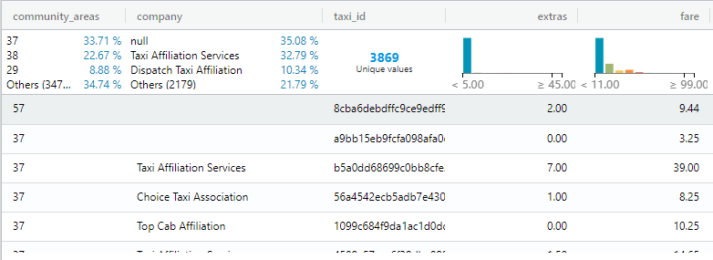
An example of the columnStats setting is below. Notice how the widgetProps property allows you to provide additional configurations to column statistics widgets.
1 2 3 4 5 6 7 8 9 10 11 12 13 14 | |
For INTEGER fields, you can also specify the widget type using the visualization property in the widgetProps object to override the system-derived widget type. The available values are slicer, histogram and kpi. See the example below:
1 2 3 4 5 6 7 8 9 10 11 | |
Note
Rendering column statistics in your raw data table requires you to import the cft-standard-charts.min.js module in order for the histogram chart to be available. See the Chartfactor toolkit installation instructions for more details.
For a working example of a Column Statistics configuration you can check the Raw Data Table - Column Statistics Demo
Custom theme
If you'd like to change the theme and styles of the Raw Data Table you can refer to Table theme configuration
Slow scroll
This configuration allows to smooth the scrolling when the table has a large amount of rows (millions). It essentially captures the scroll event and applies a "physics" factor to the scrolling speed to prevent the grid from scrolling too fast (skipping too many rows) which is the default behavior of the browser/ag-grid with large scroll heights.
1 2 3 4 5 | |
- enabled: (Boolean) Enable/disable the slow scroll. Default is
true. - factor: (Number) The speed factor. The lower the number, the slower the scroll. Default is
0.05. - threshold: (Number) The minimum number of rows to enable the slow scroll. If the table has fewer rows than this threshold, the slow scroll will not be enabled even if
enabledis set totrue. Default is1000000.
RDT functions
Sometimes, you may want to create an application that provides a UI to manage the table header, column filters, or even the table colors. The functions below allow you to do that.
Column stats functions
getColumnStatId(colName)
This functions returns the column stat visualization id for the provided column name, use this to handle the visualization in the column stat
Header functions
updateColumnHeader(headerName, newHeaderName, isGroup, groupPosition = undefined)
This function allows you to change the visible name of the column header in the grid
Params specification:
-
headerName: The name of the column to change. For Elasticsearch, the name can be with or without the
.keywordsuffix. -
newHeaderName: The name to display in the header
-
isGroup: A Boolean to specify if the header name to update is for a group or field (
group: true,field: false) -
groupPosition: If you have more than one group with the same name you can specify what group you want to update by indicating its position, taking into account only groups and not columns. Example: If you have 5 groups and 3 of them have the same name like this:
group_1, group_2, group_3, group_3, group_3and you want to update the secondgroup_3, you need to specify the position 3.
1 | |
refreshHeader()
This function allows you to refresh the header of the Raw Data Table. This is useful when you change manually the ag-grid column definitions
1 | |
Column functions
setSortable(column, sortable)
This function allows you to enable or disable the sort behaviour in a specific column
Params specification:
-
column: A string with the name of the column to hide or show
-
sortable: A boolean, if False the column will not be sortable, if True the column will be sortable
setColumnVisible(column, visible)
This function allows you to hide or show a column without deleting it.
Params specification:
-
column: A string with the name of the column to hide or show
-
visible: A boolean, if False the column will be hidden, if True the column will be showed
showColumnStat(column, show)
This function allows you to hide or show a specific column stat.
Params specification:
-
column: A string with the name of the column to hide or show
-
show: A boolean, if False the column stats will be removed, if True the column will be showed and re-rendered
refreshColumnStats()
This function allows you to refresh the column statistics row if it is enabled. This is useful when you are playing directly with ag-grid functions and you need to refresh column statistics so that they are not left in a loading state.
autosizeColumn(column, ignoreWidthDefinition = false, colDef = undefined)
This function allows you to auto-size the specified column according to its content
Params specification:
-
column: A string with the name of the column to auto-size
-
ignoreWidthDefinition: A boolean, if False the
columnsWidthconfiguration will be ignored, False by default -
colDef: Ag-grid colDef object if you specified this the colDef object will be updated with the property autoResized in True, this is useful when you need to know if a column is auto-sized,
undefinedby default
moveColumnTo(columnName, toIndex, isGroup = false, refreshGrid = true)
Moves the specified column or group to the target index
Params specification:
-
columnName: A string with the name of the column or group to move
-
toIndex: An integer with the target index starting from 0. To specify the index to move a column or group, it is necessary to consider the position of the columns in the table, not the position of the group.
-
isGroup: A boolean to specify if the function is moving a column or a group. By default this parameter is
false -
refreshGrid: A boolean to specify if you want to refresh the table header with the new changes. By default this parameter is
true. Usingfalsein this param is useful in special cases where you need to update the visualization field definitions and not the table. You can update the table later with the functionreCreateColumnDefs()
1 2 3 4 5 | |
reCreateColumnDefs()
Refreshes the column definitions. This is useful in some special cases where you update the visualization field definitions, and then you need to render those changes in the table.
1 | |
joinGroup(column, groupName, position = undefined)
This function inserts the specified field into the specified group. If the group doesn't exist it creates the group.
Params specification:
-
column: A string with the name of the column to insert in the group
-
groupName: A string with the name of the group to join
-
position: An integer with the index within the group. If this parameter is specified the field will take that position within the group.
undefinedby default
1 | |
leaveGroup(column, position = undefined)
This function allow you to remove a field from a group and put it in the main field list
Params specification:
-
column: A string with the name of the column to remove from the group
-
position: An integer with the new position for the field. If this parameter is not specified the field will be placed in front of the group.
1 | |
Column Filter functions
getColumnFilterSupport()
This function allows you to obtain an array with all column filter components available for the supported field types. This is useful when you want to provide your users with a choice of column filter component (e.g. a slicer vs. a range filter for integer values). Example below.
1 | |
getColumnFilterId(field)
This function allows you to get the element ID dynamically assigned to the column filter component of a specific field. This is useful when you want to programatically obtain the Aktive object of this specific component. The parameter is the field name of the column.
1 | |
addColumnFilters(columnFilters, refresh)
This function allows you to enable the column filters for the columns that you specify without reloading the Raw Data Table
Params specification:
-
columnFilters: An array with the field and component for the column filter be added, the prop uses the same structure of the columnFilters definition
-
refresh: This prop receives a Boolean that indicates if you want to refresh the grid header or not (refresh only the header not the entire visualization)
1 2 3 4 5 6 | |
removeColumnFilter(colName, refresh)
This function allows you to remove a specific column filter form the Raw Data Table
Params specification:
-
colName: The name of the column that you want to delete, with or without the
.keywordsuffix -
refresh: This prop receives a Boolean that indicates if you want to refresh the grid header or not (refresh only the header not the entire visualization)
1 | |
Color functions
setColorTheme(cfColor)
This function allows you to change the color theme of the Raw Data Table
Params specification:
- cfColor: The Color object provided for the toolkit
cf.Color()
1 2 3 4 5 6 7 | |
RDT Events
The RDT triggers the following events:
sort-changed
This event fires when the header of the columns are clicked to change the sort. The event received provides information about the sort model used:
1 2 3 4 5 6 7 8 9 | |
rdt:data-updated
This one is triggered when new data is received and is ready to be displayed in the columns. New data refers to the initial data loaded and subsequent request triggered by the RDT infinite scrolling.
1 2 3 4 5 | |
rdt:columnMoved
This event is triggered when a column is moved to a different position. Example:
1 2 3 4 5 | |
rdt:dragStopped
This event is triggered when the column dragging event finishes.
1 2 3 4 5 | |
rdt:col-stats-rendered
This event is triggered when the column statistics cells are rendered in the DOM. It is triggered on the first load of the Raw Data Table and when new columns are coming to the scroll viewport.
1 2 3 4 5 | |
rdt:columnPinned
This event is triggered when a column is pinned by dragging and dropping the column to the left or right.
1 2 3 4 5 | |