Multigroup Trend
Multigroup Trend is a spatial visualization, useful when you want compare a metric over time where each line is defined by the combination of values of multiple attributes. Use the standard Trend chart when you just need to group by time and a single attribute.
Creating a Multigroup Trend
In addition to a time field, you need to specify one or more related attributes. Remember, if you only have one attribute in addition to the time field, you can use the standard Trend chart.
This chart includes safeguards to avoid drawing a large number of lines for the combiation of values of the attributes selected. They are the seriesLimit and the timeUnitsLimit options. The chart will not render if these limits are exceeded. Refer to the Options section to see how to configure these limits.
The use case for this chart is to have slicers start with at least one selection to filter and allow users to add more for comparison.
1 2 3 4 5 6 7 8 9 10 11 12 13 14 15 16 17 18 19 20 21 22 23 24 25 26 27 28 29 30 31 32 | |
Note
It is mandatory that the first row be of the type datetime, and sort is only allowed in the datetime row.
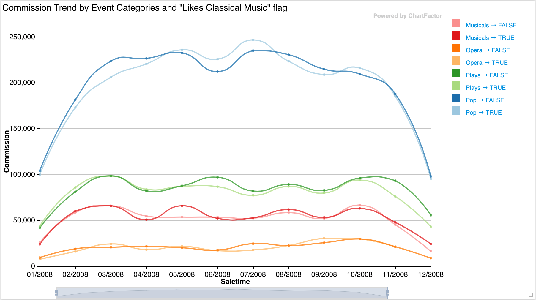
The previous code will render the Trend Chart below:
Options
Show metric function
This setting allows to remove the rendering of the metric operation (e.g. sum, avg, min, max) from the tooltip and axis. Example:
1 | |
Change query limit
This setting allows to limit the results obtained from the data engine at the data provider level. The query is modified to specify this limit. The default is 1000. Example:
1 | |
Change series limit
This setting allows to specify the maximum number of trend lines to render in the visualization. This is a visualization-level limit to prevent overloadling the UI. An error message is displayed if the limit is exceeded. The default is 40.
1 | |
Change time limit
This setting allows to specify the maximum amount of time units that a specific trend line can have. The default is 200.
1 | |