Visualizing your data
Now that you connected to your data, it is time to visualize it. The steps are the same regardless of where your data is stored (e.g. Elasticsearch, BigQuery, Dremio, etc.). In this example, we use the Austin 311 Calls public dataset residing in Google BigQuery.
- Select the main Studio button on the lower right corner of the dashboard to open the Data Provider dialog
- Select the data provider you connected to. In this case, I'll select BigQuery. Refer to Connecting to your data if you have not connected to your data provider yet.
- Navigate to Data Sources within your data provider
- Select the source to visualize. In this example, I navigate to the bigquery-public-data data source folder, select the austin_311 dataset, and then select the 311_serice_requests table.
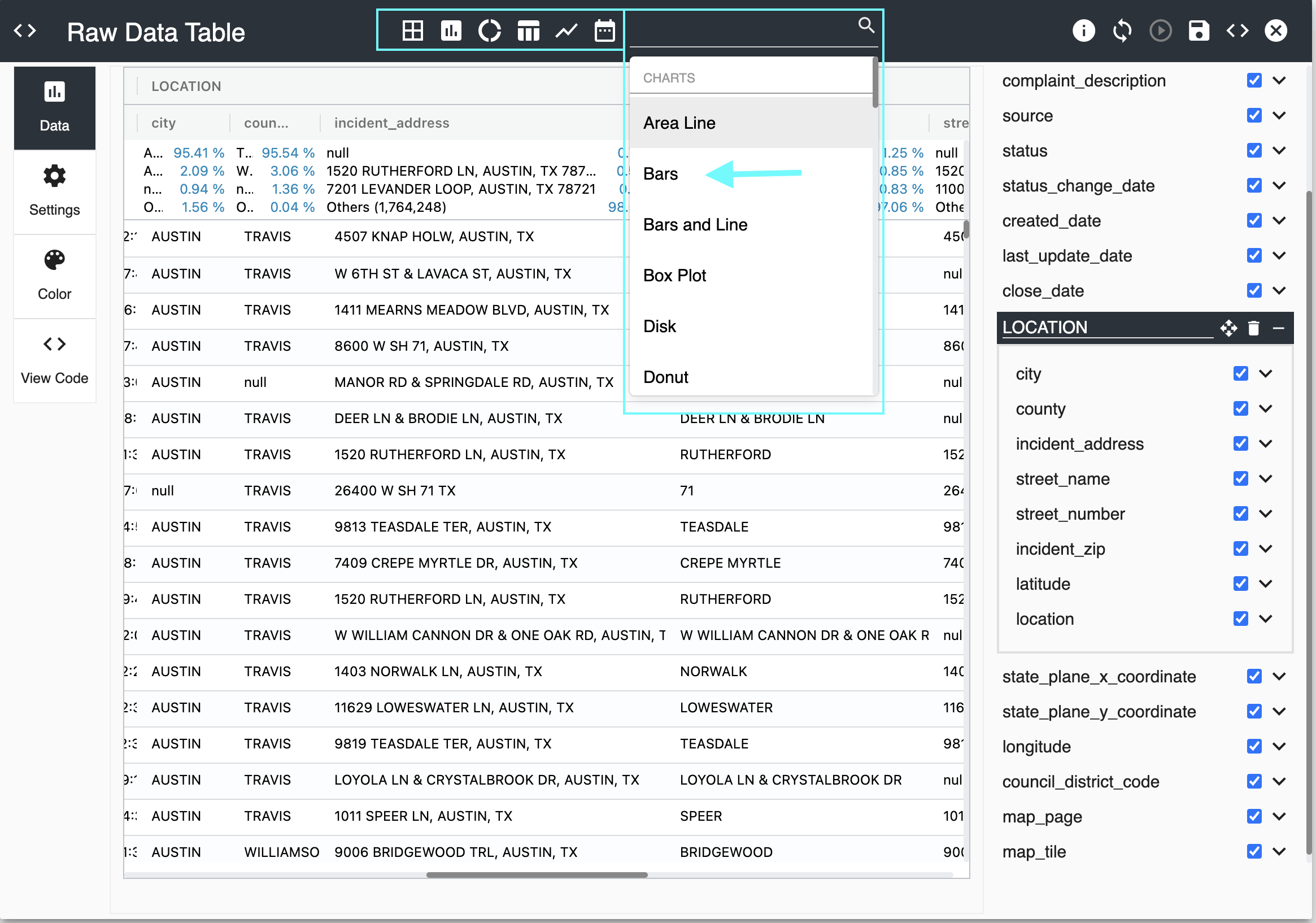
You should see an initial visualization similar to the one below:
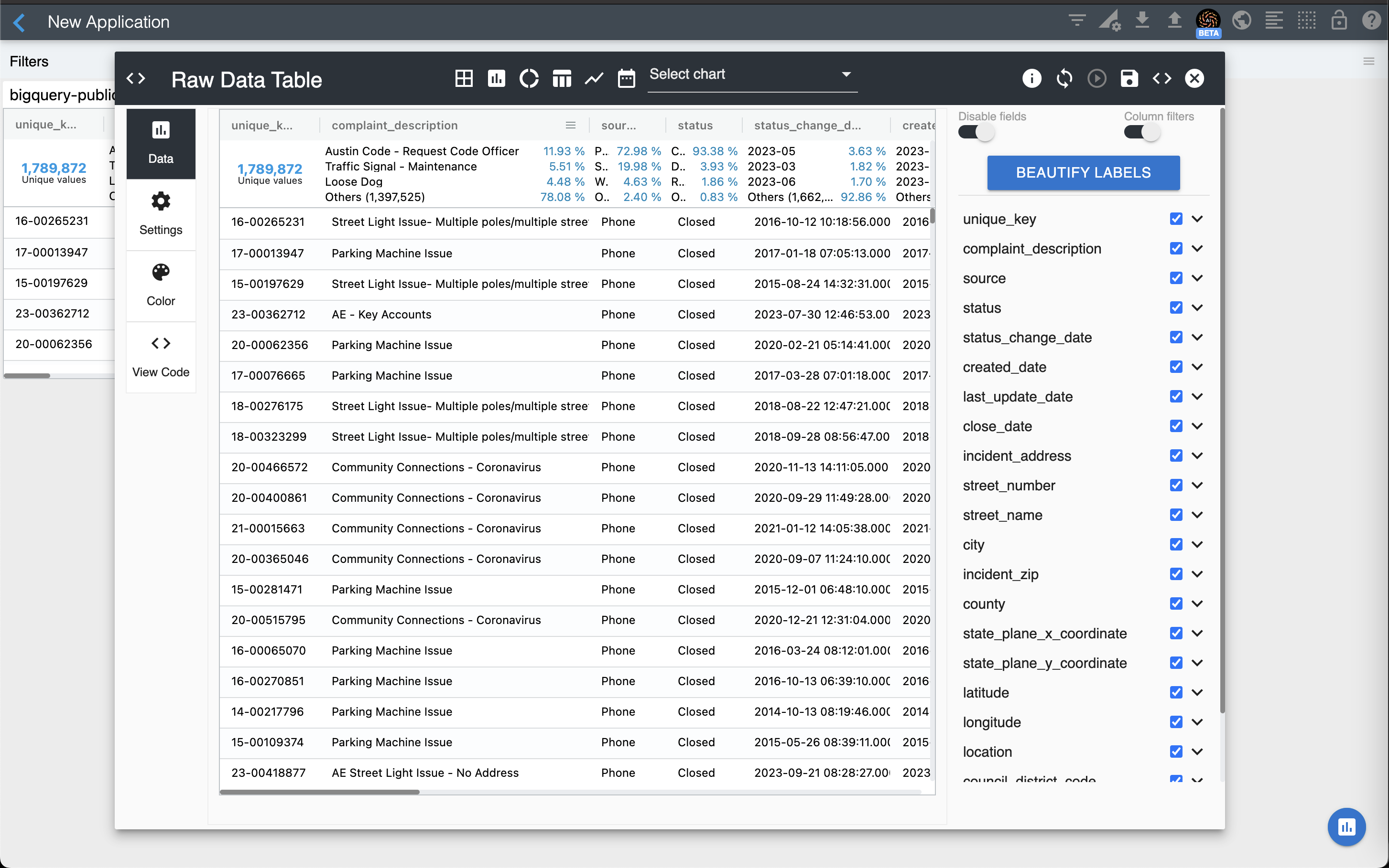
The Raw Data Table above allows you to browse through raw data as it is stored in your data engine and scroll through it infinitely. It also allows you to sort by one or many columns and also filter it by any column value.
From here you can do a number of things such as unchecking the columns you want to remove from your table, relabeling the columns you want to keep, drag them around to reorder them, and specify how to sort the data. To sort a specific column, simply click its column header. Clicking again will sort it in descending order. To sort by a second column, do a shift-click on the header of the second column, and so on.
Column Labels
You can use the Beautify Labels button to beautify all column labels at once. This process automatically removes underscore characters ("_") and capitalizes the first letter of each column label.
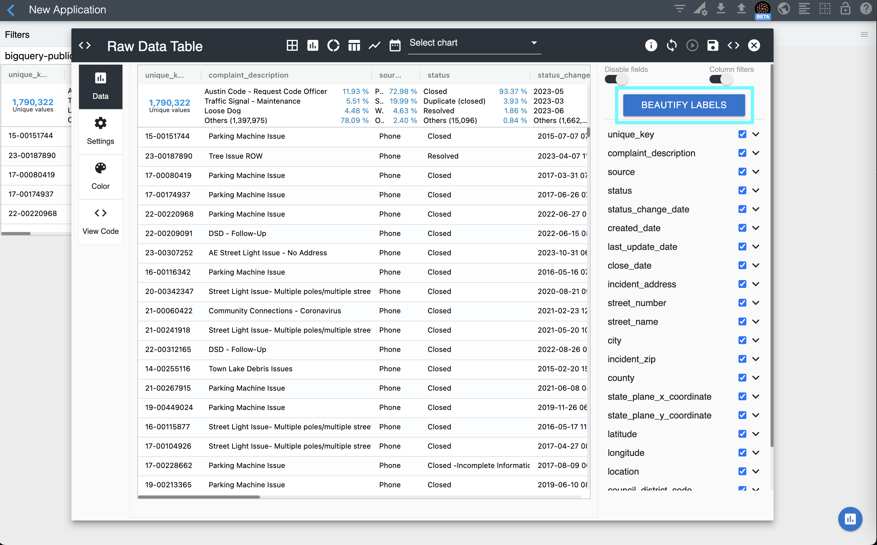
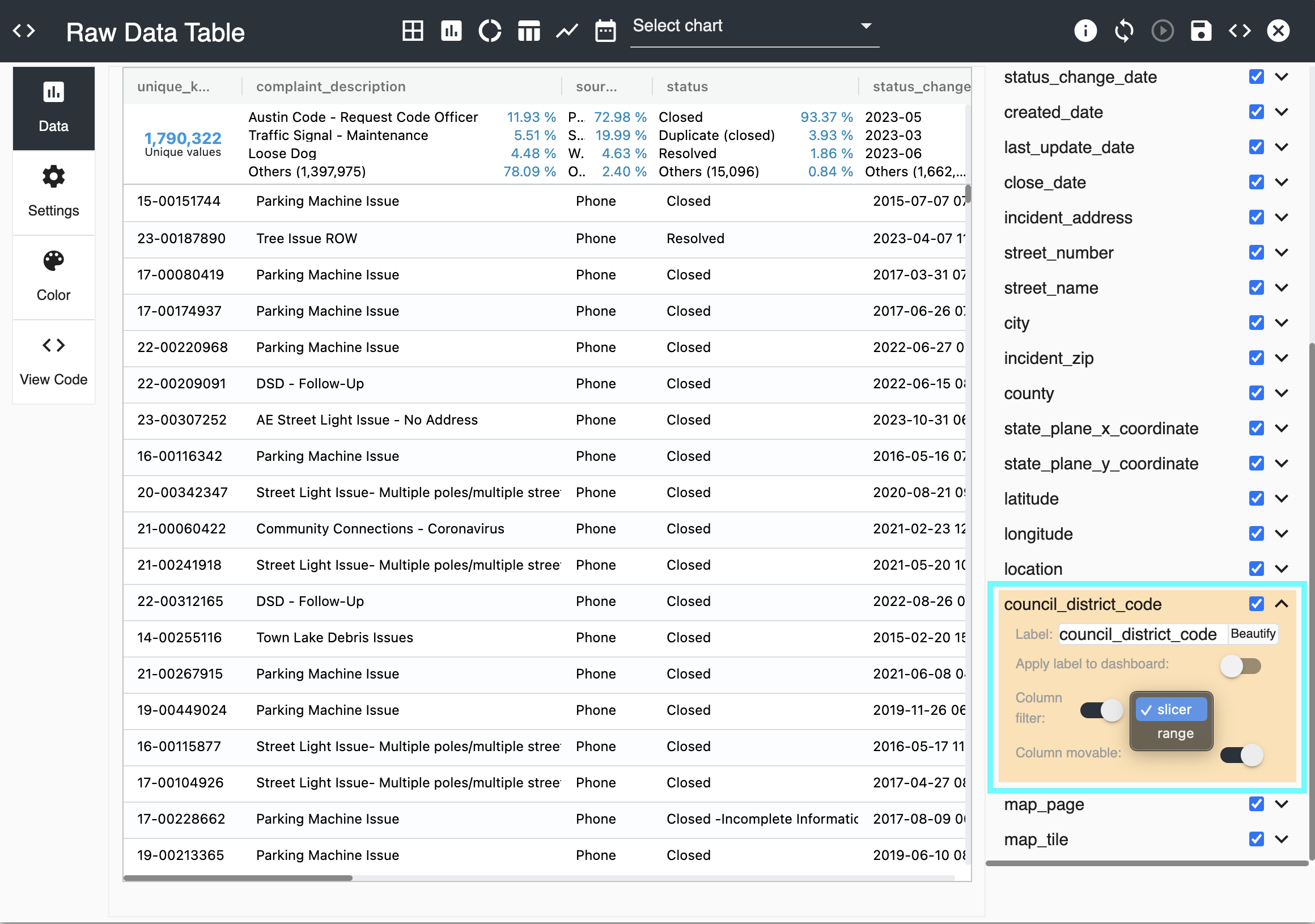
To update a specific column, expand the desired column on the column editor. You can modify its label, apply this label change to all widgets in the dashboard (as opposed to only the table), enable/disable this column filter widget, and allow users to drag this column to change its position in the table.
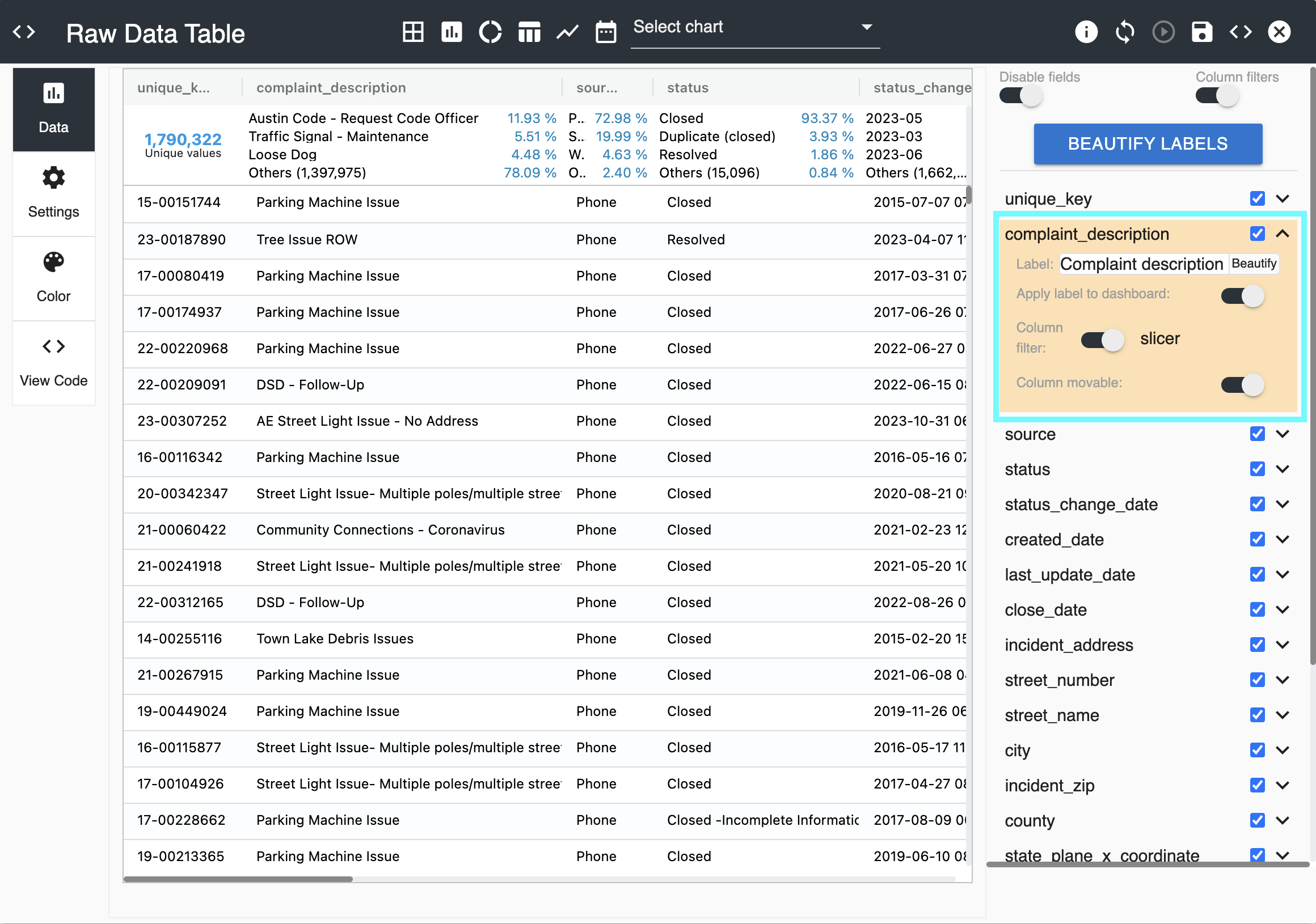
For integer columns, you can select the slicer or the range filter as the column filter widget.
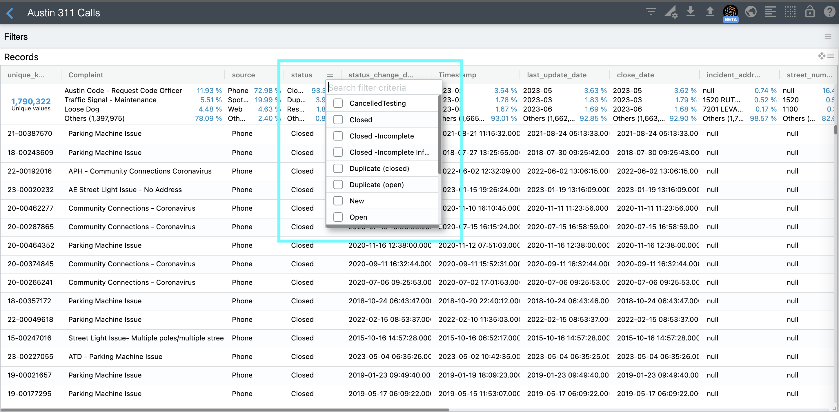
Column Filters
One of the most powerful options of this table visualization is its Column Filters. It allows users to easily filter by any column value. Column filters are enabled by default. You can disable column filters for all columns at once using the top right "Column filters" switch. You can also enable/disable column filters column by column by expanding columns individually and enabling/disabling their filter option.
Column Groups
You can easily create groups of columns. Simply use the right panel to drag a column on top of another and a column group will be created. Keep dragging more columns into your group as needed.
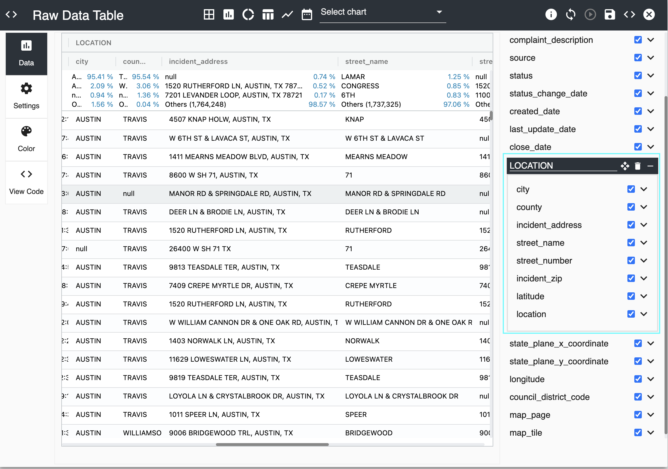
You can relabel your column group by simply typing a different group name. And if you want to remove a column from your group, simply drag it out of it.
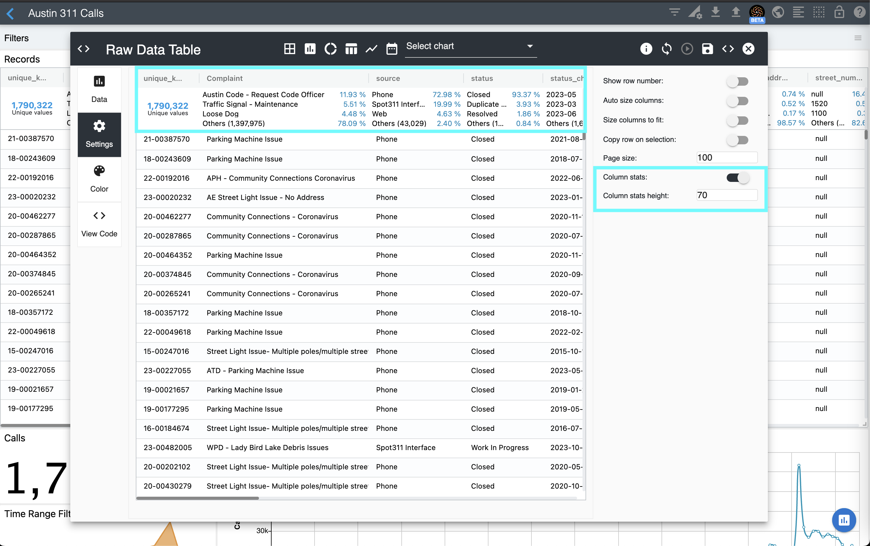
Column Statistics
One of the most powerful features of the Raw Data Table is its Column Statistics. It helps you quickly understand the dataset by providing the distributions of each column. This feature is enabled by default. You can turn it off in the Settings section.
Creating other visualizations
You can use the chart editor to create many visualizations. Simply select one of the visualization shortcuts or select/type its name on the visualization list. In this section we are going to describe how to configure a bar chart.
First, select Bars from the chart list.
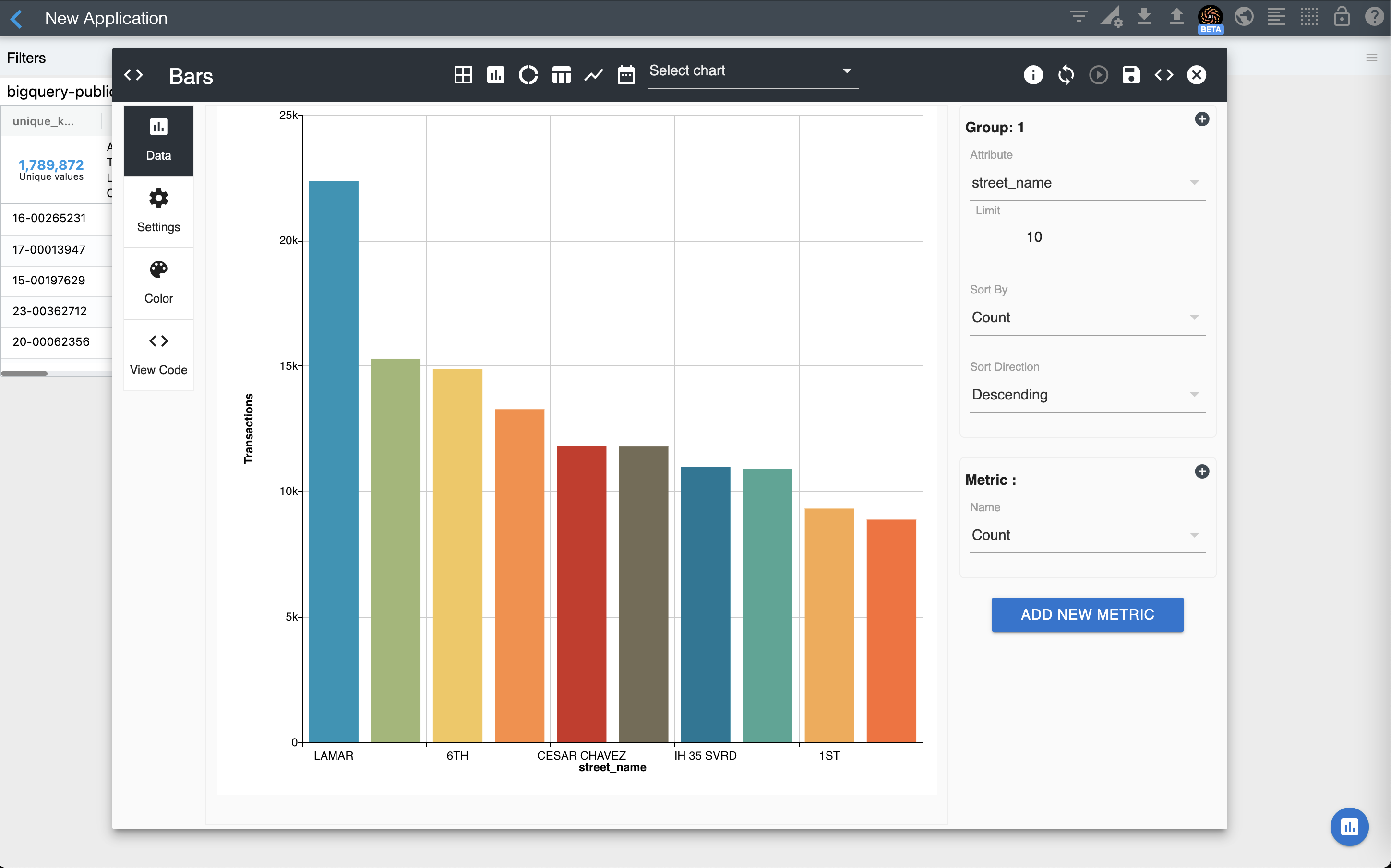
Now configure the data of your chart as follows:
- Group 1
- Attribute: street_name
- Limit: 10
- Sort By: Count
- Sort Direction: Descending
- Metric 1
- Name: Count
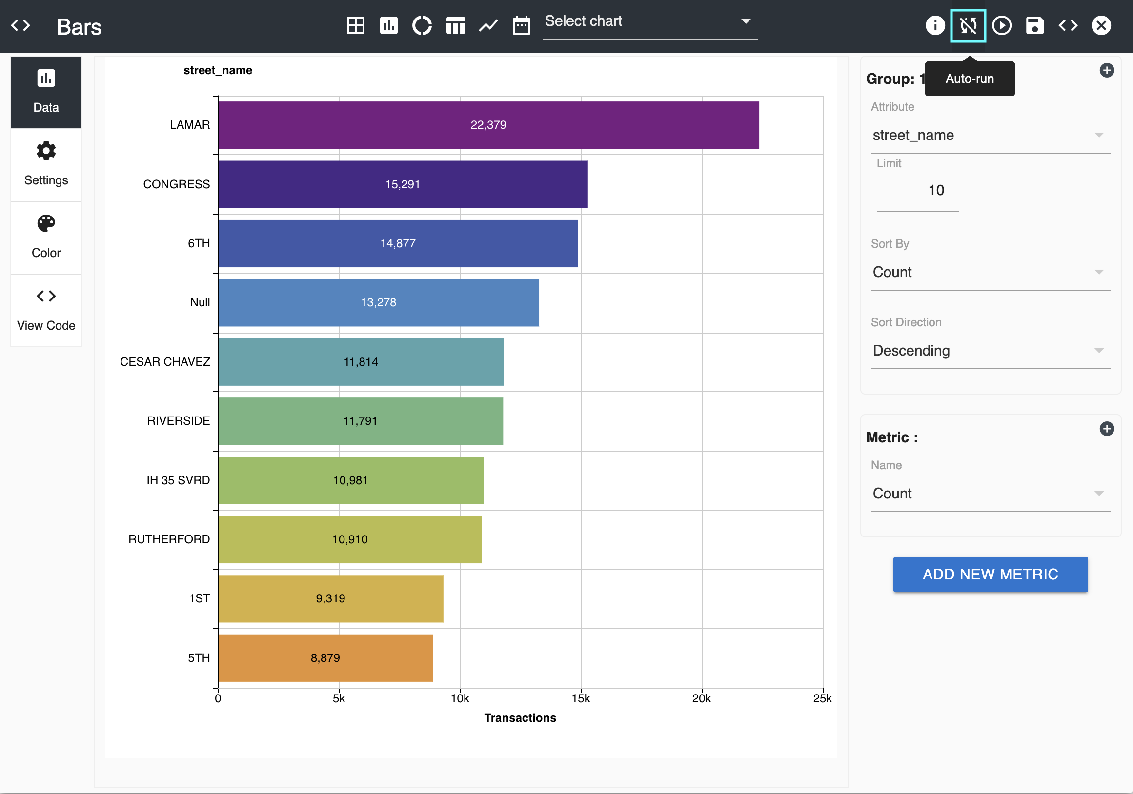
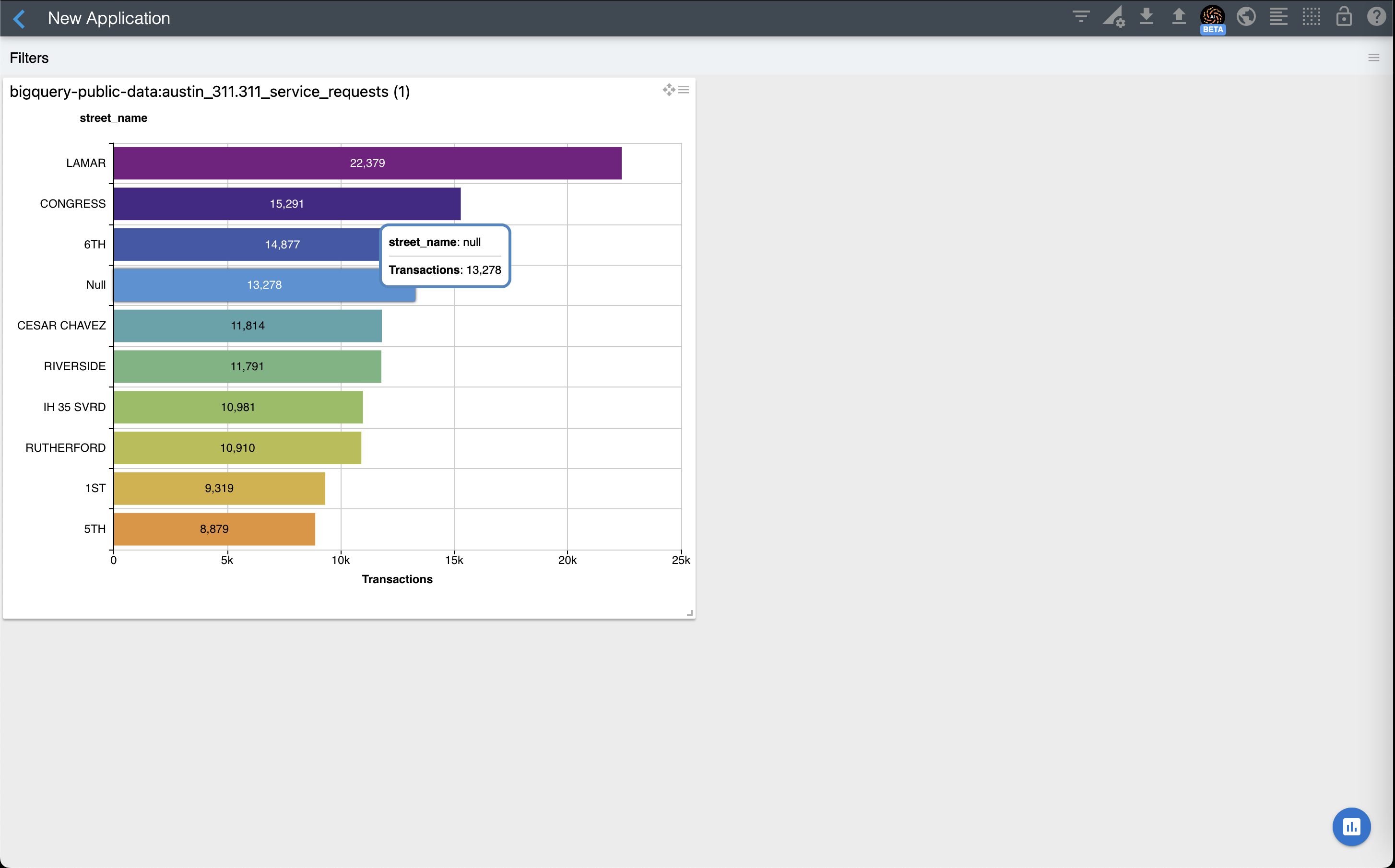
You should see a bar chart as the one below:
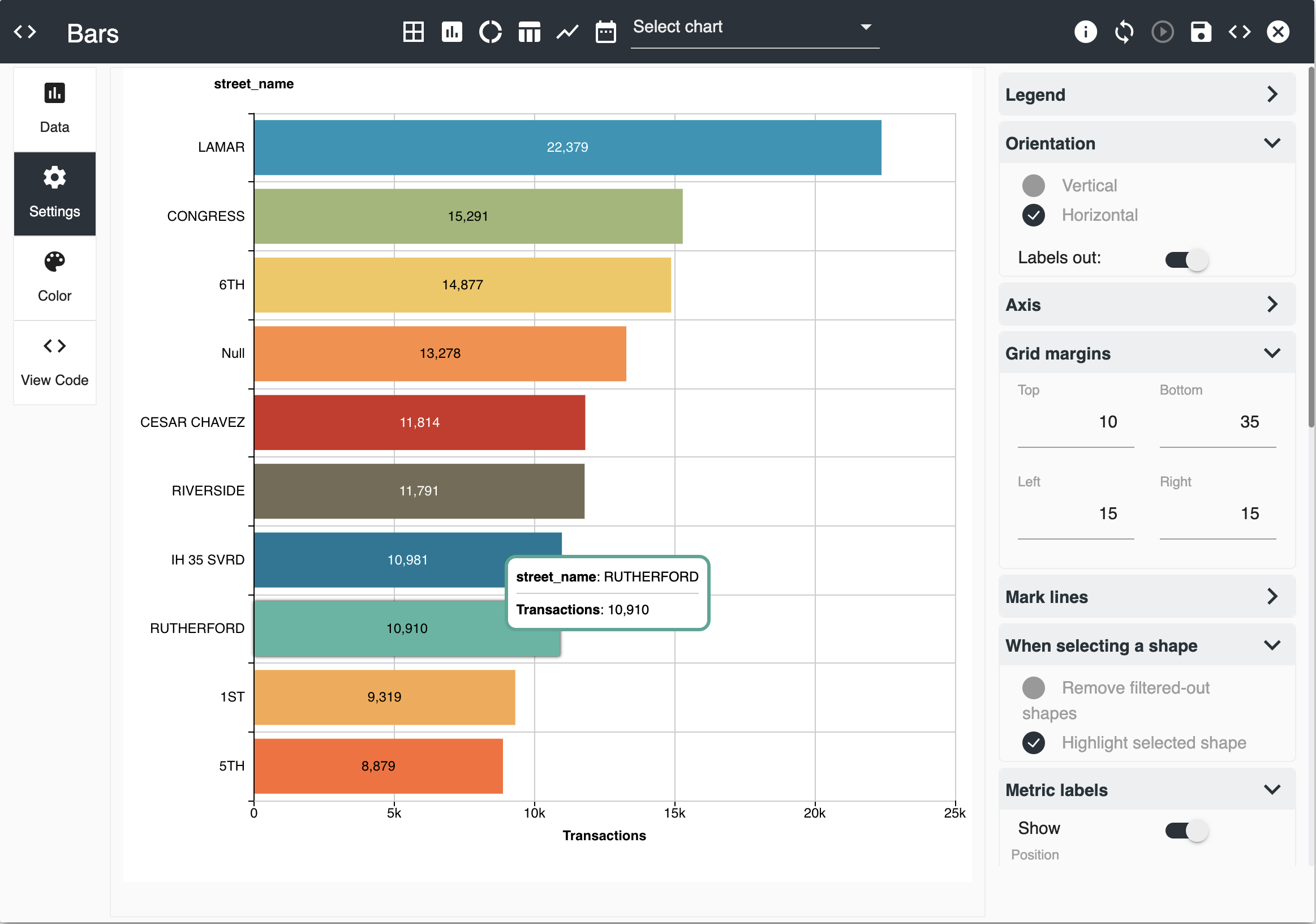
Now let's select Settings on the Editor's left panel to configure some settings:
- Open the Orientation selction and select Horizontal Orientation
- Turn on Labels out
- Open the Grid Margins section and set 15 for left and bottom. Leave the default for the other ones.
- Open the When selecting a shape section and select Highlight selected shape
- Open the Metric labels section and turn on "Show"
You should now see the visualization as follows:
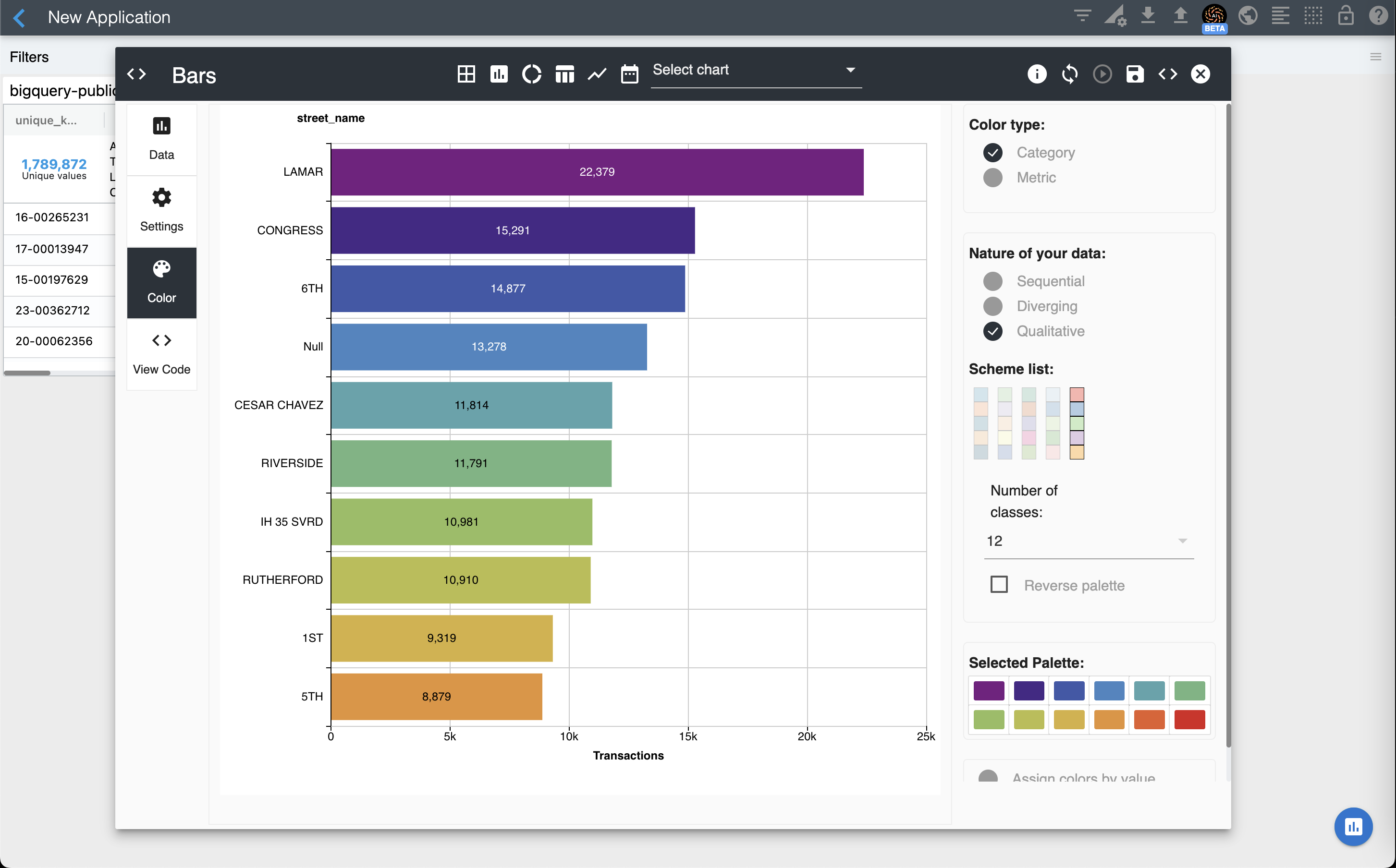
Now let's select Color on the Editor's left panel to configure our chart's color palette:
- Select Qualitative for Nature of your data
- Select the last palette on the Schema list
You should now see the visualization as follows:
Finally, select the SAVE button on the top right of the editor. Now, you can add a title to your chart and resize it as needed. You should have a visualization similar to the one below:
As an exercise, add a couple of charts to your dashboard.
The Supported Visualizations page lists all available visualizations.
Slow sources support
You may see the message below while configuring your visualization in the Editor:
Your source is slow, enable "Manual run" for a better user experience
This means that ChartFactor Studio noticed a significant latency (beyond 3 seconds) when you select attributes, limits, sorts, and metrics and it is suggesting to use "Manual run" instead. To enable "Manual run" simply select this option at the top of the editor as shown below:
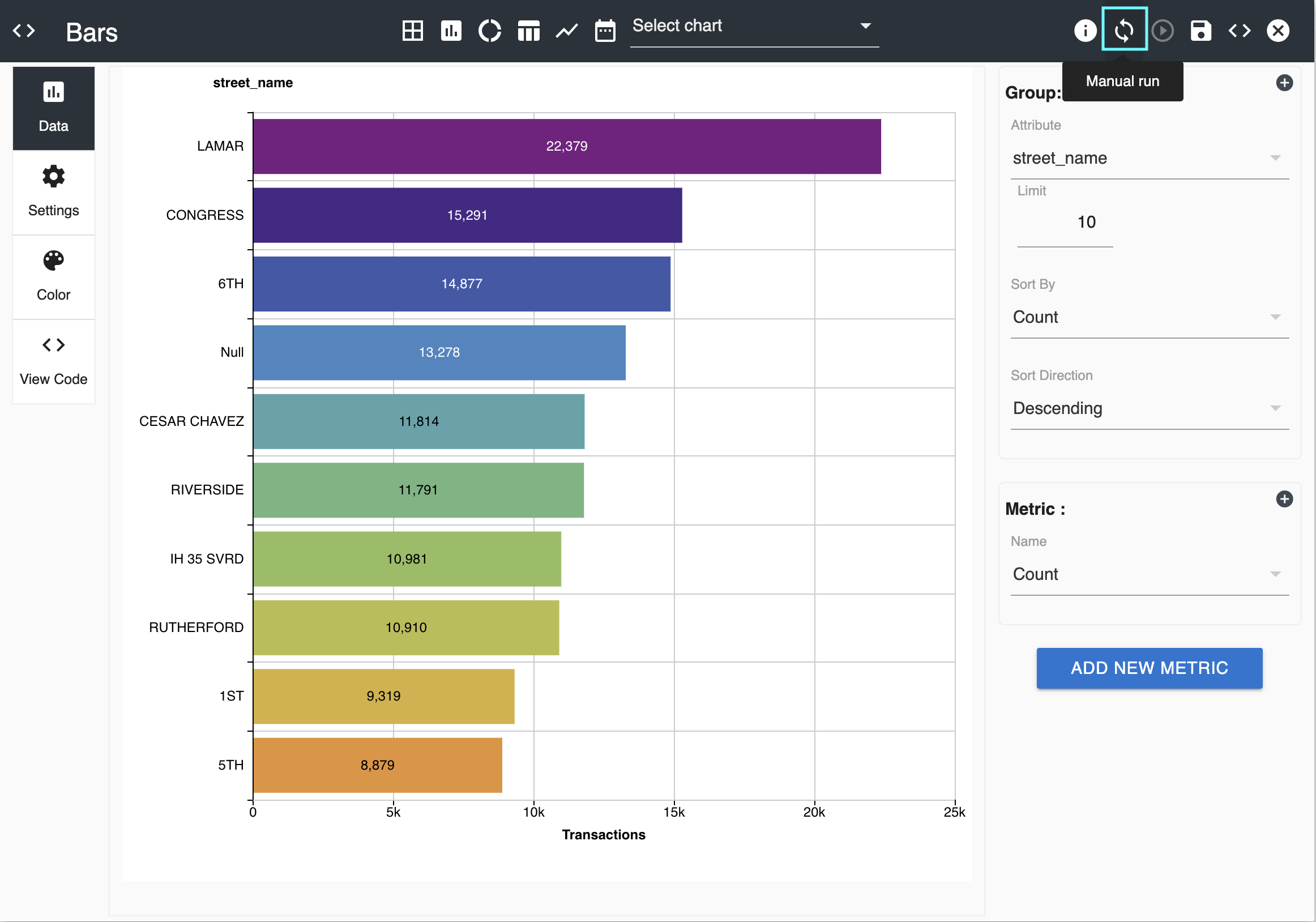
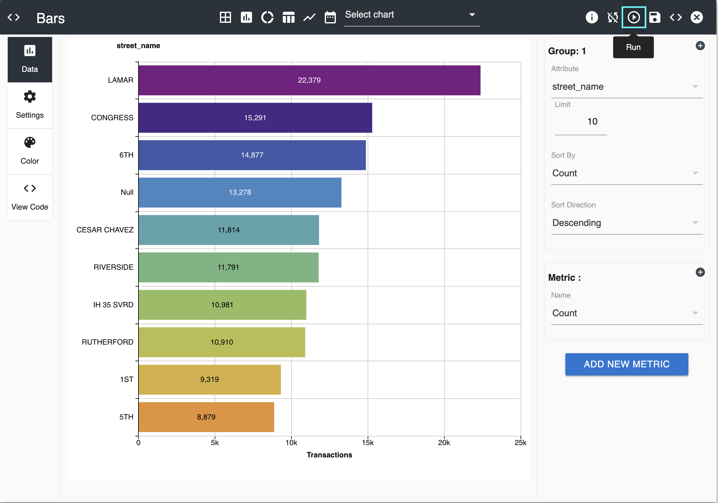
After selecting this option, you can make all your data-related changes in the Editor without ChartFactor Studio executing them immediately. You can select the "Play" button when you want the visualization to reflect all your changes as shown below.
You can go back to auto-run by selecting the "Auto-run" button as shown below.