Gauge
The Gauge chart is useful to visualize a specific KPI value framed within a certain range.
We can obtain a Gauge chart in the following way:
1 2 3 4 5 6 7 8 9 10 11 12 13 | |
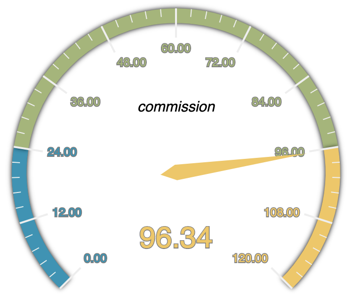
The previous code will render a Gauge chart as follows:
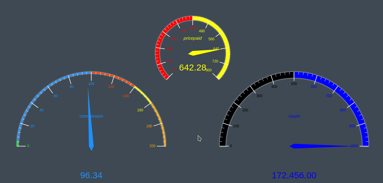
The Gauge chart also allows the visualization of multiple KPIs as we can see below in this example of much greater complexity:
1 2 3 4 5 6 7 8 9 10 11 12 13 14 15 16 17 18 19 20 21 22 23 24 25 26 27 28 29 30 31 32 33 34 35 36 37 38 39 40 41 42 | |
Previous code will render a Gauge chart as follow:
Gauge configuration
The Gauge supports multiple settings to change its rendering behavior. The following are the supported settings:
angles
Allows defining the start angle and end angle for each Gauge, by default [225, -45] 
ranges
Allows to define the minimum and maximum ranges for each Gauge, by default [0, 100]
radius
Allows to define the radius (size) for each Gauge, by default ‘70%’
rangeColors
Allows to define a range of colors for each Gauge that consists of an array of arrays in which each subarray is a color segment whose first element is the percent up to which it arrives and the second is the css color, by default three segments with the first three colors of the color palette of the selected theme.
layout
Allows you to define the position for each Gauge that consists of an array of arrays in which each subarray has the X and Y position of the center of the Gauge generally in percent, by default for a gauge: [[‘50%, 50%’]] , for two: [[‘25% ‘, ‘50%’], [‘75% ‘, ‘50%’]], for three: [[‘25% ‘, ‘50%’], [‘50% ‘, ‘50%’], [‘75% ‘, ‘50%’]]
lineWidth
It is an array that allows to define the width of the perimeter line for each Gauge by default: [15]
clockwise
It is an array that allows you to define if the direction is clockwise for each Gauge by default: [true]
splitNumber
It is an array that allows to define the number of divisions for each Gauge by default: [10]
showLabel
Allows to define if metric labels, also referred in this documentation as "title labels" are rendered or not, by default true
titleLabel
- textBorderColor: is a string that allows to change the border color around the title text.
- textBorderWidth: is an integer that allows to change the width of the border around the title text.
- fontSize: is an integer that allows to change the font size of the title text.
scaleLabel
- textBorderColor: is a string that allows to change the border color around the scale labels.
- textBorderWidth: is an integer that allows to change the width of the border around the scale labels.
- fontSize: is an integer that allows to change the font size of the scale text.
detailLabel
- textBorderColor: is a string that allows to change the border color around the detail text.
- textBorderWidth: is an integer that allows to change the width of the border around the detail text.
- fontSize: is an integer that allows to change the font size of the detail text.
needle
- borderColor: is a string that allows to change the border color around the needle.
- borderWidth: is an integer that allows to change the width of the border around needle.
- opacity: is an integer that allows to change the opacity of the needle. The value has to be a number between 0 and 1.