Pivot Table
A pivot table is a table that summarizes the data of a raw data table. This summary might include sums, averages, or other statistics, which the pivot table groups together in a meaningful way. The pivot table is based in ag-grid
In the ChartFactor toolkit, we can define a Pivot Table in the following way:
1 2 3 4 5 6 7 8 9 10 11 12 13 14 15 16 17 18 19 | |
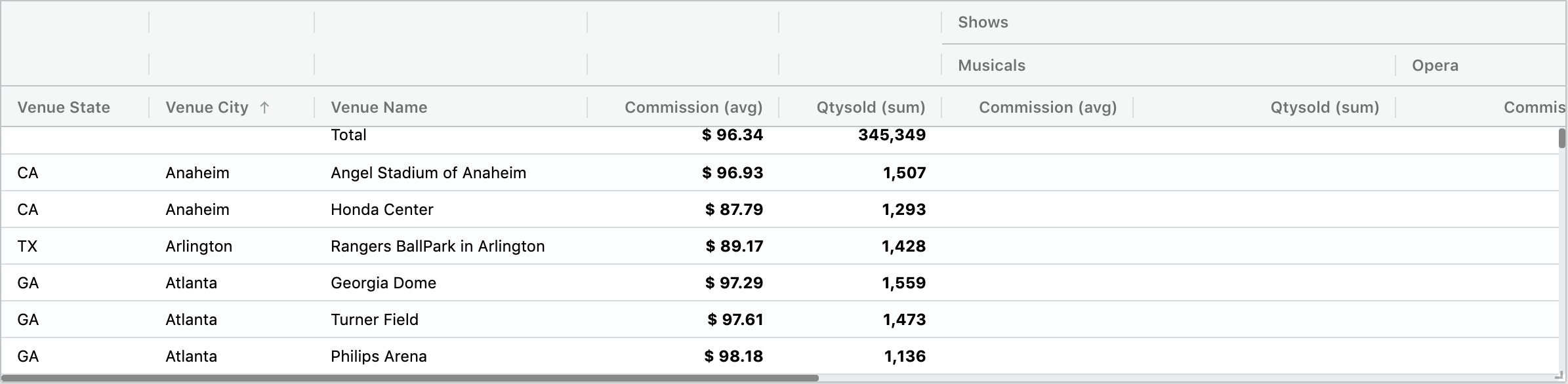
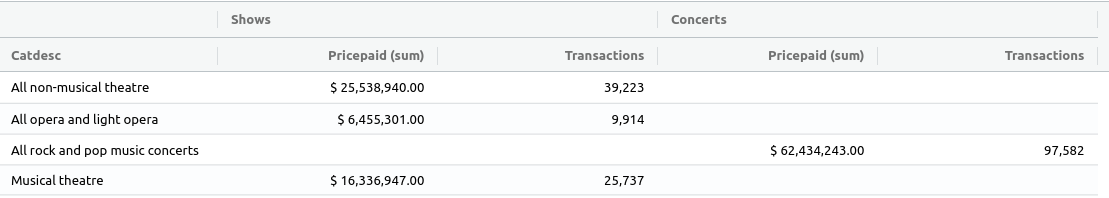
The previous code produces the following result:
The pivot query syntax is very similar to the raw query syntax but instead of fields it has rows and columns. They can be declared in a short way in the following way:
1 | |
and in a long way like the following:
1 2 3 4 | |
In the long form for rows you can specify a label as a second argument.
Configuring the size of the queries
- limit: limits the rows of the actual query (the amount of data needed to assemble it is always greater). The default limit is 1000.
The example below illustrates the use of this parameter:
1 2 3 4 5 6 7 8 9 10 11 | |
Options and configurations
Setting the sort via AQL
Sort order can be specified via AQL in this way:
1 2 3 4 5 6 7 8 | |
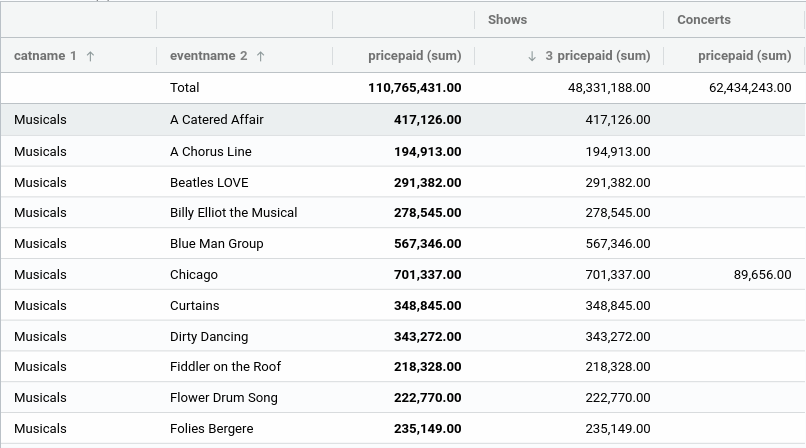
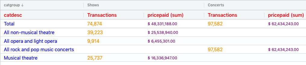
The above will sort by catname ascending first, then eventname also ascending and finally pricepaid for Shows descending:
Sorted columns will have the up arrow indicator when is ascending and the down arrow when is descending. Also the sort order in the same way that was specified in the aql.
Notice that when sorting by nested columns, the column name must include all column values separated by || (double pipe), so for example a two group column could be defined as: First group||Second group||Metric.
Note
When specifying the sort of a column that is nested, the sort definition should always include the metric field at the end even when topGroupIsMetric is true. Example: First group||Second group||Metric.
Sorting column header values
Not only the values of the column, but also the values of the header for each column can be sorted.
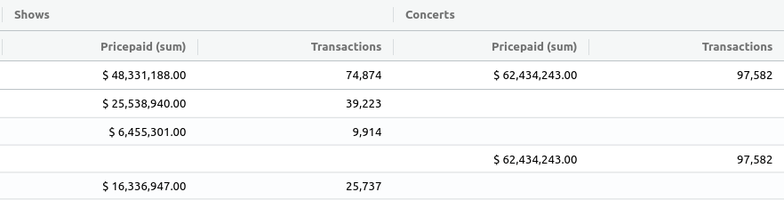
In the above example one single column is used: "catgroup". The only two values for this column are "Shows" and "Concerts" with undefined sorting.
If we want to sort them ascending we need to add the column name to the sort configuration:
1 2 3 4 5 6 | |
The result will be the column header sorted:

Setting time granularity
You can specify the time granularity of a Row or Column as shown bellow. If not specified, it will use the default granularity of that time field at the data provider level.
1 2 | |
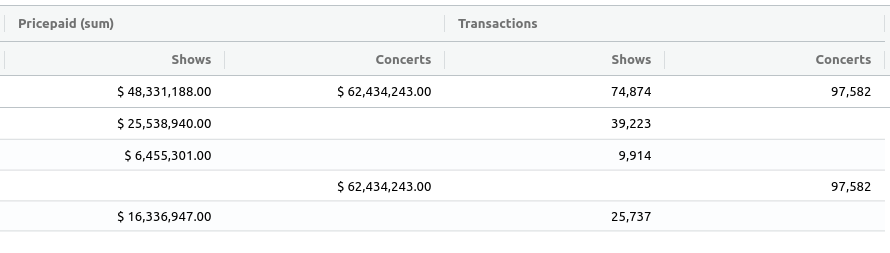
Using metrics as top columns
By default when using columns, metrics are displayed always below the attribute columns:
If we want to re-organize the columns by moving the metrics to the top we do the following:
1 | |
The result will look like this:
Turning off totals
Pivot totals can be turned off with the showTotals option. We can individually hide row totals, columns totals or both.
1 | |
With the configuration above, all totals are being turned off:
Formatting cells
The values of the cells in the Pivot Table can be formatted using exactly the same formatting option used by the Raw Data Table.
Additionally, for pivot tables, the fields array property of the formatter object supports JSON objects in addition to strings. The JSON object structure is useful when your pivot table uses the same metric field name several times but with different operations. In this situation, you can specify the field name and operation as shown in the example below for field3.
1 2 3 4 5 6 7 8 9 10 11 12 | |
Derived columns and formatting
Having in consideration that the Pivot Table supports derived fields, we could create new columns to display custom values like for example a column to display a color category. Let's see how:
- Create a derived field from the actual field we want to use as category and add it to the provider's custom metadata:
1 2 3 4 5 6 7 | |
- Create the formatter function:
1 2 3 4 5 6 7 8 9 10 11 12 13 14 15 16 17 18 19 20 21 22 23 | |
Notice in the above function that we return an empty value but the CSS style represents the color. Next we add the derived field to our Pivot Table:
1 2 3 4 5 6 7 8 9 10 11 12 13 14 | |
The result:
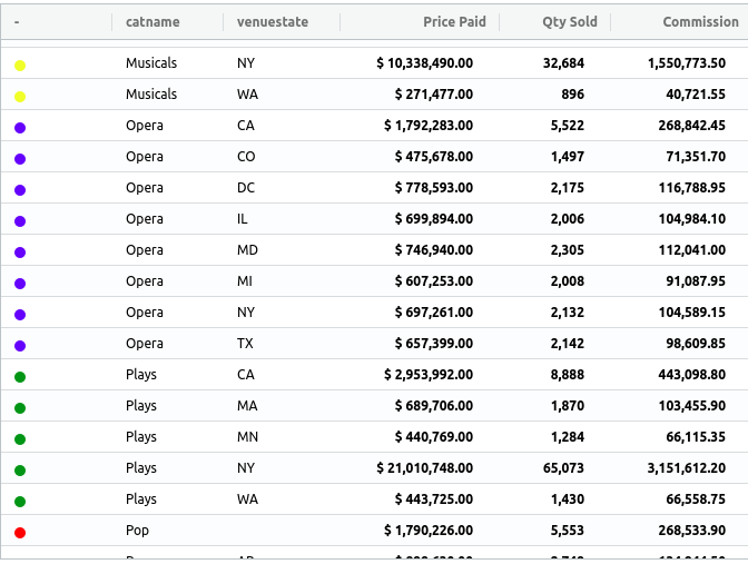
With this feature we can set icons, images, etc as categories or values.
Auto size columns
The autoSizeColumns setting will make all the visible columns on the table viewport adjust to the text.
1 | |
Columns width
This property, as explained in the columns width topic of the Raw Data Table, allows to specify the ideal width for every grid column.
For the Pivot Table's particular case, this property has a small difference in the way it is configured. See the example bellow:
1 2 3 4 5 6 7 8 9 10 11 12 13 14 15 16 17 18 19 20 21 | |
Note that the grouped columns are separated by the symbol || (same as the sort config), which is used to specify the sub-column of the group that we want to set the size for.
Align columns label
This option aligns the header labels of top columns. By default these labels will be left aligned.
1 | |
Custom metadata
The Pivot Table supports custom metadata in the same way that other visualizations, to see details click here
Hiding metrics function
In the above examples, if we want don't want to display the metric function Pricepaid (sum) we just need to specify a custom label for the metric:
1 | |
Providers Support
Please refer to the Providers Capabilities table.
Ag-grid custom options
Since the Pivot Table is based on ag-grid, it supports to pass custom configurations directly to ag-grid.
The custom columns options can be configured in the same way as in the raw data table custom options but using the fromJSON() function from the Row and Metric object instead of Field:
1 2 3 4 5 6 7 8 9 10 11 12 13 14 15 16 17 18 19 20 21 22 23 24 25 26 27 28 29 30 31 32 33 34 35 36 37 38 39 40 41 42 43 44 45 46 47 48 49 | |
In the example above we have used the fromJSON method of the metrics and rows to inject the colOpts property with custom configurations to the fields. In this case we are setting custom css classes that we'll define later to apply a different styling to the headers and cells.
1 2 3 4 | |
The above will render a Pivot like this one:
Copy row on selection
Refer to the Raw Data Table copy row on selection topic to see how to activate this functionality.
Custom theme
If you want to change the theme and styles of the Pivot Table you can refer to Table theme configuration
Events
sort-changed
This event fires when the header of the columns are clicked to change the sort. The event received provides information about the sort model used similar to the one described in setting the sort via aql:
1 2 3 4 5 6 7 8 9 10 11 | |