Visualizing your data
This section assumes you already covered the Exploring data section. In this section, we will add a stacked bar and a histogram to your new application.
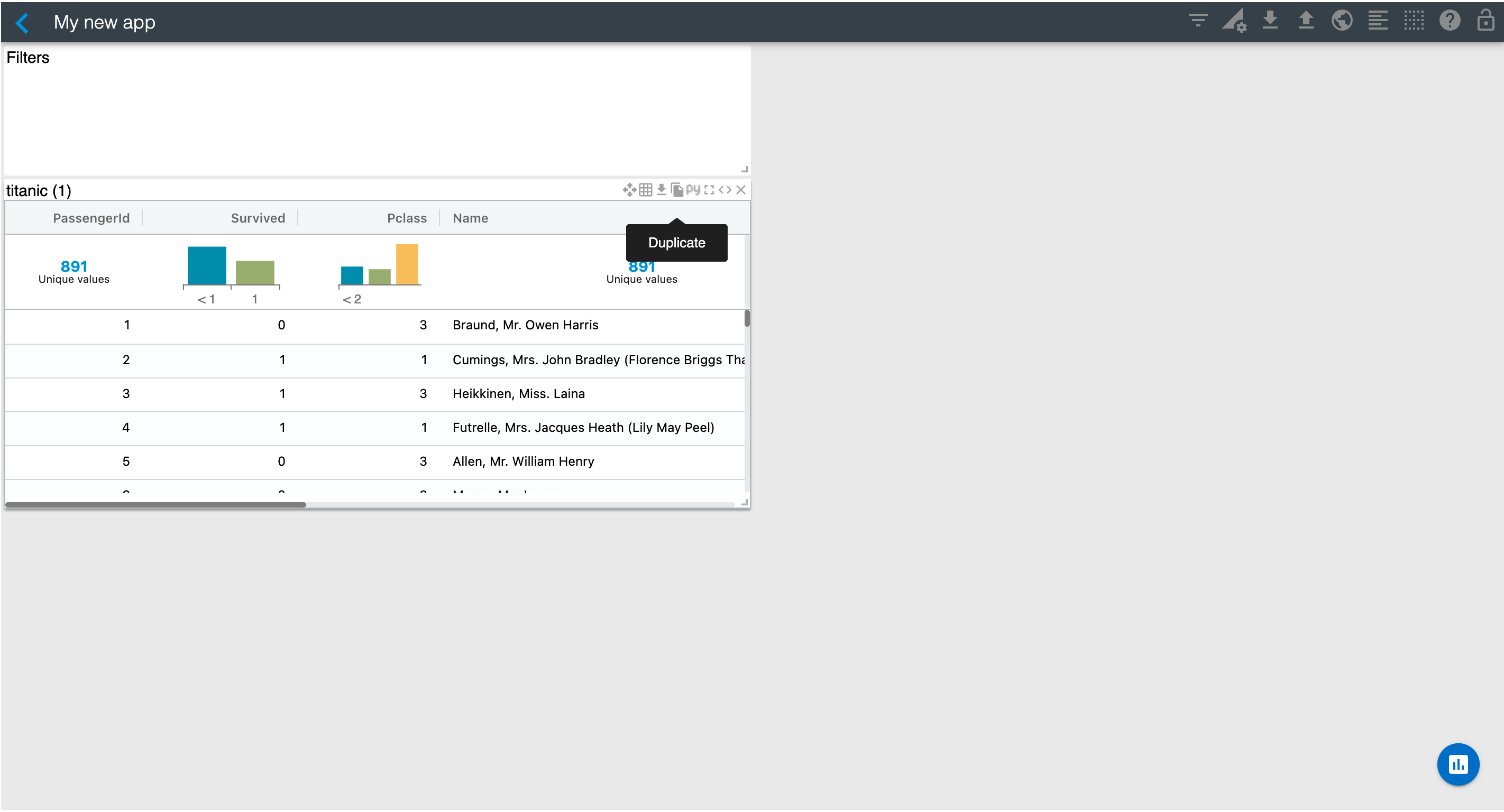
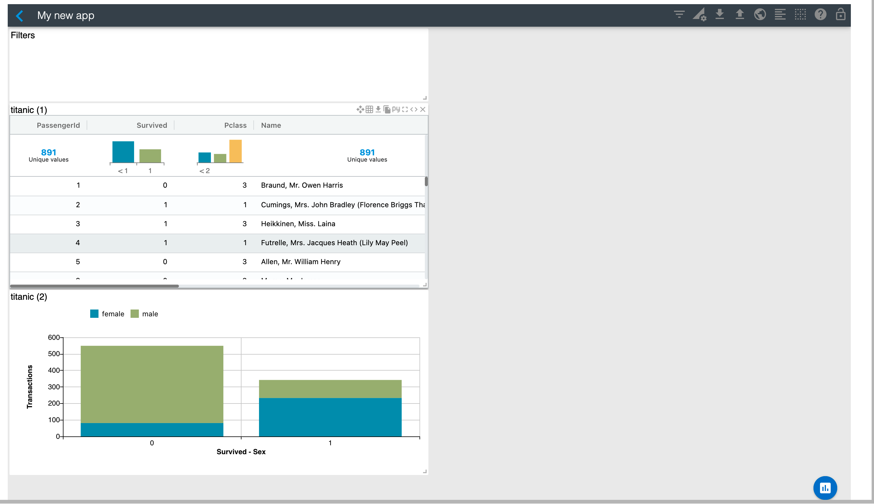
Duplicate the table chart that you created in the previous section by using the "Duplicate" option on the top-right of the widget.
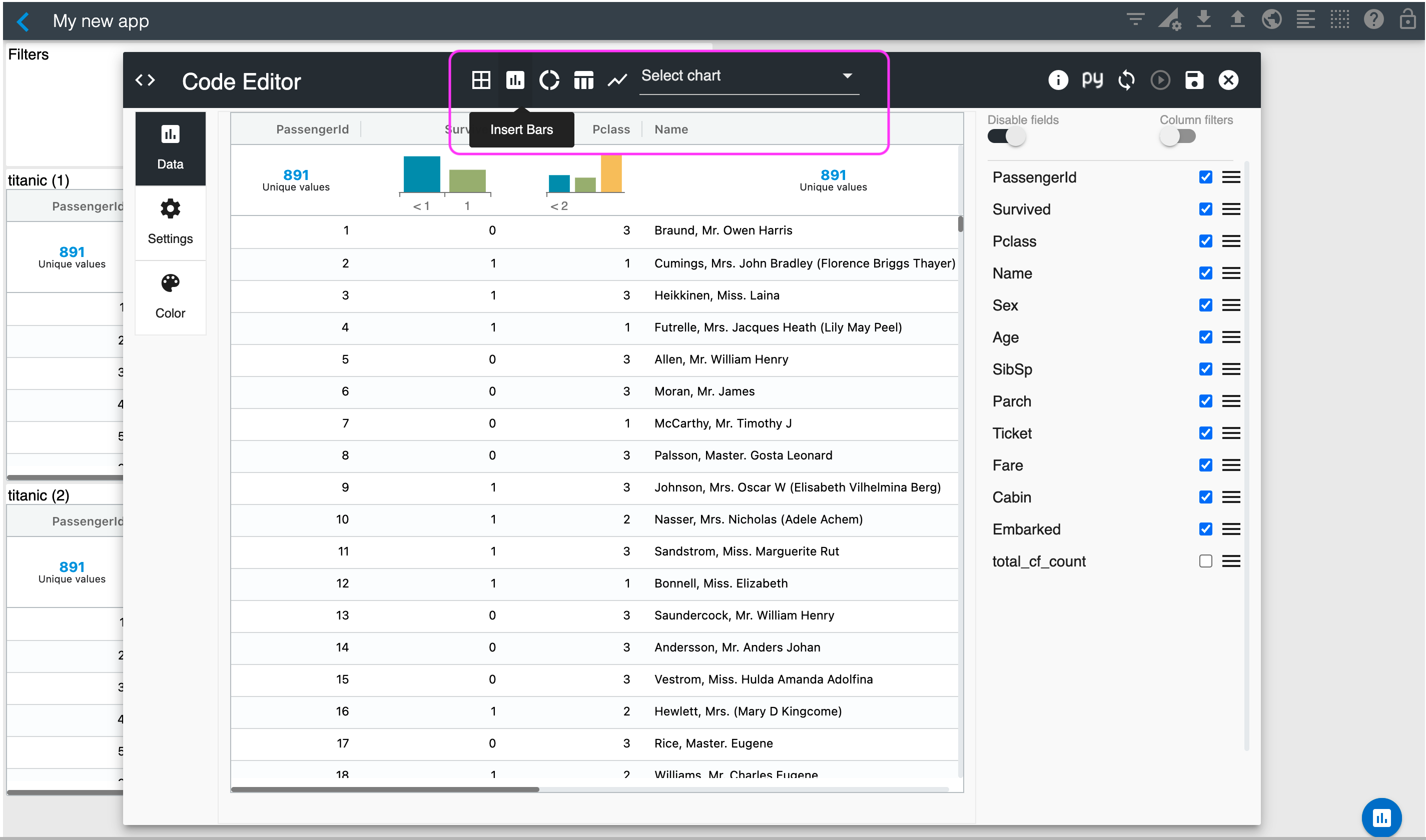
Open the Studio Editor for the newly created chart using its "Edit" option on the top-right of the widget. Once in the editor, select the Bars icon located on the chart menu area shown below. You can also use the "Select chart" dropdown also located on the menu area to select "Bars".
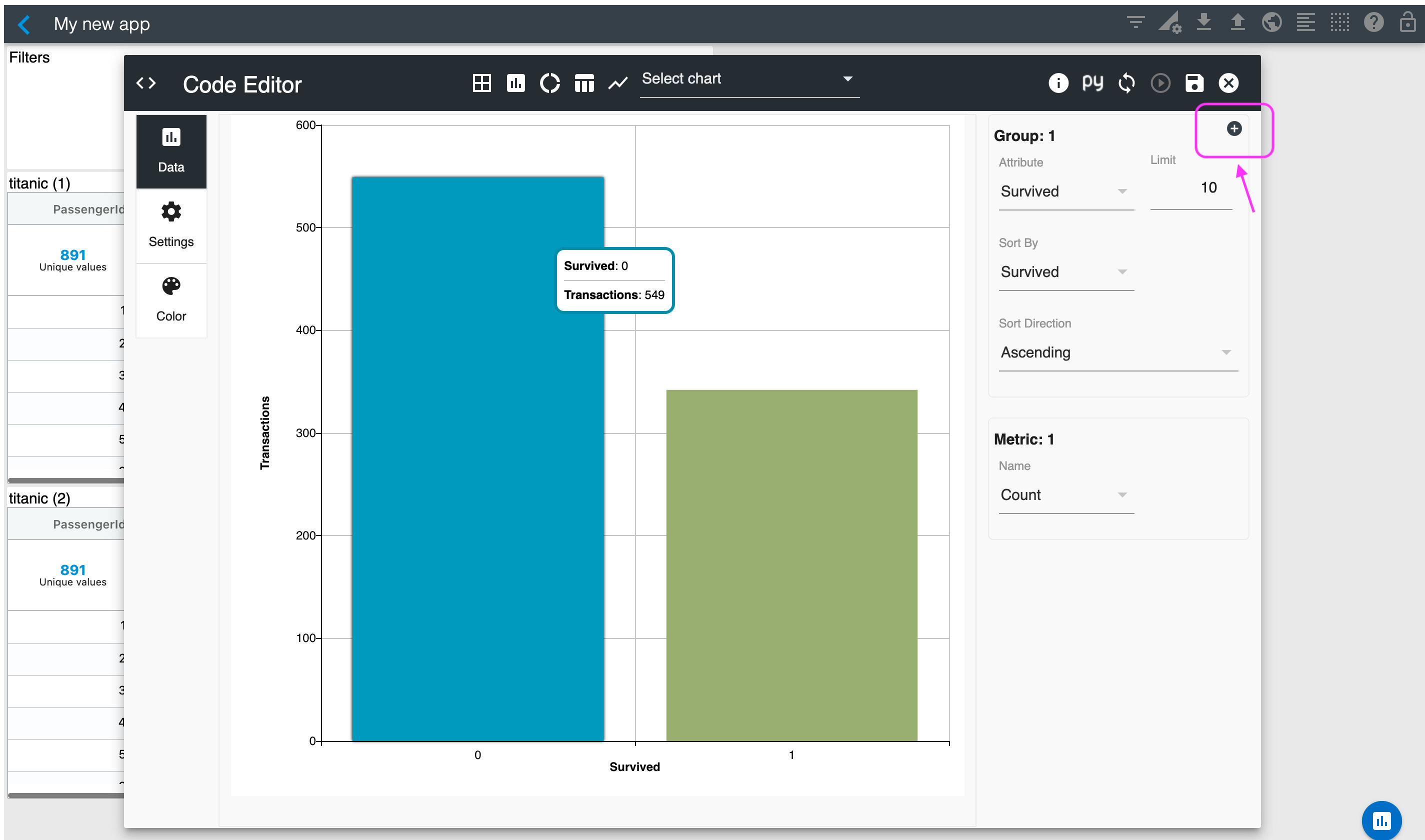
After selecting "Bars", use the right menu area to set the "Survived" field as the Group attribute and the Sort attribute. Also, select Sort Direction "Ascending" and "Count" as the metric. Your bars should look like the picture below.

To create your stacked bars, click on the Plus ( + ) button in the group area.
Select the "Sex" field for the configuration of the Attribute for Group 2. Then, go to the Settings section and select "Top" for the legend configuration.
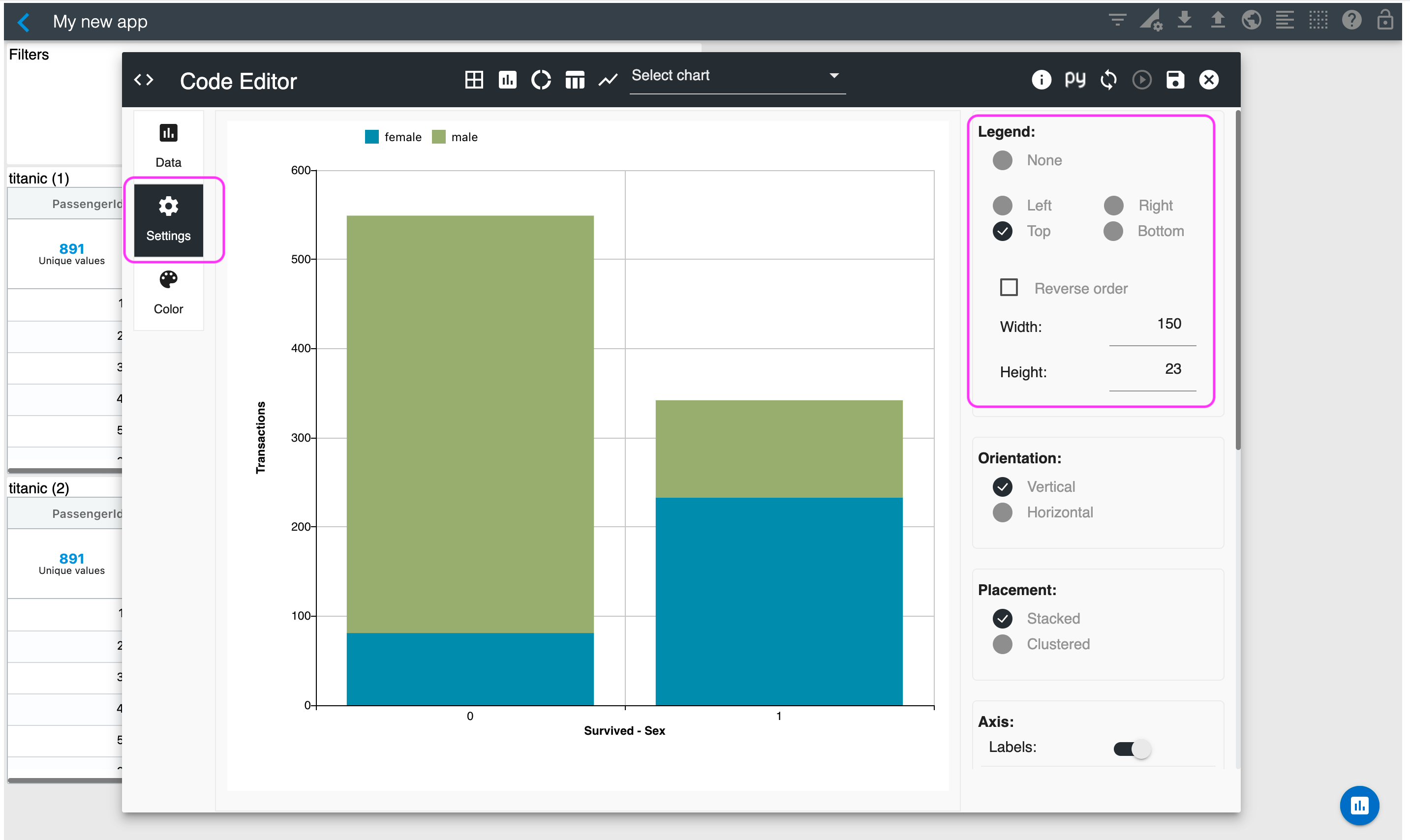
Let's save this chart using the Save button. Your application should now include a raw data table and a bar chart, similar to the ones shown below.
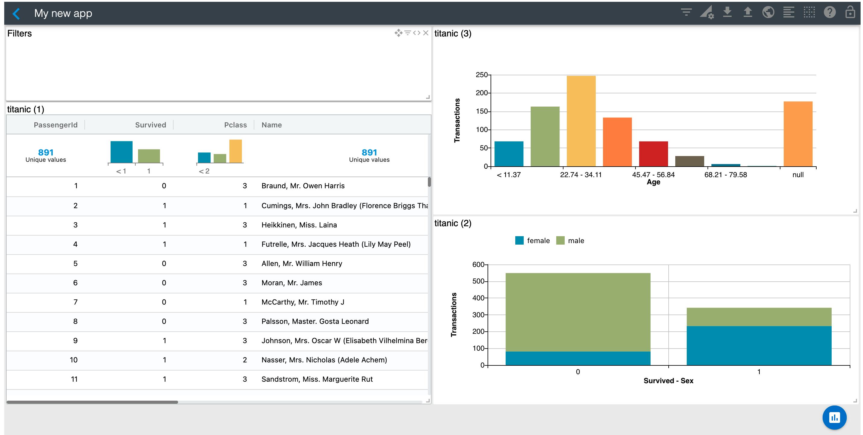
Use the "Duplicate" option on the top-right of the bars widget to create another chart. Once in the editor, select Histogram using the "Select chart" dropdown. Select "Age" as the metric and save. Arrange your charts as you'd like. Your application should look similar to the one below.
The next section will show you how to filter data interactively.