Interaction Manager
The Interaction Manager (IM) is a special visualization that adds a higher level of interaction to an app or dashboard. If we have a set of visuals and we add an IM visualization, it will automatically register and listen for any click or range operation (Time Range Filter, Time Range Picker, Range Filter) that occurs to immediately build and trigger the corresponding filter that will affect all visuals in the dashboard.
The IM is not attached to any provider or source.
1 2 3 4 5 | |
The IM won’t show anything until one or many of the previously mentioned events is triggered.
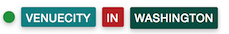
Displaying Filters
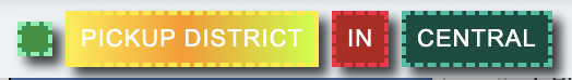
As soon as we fire an event by clicking or applying a range of values the IM will start showing the respective filters. For example if we click in a Bars visualization that is grouped by “venuecity”, we’ll have the following filter reflected in the IM:
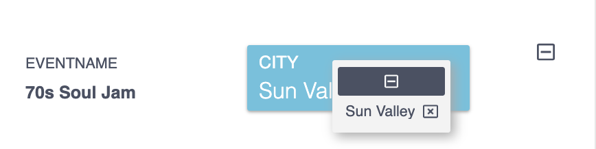
The filter displayed by itself also has a high level of interaction. The green circle allows the filter to be disabled/enabled:
The name of the field is used to remove the filter permanently:
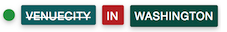
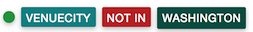
The red square represents the operation. By default the operation is “IN” when clicking on visuals. Filters with this operation can be switched to “NOT IN” and backwards by clicking on the red square:
Range visualizations will trigger filters with operation of type “BETWEEN”:
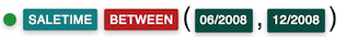 A time range filter
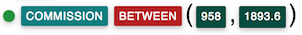 A metric range filter
Multiple Filters
The more visualizations interact with, the more filters we’ll have. Multigroups visualizations will trigger two or more filters at a time (Heat Map, Trend, Pivot….). They all will be joined by the operation “AND”.

Repeated filters won’t re-query the visual.
Exposed API
Sometimes we may want a custom way to handle filters. Or even have a different UI to interact with filters. In any of these cases instead of handling events, multi-source and visuals validations, applying and removing filters and some other taks, we can also let the Interaction Manager take on all this, we just need to create our custom UI.
To avoid the IM from rendering its own UI , we use the noUI option when is created:
1 | |
1 2 3 | |
Api Methods
async updateFilters(filters)
It receives an array of Filter ojbects as a parameter. Then, it performs the following:
- Validates filters and tests them against Interaction Manager restriction rules
- Dispatches the
filter:before-addevent - Stores filters within the interaction manager. This includes adding new filters and updating existing filters.
- Invokes applyFilters() which will also trigger the
filter:addedevent
async deleteAllFilters()
Completly removes all filters from the visualizations and from the IM. Before removing any filters, it dispatches the filter:before-remove event. Finally, for each visualization, it dispatches the filter:viz-finish event after the visualization finishes execution. No parameters required.
async applyFilters()
It triggers the filters that are stored by the IM. It also dispatches the filter:added event. No parameters required.
async getFiltersAppliedToSource(source, provider)
Returns the list of Filter objects that are currently applied to the specified source. It takes two string parameters: The source and the provider. When these two parameters are specified, this function returns the Filter objects that are found in the IM and that are applicable to the source and provider specified.
Example:
1 2 3 4 | |
async getFiltersConditions(visualization)
Returns a promise with the IM filters that are applicable for a specific visualization, indicating if they should be filters or client filters.
Params:
- visualization: Visualization to evaluate.
Response example:
1 2 3 4 5 6 7 8 9 10 | |
async removeFilter()
Removes one filter from all visualizations. It may take two parameters: The filter object to be removed (required) and the option object. The option object can include the following properties:
disable: Valid values aretrueandfalse. Ifdisableis true, then the filter is not deleted, just disabled. Ifdisableis false (default), the filter is permanently removed. In this last case, thefilter:before-removeevent is dispatched, assumingdebounceis false (default).debounce: Valid values aretrueandfalse(default). Ifdebounceis true, removeFilters() does not dispatch thefilter:before-removeevent and also it does not re-execute each visualization with the removed filter.
The filter:removed event is dispatched after the filter is removed.
Example:
1 2 3 4 5 6 7 | |
drill(config)
Sets the provided configuration as the new drill configuration. Refer to the Drill Hierarchy section for information on drill configurations.
getFilters()
Returns the list of Filter objects that are currently applied. No parameters required.
getFilterTemplate(filters)
Returns the HTML template for the filters that are passed as parameter. The template is a string that can be used to render the filters in a custom UI. This template does not include the filter's interaction, it only renders the filters as they are.
setFilters()
Sets new filters to the IM. Receives two parameters, the first one is a list of Filter objects, the second one is a boolean that indicates the IM if it should clean the stored filters (if any) within the IM before adding the new ones. False by default.
These list of filters won't be applied and won't affect any visual until the applyFilters method is called.
1 2 3 4 5 6 | |
Note
Filter objects to be used with the IM must have the property label() and it must match with the label of the field that we want to filter. This ensures the cross-source filtering capability.
updateContent()
This should be only used if we use the built-in IM UI. For example if we have created an app that when it loads it should also load any set of filters stored somewhere. In that case we need to set all the filters to the IM, apply them and then update the UI.
1 2 3 | |
addRule()
Add a new rule for a visual, it takes two parameters: the visual id (the id of the DOM element) and the rule. Rules are explained in the Filter Rules section.
removeRule()
Deletes a rule for visual. Takes the visual id as a parameter.
stopExecution()
Completely stops the execution of the IM before a filter event is processed. See the Filter Event section. Takes no parameters.
Many callbacks can be executed after the visualization loads the data after the filter is applied.
evaluateQueryFilters(filters, staticFilters)
It returns an array of filters that the Interaction Manager should apply to a visualization. It receives two input parameters, filters and staticFilters, each of them arrays of cf.Filter objects. The function loops through each filter and if a filter path (i.e. its field name) matches an existing static filter, the function makes a decision to discard the Filter in favor of the Static Filter based on the coexistent property of the matched static filter.
When the coexistent property of the static filter is true (default), the function discards the Filter in favor of the Static Filter only when their operation is the same and it is other than NOT IN. This allows users to add static filters to visualizations to exclude certain values using the NOT IN operation and still be able to interact with them by selecting other values (e.g. IN operation).
When the coexistent property of the static filter is false, the function always discards the filter in favor of the matched static filter of the same path (i.e. field name). This allows true static behaviour when you want to always have a specific visualization (e.g. KPI) show a metric (e.g. revenue) for a specific filter (e.g. paymentType=CASH).
Filter Events
The IM dispatches several events during its workflow that we can subscribe to. They are useful to perform actions in different stages. For example to show/hide a loading indicator between a filter is triggered and the visual is ready with the new data.
The way we subscribe (and unsubscribe) is in the same way that we do with other events, by using the aktive instance of the IM:
1 2 3 4 5 6 7 | |
Let's describe the events.
filter:before-add
It is fired right before a filter is going to be added to the IM. At this point the filter has not been saved or applied to any visual. If we interrupt the IM workflow at this point (by using the api.stopExecution()) the app will stay the same as before.
The data obtained by the callback is an object with these properties: name which is the event name and filters, an array of the filters to be processed.
filter:added
At this point the filter was stored by the IM and it was triggered over the visuals, so many of them will be in the process of querying the server to obtain the new data.
The data for this event is also an object with three properties: name as the event name, affectedVisuals which is an array of the visuals that are going to be affected by the filters, and filters which is an array with the current filters stored by the IM.
filter:before-remove
Same as filter:before-add, but when a filter is going to be removed. The filters property of the data received by the callback is an array with the filter being removed. If the IM workflow is stopped at this point, the filter will never be removed from the IM or from any visual.
filter:removed
Same as filter:added but when the filter was removed from the IM and the queries are triggered for each visual. The filter property of the data will represent the remaining filters (if any) in the IM. The filter that was removed will be the removed property.
filter:viz-finish
This event is fired by each visual. So if we have ten visuals it will be fired ten times (as long as the visual can be affected in one way or another by the filter).
So for example if a visual is affected by a filter and it has to query the server, then the event is going to be fired just right after the new data is obtained by the visual. That's why this is the event by excellence to dispatch visual related actions like the loading indicator mentioned before, since different visuals have different times to get back the data from the server.
On the other hand, if the filter affects the visual just as a client filter, then the event will be triggered inmediatly.
In the case a filter affects the visual you will receive a response object with the following structure:
1 2 3 4 5 6 7 8 | |
Response object keys:
-
name: This key represents the event name in the callback.
-
element: This key represents the element id that contains the visual.
-
visualization: This key represents the visualization object.
-
data: This key represents the response received by the server. It could also contain the error object if the server request failed.
-
executed: This key represents if a filter was executed in the visual.
-
error: This key represents if any error happens in the filtering processing. Valid values are true or false.
Filter Restrictions
IM level
Sometimes there are filters that require special interactions. For example a date filter that should not be removed, a certain field that should never trigger a filter or filters depending on other filters. These interactions are handle by "filters restrictions".
1 2 3 4 5 6 | |
A filter restriction may have the following properties.
remove: True by default. If is set to false, the filter can't be removed from the Interaction Manager.
add: True by default. Set to false means that the respective filter with that label will never be applied through the Interaction Manager.
dependsOn: The label of another filter. As in the example above, 'Secondary Filter' depends on 'Main Filter' which means that the secondary can't be applied until the main is, and if the main is removed, the secondary will be removed as well.
The Interaction Manager sends "notification" events to client applications when these rules are not met.
Visualization level
There are some cases where to execute and render a visualization, it is required to have certain filters applied. For example it could be a high cardinality visualization that requires a filter to exist beforehand to avoid bringing too much data, or a bar chart that displays a filter driven rate.
In these cases we can specify some restrictions to the visualization so it executes only when one of these rules are applied:
1 2 3 4 5 6 7 8 9 | |
As show in the example above, .onlyWithFilters() takes an array of restrictions. Also, the .onlyWithFiltersMsg() allows to specify a custom message when the required filters are not applied. A restriction object should be defined as follows:
1 2 3 4 5 6 7 8 | |
The property filter is self-explanatory. with is an optional property that takes an array of values that should match exactly with the respective filter (all the values in the array must be contained in the corresponding filter). withAny is similar to with, except the array acts like an OR instead of AND, meaning that if any of the values in the array is present in the corresponding filter, the execution is allowed.
By default the restrictions in the array passed to onlyWithFilters are exclusive. This means that the visualization can be executed if one of them is validated as true. To override this we use the property andFilters which takes an array of restrictions that must be validated as true along with the outter one:
1 | |
The above required both filters: likesports and eventname to be applied in order to execute.
Filter Rules
Whenever a filter is triggered, the IM will try to apply it to all registered visuals. However, sometimes we may want to override some behaviours such as avoiding a given chart from triggering a filter, or have a another one not to be affected by any filter even if it should. These and more can be done by using rules
Rules are checked everytime between a filter is triggered and before being applied so it can decide what to do with the visual and the filter.
They are defined by visual as shown below where bars-element-id is the HTML element id of the chart:
1 2 3 4 5 | |
Rules can be set to the IM before the IM is executed by using the .set method:
1 | |
Rules can also be added after the IM is executed, by using the .addRule method explained before. The difference is that this method takes only one rule at a time since rules are meant to be declared only at the beginning.
1 | |
There are different rule properties:
receive
A boolean. If false, no filter will affect the visual. True by default. This visual will never trigger the filter:viz-finish event.
remove
A boolean. If false, removing a filter will never affect the visual. True by default.
trigger
A boolean. If false, the visual will never trigger a filter when clicked. True by default.
clientFilters
A boolean. When true, if a filter matches the group-by attributes of the visualization, it will try to apply it as client filter (if supported). So it won't trigger a query and the filter:viz-finish event won't be dispatched either. Other filters will affect the visualization normally. Refer to Client Filters for more information.
serverFilters
An array of strings representing the field names that can affect the visual if a filter is applied. These filters trigger new queries.
This configuration will take precedence over client filters. So if a field is found in the serverFilters array, then the filter will be always taken as a server filter even if the clientFilters property is true.
Another case that can be handled is that we may want the visual to be affected only with a client filter, but no other filter should have effect (like when we use receive: false). In this case we set clientFilters as true, and serverFilters as [] (empty array)
filterConditions
A function. This is only recommended for very specific cases that can't be solved with the above configurations. If specified, clientFilters and serverFilters will be ignored.
1 2 3 4 5 6 | |
This function takes as paramateres, a filter and the visual (an aktive instance) and returns an object with two properties: execute, that tells the IM if that filter should re-execute the visual or not, and client that specifies if that filter should be used as a client or not.
So, what if we have several filters to be applied? This function is called by each filter because usually the validation is done based on which filter can be applied and which can. If for a given validation the execute parameter is returned as true at least once, then the visual will be executed.
This is an example of a definition of different filter rules:
1 2 3 4 5 6 7 8 9 10 11 12 13 14 15 16 17 18 19 20 21 | |
Drill Hierarchy
Attribute Fields
The drill hierarchy feature allows to define a path (a list) of fields that a visual will follow according to the filter being applied on it, as long as the filter matches a field defined in that path.
So if we have a Bars that is grouped by “venuecity”, we can tell the IM that when the Bars is clicked, right after being affected by the “venuecity” filter, it should switch the group by to the next field in the path (let’s say “venuename”). This is what is called drill-in. Then, whenever the filter “venuecity” is removed, it should switch or drill-out back to “venuecity”.
Drill paths can have 2 or more field names. The main rule here is that the first field name in the path must be the current “group by” of the visual, so the IM knows what it should use as the base field for that group.
If we follow the example of the Bars explained before, we can configure a drill hierarchy like this:
1 2 3 4 5 6 7 8 9 | |
The drill hierarchy also allows to define a path for colgroups, typically used for intersection queries in Heat Maps and Trend charts. The way to do it is by using the colGroup key (e.g. colGroup1, colGroup2). The syntax is similar to groups. Example below:
1 2 3 4 5 6 7 8 | |
Let’s go into what we have:
The drill hierarchy configuration is a JSON. Each visual that we want to assign a configuration is represented by the HTML element that hosts that visual.
Single group visuals must only have the key group1 configured, as they only have one group by. Multigroups visuals on the other hand may have 1 or many groups (depending on the visual) configured by using group1, group2…. groupN, depending on how many groups we want to configure. It is NOT required to set a path to all groups, since we may only want to specify a path for the 2nd group for example.
Changing visualization properties and options
The drill configuration not only allows changing groups but also any other option that is supported by the visualization. (We refer to any option configured with the .set() property)
So for example when drilling into the second field of the path we could also change the color palette for a more visual effect:
1 2 3 4 5 6 7 8 9 10 | |
We can also define a configuration like this using colgroups using the key colGroup. example below:
1 2 3 4 5 6 7 8 9 10 | |
As we can see in the example above, the path values are not strings (field names), but objects. Each object has the field property which is the field name to be used and the default property which specifies the respective state when the drill hierarchy hits that level. This property is not required, however it is highly recommended to have it or otherwise it will use the last modified state. It's also recommended have a default value for each option modified in other levels.
So in this case, if a filter for venuecity is applied, the visualization will drill into venuename and it will change the property color to use the purple palette. When the filter is removed, it will go back to venuecity with the default color. If the default property was not defined for venuecity, the same color configuration (purple) would be used since it was its last modified value.
Changing options under specific filter conditions
We can even be more accurate by changing the option only if the filter that changed the drill configuration has a specific value. So let's say that we want to use the purple palette only when the filter for venuecity is applied for New York:
1 2 3 4 5 6 7 8 9 10 11 12 13 14 15 | |
If the filter applied for venuecity is not New York, the default color for that level will be used. It is important to mention that the purple palette will be applied if the filter ONLY contains New York. In case other values besides New York are part of the filter, the default configuration will be used.
Here another example on changing several options when using maps visualizations (Vector Map):
1 2 3 4 5 6 7 8 9 10 11 12 13 14 15 16 17 18 19 20 21 22 23 24 25 26 27 | |
Adding more restrictions
Let's imagine that we apply a filter like this: city = "Saint Petersburg", and we want to load a shape containing that city. How do we know if it is refering to the Saint Petersburg in Florida or its counterpart in Russia? How can we load the shape only when is the one located in Florida for example?
In this case we use the requires property to add the extra validation we need by refering, in this case, that the floridaShape is going to be applied when the filter city = "Saint Petersburg" is preceeded by the filter country = "United States".
1 2 3 4 5 6 7 8 9 10 11 12 13 14 15 16 17 18 19 20 | |
Pivot Table
The Pivot Table doesn't use groups, but rows and columns. This is how the drill hierarchy is defined for it:
1 2 3 4 5 6 7 8 9 10 11 12 13 14 15 16 17 | |
The configuration above shows how to specify a drill path for the specific rows or columns. The number represents the row or column as it was specified in the Pivot Table aql.
Note
The first row or colum is identified with 1 and not with 0 for clarity purpouses.
Geo Map
Similar to the Pivot Table's drill-in described in the previous section, the Geo Map uses rows. Therefore, we can combine the Pivot Table drill configuration with the one described for the vector map:
1 2 3 4 5 6 7 8 9 10 11 12 13 14 15 16 17 18 19 20 21 22 23 24 25 26 27 28 29 30 31 32 33 34 35 36 37 38 39 40 41 42 43 44 45 46 47 48 49 | |
Note that Geo Map GL supports declarative multi-layers and declarative multi-shapes within a shape layer. The following notes are important when configuring drill-ins for your Geo Map as shown in the example above.
- The
visualizationIdis the Aktive instance ID of the shape layer you are configuring. Refer to The Aktive Instance ID section of the Geo Map GL document for a description of how to construct this ID. - The
shapeproperty can include template expressions that refer to GeoJSON properties of the selected shape. For example, when users are at the first level and select a US State, you can construct the shape name of the next level using the selected US State. In the example above, thenameproperty refers to the name of the state. - The
prevShapeproperty allows you to modify properties of the previous shape when drilling in to the next level. For example, when drilling-in from US States to US Zip Codes, you can reduce the opacity of the US States shape. - The
sourceproperty allows you to switch the data source of the shape layer. For example, when drilling-in from US States to US Zip Codes, you can switch the source from a source that contains US State-level statistics to a source that contains US Zip Code level statistics. - The
onceOnDrillproperty allows you to configure some shape properties that will be applied only once when users drill in to the next level. For example, when drilling-in from US States to US Zip Codes, you can set thefitBoundsproperty totrueso that the map fit-bounds to the selected US State shape during the drill-in but it does not fit-bounds after users zoom in and applying other filters. The supported properties are the following:fitBounds: If set totrue, the map will zoom-in to the selected shape only once when users drill-in. The previousfitBoundsvalue will be set after the drill-in is complete.color:dynamic: If set totrue, the color ranges of the shape will be dynamically re-calculated based on the data only once when users drill-in. The previous value of the dynamic color range configuration will be set after the drill-in is complete.
Note
- The source property, used to switch sources in a drill-in configuration, is supported for drill-in configurations of up to two levels.
- Shape-specific options as well as the
prevShapeproperty apply to Geo Map V2 and Geo Map GL.
Time Fields
Auto drill-in
The 'AUTO' drill-in configuration calculates the time granularity according to the size of the time window selected using its out-of-the-box breakpoints. This way, users can just apply time filters and the chart updates with its new time granularity automatically. See below an example of how to set an automatic time drill-in.
1 2 3 4 5 6 7 8 9 10 | |
Drill-in break points
With this configuration you can specify what are the limits of each granularity and the IM calculates the time granularity automatically according to the size of the time window selected. See the breakpoints definitions below, one for the time group of a trend chart, one for a row query of a pivot table, and one for a column group of a heat map. According to these definitions, the next time granularity will be YEAR if the size of the selected time window is 3 years or greater. Otherwise, it will be MONTH if the selected time window is 3 months or greater. Otherwise, it will be DAY if the selected time window is 3 days or greater, and so on.
1 2 3 4 5 6 7 8 9 10 11 12 13 14 15 16 17 18 19 20 21 22 23 24 25 26 27 28 29 30 31 32 33 | |
Mixed Fields
Multigroups visualizations can group by an attribute and a time field at the same time. In these cases the IM will ignore any configuration specified for the time field and will only use the drill path for the attribute field if any.
Non supported visualizations
There are a two types of visualizations that currently don't support drill-in configurations:
-
Visualizations that don't perform any type of aggregation (don't use any attributes): KPI, Gauge, Raw Data Table, Range Filter.
-
Visualizations that perform pivot queries: Sankey, Group Trend and Sunburst.
From the second group there are two exceptions covered in the previous sections: Pivot Table and Geo Map.
Skins
Skins allow you to change the theme of the Interaction Manager. If you are not comfortable with the default skin you can change it. You just have to use the following code:
1 | |
Classic Skin
This is the default skin for Interaction Manager.
You can also render a customized classic skin like the one below:
To do that, set the following classic custom skin configuration:
1 2 3 4 5 6 7 8 9 10 11 12 13 14 15 16 | |
Classic Skin Configuration
-
type: inside this option, you can define the type of the skin. Example:
classic. -
imContainer
- style: inside this option, you can define all the necessary CSS style to modify the
Interaction Managercontainer. You can define a string with all the properties you need like you normally do when setting the attributestylein some HTML tag.
- style: inside this option, you can define all the necessary CSS style to modify the
-
filters
-
containerStyle: inside this option, you can define all the necessary CSS style to modify the filters container.
-
filterToggle: inside this option, you can define all the necessary CSS style to modify the toggle button (The button for enable and disable a filter).
-
filterName: inside this option, you can define all the necessary CSS style to modify the filter name.
-
filterOperation: inside this option, you can define all the necessary CSS style to modify the filter operation.
-
filterValues: inside this option, you can define all the necessary CSS style to modify the filter values.
-
-
trash: inside this option, you can define the configuration of the filter values component displayed when you click over a filter item.
- containerStyle: inside this option, you can define all the necessary CSS style to modify the
REMOVE ALLbutton.
- containerStyle: inside this option, you can define all the necessary CSS style to modify the
Modern Skin
The modern skin looks like the example below.

To use it, set the Interaction Manager skin as follows:
1 | |
As with the classic skin, you can configure the modern skin in many different ways. For example, you can render a customized modern skin like the one below:
To do that, instead of .set("skin", "modern"), set the following custom skin configuration:
1 2 3 4 5 6 7 8 9 10 11 12 13 14 15 16 17 18 19 20 21 22 23 24 25 26 27 28 29 30 31 32 33 34 35 36 37 | |
Modern Skin Configuration
-
type: inside this option, you can define the type of the skin. Example:
modern. -
filter
-
style: inside this option, you can define all the necessary CSS style to modify the filter container. You can define a string with all the properties you need like you normally do when setting the attribute
stylein some HTML tag. -
labelStyle: inside this option, you can define all the necessary CSS style to modify the filter label. It is useful when changing the font-size and color. You can define a string with all the properties you need like you normally do when setting the attribute
stylein some HTML tag. -
valueStyle: inside this option, you can define all the necessary CSS style to modify the filter value. It is useful when changing the font-size and color. You can define a string with all the properties you need like you normally do when setting the attribute
stylein some HTML tag. -
palette: inside this option, you can define a custom palette for filter item background-color. Any selected filter take a color from this palette.
-
-
filterValues: inside this option, you can define the configuration of the filter values component displayed when you click over a filter item.
-
container
- style: inside this option, you can define all the necessary CSS style to modify the filter values container. You can define a string with all the properties you need like you normally do when setting the attribute
stylein some HTML tag.
- style: inside this option, you can define all the necessary CSS style to modify the filter values container. You can define a string with all the properties you need like you normally do when setting the attribute
-
button
-
icon: inside this option, you can define the icon for the remove button in filter values. It supports
FreeandRegularawesome icons. You have to set here the class for a new icon example:far fa-trash-alt. -
style: inside this option, you can define all the necessary CSS style to modify the remove button inside filter values container. You can define a string with all the properties you need like you normally do when setting the attribute
stylein some HTML tag.
-
-
valueItem
-
icon: inside this option, you can define the icon for the remove button in filter values. It supports
FreeandRegularawesome icons. You have to set here the class for a new icon example:far fa-trash-alt. -
style: inside this option, you can define all the necessary CSS style to modify the items inside the values list for a filter. It is useful for changing the font-size and color. You can define a string with all the properties you need like you normally do when setting the attribute
stylein some HTML tag.
-
-
-
emptyItem: inside this option, you can define the configuration when you don't have any selected filter.
-
text: inside this option, you can define a custom message to show every time you don't have any filter selected.
-
style: inside this option, you can define all the necessary CSS style to modify the empty filter message. It is useful when changing the font-size and color. You can define a string with all the properties you need like you normally do when setting the attribute
stylein some HTML tag.
-
-
disabledItems: inside this option, you can define the configuration when you want to disable a specific filter.
-
style: inside this option, you can define all the necessary CSS style to modify the filter container when is disabled. You can define a string with all the properties you need like you normally do when setting the attribute
stylein some HTML tag. -
labelStyle: inside this option, you can define all the necessary CSS style to modify the filter label when is disabled. It is useful when changing the font-size and color. You can define a string with all the properties you need like you normally do when setting the attribute
stylein some HTML tag. -
valueStyle: inside this option, you can define all the necessary CSS style to modify the filter value when is disabled. It is useful when changing the font-size and color. You can define a string with all the properties you need like you normally do when setting the attribute
stylein some HTML tag. -
filters: inside this option, you can define an array with the filter's name you want to disable. For example, using this array
["eventname.keyword"]means every time you filter some visualization grouped by this field remove the possibility to interact with this filter item, you are not allowed to click over this item and get the list with all the filter's values. To remove it you can use the trash button or the Interaction Manager API.
-
-
trash: inside this option, you can define the configuration for the remove all button. This button is shown in the top-right corner.
-
show: inside this option, you can define if you want to show the remove all button or not. This is a boolean value.
-
icon: inside this option, you can define the icon for the remove all button. It supports
FreeandRegularawesome icons. You have to set here the class for a new icon example:far fa-trash-alt. -
style: inside this option, you can define all the necessary CSS style to modify the remove all button. It is useful when changing its color. You can define a string with all the properties you need like you normally do when setting the attribute
stylein some HTML tag.
-