Skip to content

Box Plot

In descriptive statistics, a Box Plot is a method for graphically depicting groups of numerical data through their quartiles. Box Plots may also have lines extending vertically from the boxes (whiskers) indicating variability outside the upper and lower quartiles, hence the terms box-and-whisker plot and box-and-whisker diagram. Box Plots are non-parametric: they display variation in samples of a statistical population without making any assumptions of the underlying statistical distribution. The spacings between the different parts of the box indicate the degree of dispersion (spread) and skewness in the data.

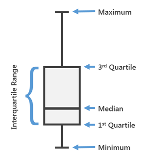
Box Plot Elements: The following image shows the basic elements of the boxplot supported by the ChartFactor Toolkit.

BP

The following code shows how to create a simple Box Plot using the ChartFactor Toolkit:

 1
 2
 3
 4
 5
 6
 7
 8
 9
10
11
12
13
14
15
16
17
18
19
20
    // Define the metrics to be used
    var metrics = [];
    var metric = cf.Metric('commission', 'percentiles');

    // define attribute to group by
    var groups = [];
    var group = cf.Attribute('catname')
                    .limit(10)
                    .sort('desc', metric);

    metrics.push(metric);
    groups.push(group);

    var myChart = cf.provider('Elasticsearch')
                    .source('ticket_sales')
                    .groupby(...groups)
                    .metrics(...metrics)
                    .graph('Box Plot')
                    //.set('orientation', 'horizontal')
                    .element('chart');

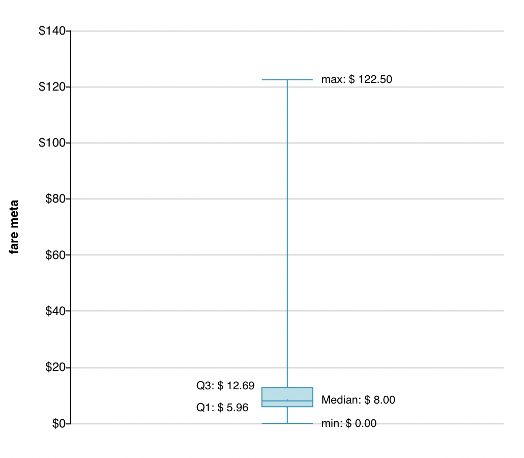
Previous code will render a Box Plot like follow: BP

Without Group: Box Plot supports no group, is the simplest example of this chart. Notice that by default quartiles are printed in the chart. BP

The following code shows how to set serie label to Box Plot without group.

 1
 2
 3
 4
 5
 6
 7
 8
 9
10
11
12
13
14
15
16
17
18
19
20
21
22
23
24
25
26
27
28
29
30
31
32
    let provider = cf.provider("Elasticsearch");
    let source = provider.source("chicago_taxi_trips");
    // Define metrics
    let metric0 = cf.Metric("fare", "percentiles");
    // Define attributes to group by
    let myData = source
        .metrics(metric0);
    // Define Grid
    let grid = cf.Grid()
        .top(35)
        .right(25)
        .bottom(35)
        .left(45);
    // Define Color Palette
    let color = cf.Color()
        .palette(["#0095b7", "#a0b774", "#f4c658", "#fe8b3e", "#cf2f23", "#756c56", "#007896", "#47a694", "#f9a94b", "#ff6b30", "#e94d29", "#005b76"]);
    // --- Define chart options and static filters ---
    let myChart = myData.graph("Box Plot")
        .set("grid", grid)
        .set("orientation", "vertical")
        .set("color", color)
        .set("axisLabels", true)
        .set("xAxis", { "show": false })
        //.set("yAxis", { "show": true })
        .set("serieLabel", {
            show: true,
            rotate: 0,
            fontSize: 12,
            color: "black",
            position: "alternate",
        })
        .execute();

Serie Label

The following are the supported settings:

  • show: true|false.
  • rotate: Number from 0 to 360.
  • fontSize: Number.
  • fontStyle: normal | italic | oblique.
  • fontWeight: normal | bold | bolder | lighter.
  • color: text Color. By default is inherit.
  • position: top | left | right | bottom | alternate. By default is alternate.